Macbeth Art -Kaitlyn and Ariana
For our Macbeth Creative Project me and Ariana wanted something that showed we had a clear understanding of the play yet allowed us to make our own interpretations of scenes from Macbeth. This is why we chose an artistic approach by illustrating scenes we hand selected because of their depth in meaning and creative wordplay. We each made three illustrations.
One was an image of a sword with a crown on the end. The sword and crown were made to be incredibly fancy with jewels and designs engraved on them. This is because it seemed like that was the way Macbeth viewed the status of King. He expected it to be luxurious and to bring him fame and respect, not how it actually turned out for him. The quote wrapping around the sword says, “If it were done when ‘tis done, then ‘twere well, it were done quickly.” (1.7.1-2) This is a quote from Macbeth, it basically means that when something is being done, it’s being done quickly and right. When he said this, he was talking about the assassination of King Duncan, which brings back the element of the crown and the sword.
Another illustrated depiction is of a hand dropping a crown and another hand reaching up to grab it. The hand dropping the crown is meant to be Duncan letting go of his crown as he is dying and the hand coming up from the bottom is Macbeth’s hand reaching to grab it. The crown in this illustration is much simpler than the one from the previous drawing. The reason being Duncan was a good King, he wasn’t a tyrant. and people loved him. It makes me feel like he was a simple person who didn’t need jewels to make him feel like his power is validated, he was fine with just a plain crown. On the bottom of the image, Macbeth’s wrist is smudged and it looks like he’s fading. I did this to represent his doubt. As you can tell by the scene right after he finally murders Duncan , Macbeth is very uncertain about what he did. He is telling Lady Macbeth that he heard Malcolm and Donalbain wake up in the next room and the play suggests that he was hallucinating (2.2.24-28).
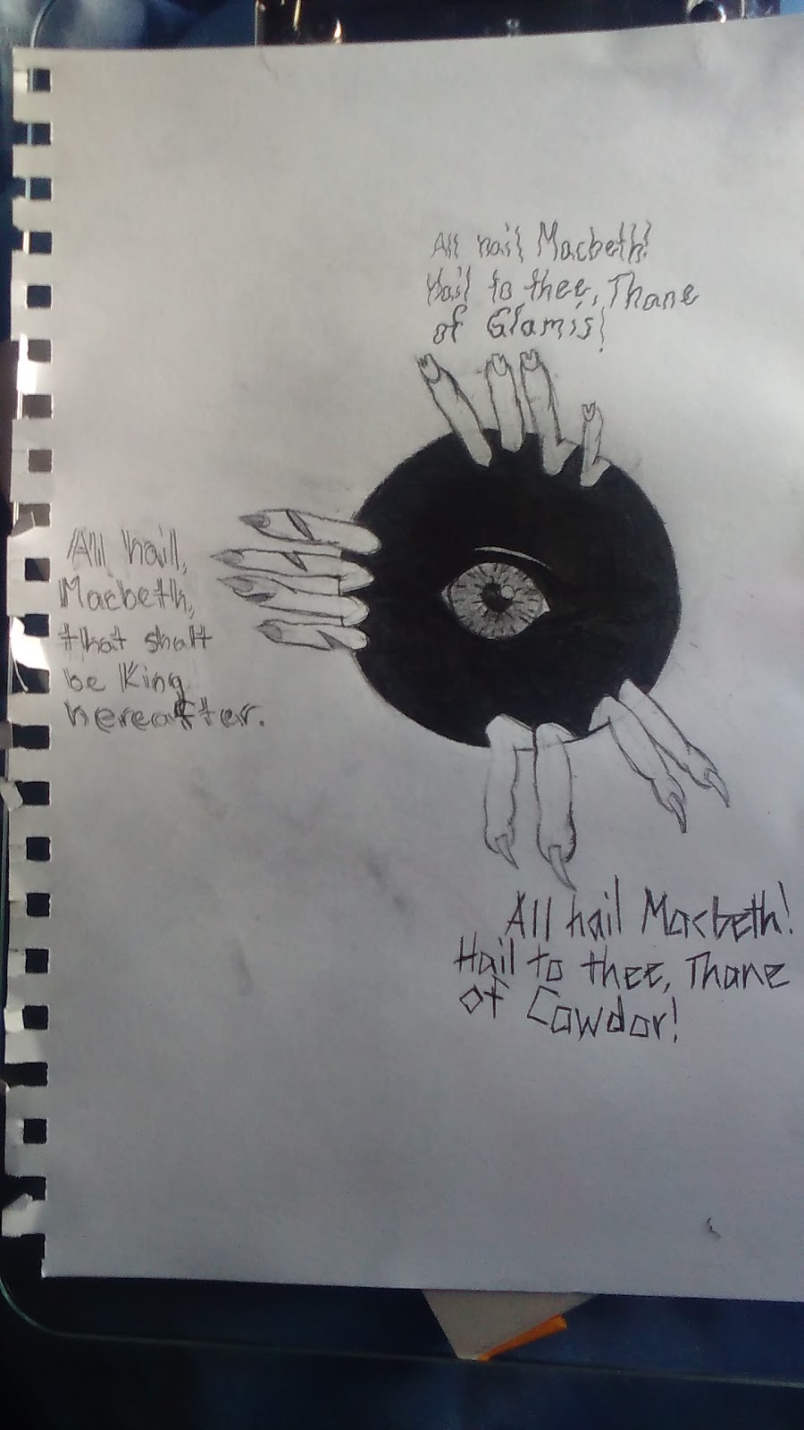
The third illustration was an image of an eye inside of a hole with three hands holding onto the edge. The hands are meant to be the witches’, since the witches were described as horribly ugly, the hands all have something weird and nasty about them. When the witches were first introduced to Macbeth, he was in awe (1.3.57), which is why the eye is so wide. The hole is supposed to represent the prophecies and how the were good at first, but after just a little bit it all went downhill for Macbeth and he was basically in a hole of lies and deceit. Near each of the hands are one of the first three prophecies Macbeth received, obviously because each witch gave him one prophecy.
Another illustration was one of a large smile. One half of the smile is straight pearly whites, while the other side has crooked daggers for teeth. On the evil side of the smile there is also a culmination of blood around the bottom edge, dripping with blood. To enforce the next door neighbor, friendly face esque vibe, I also added a tongue sticking. This is purely for humor and adds a bit of innocence. It’d look harmless with the straight white teeth straight across, but with the dagger half of the smile, it gives off a feeling of “I know something you don’t.” The scene is a representation of Malcolm’s line “There’s daggers in men’s smiles; the near in blood, the nearer bloody.” (2.3.138-139)
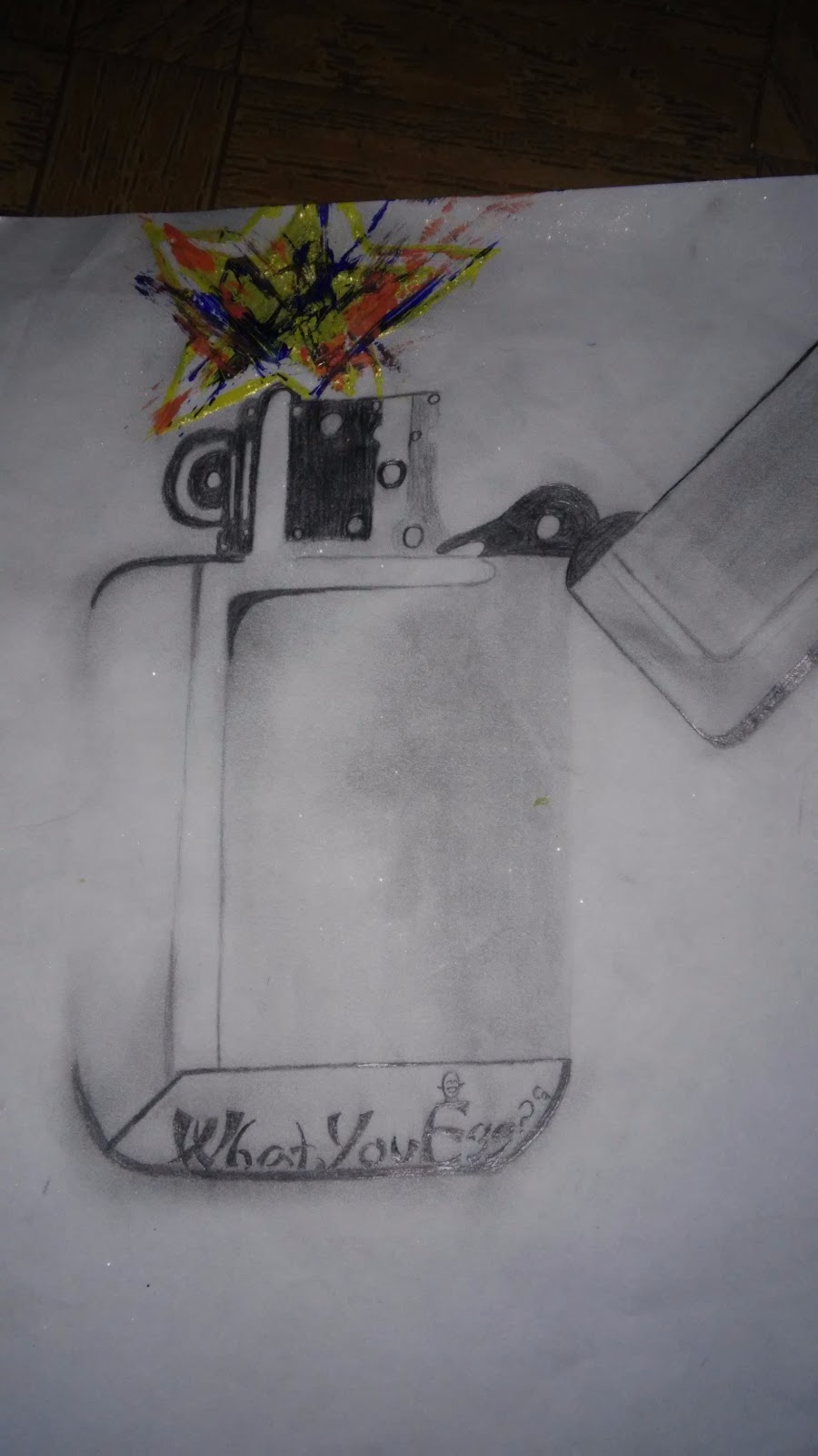
The second image is of a lighter, but with a star where the flame would be. This represents “Stars, hide your fires; let not light see my black and deep desires.” (1.4.50-51) I chose to illustrate it this way to make it literally look like the stars’ shine would be hidden by the lid of the lighter. To add even more emphasis, I utilized contrast by using yellow paint, orange paint, dark blue paint, and a tad bit of glitter to make the star a stark against the black and white theme. For a little humor, I had the name of the company that made the lighter be “What, you egg?” (4.2.83) This makes the lighter a bit jazzier compared to the bare grey-toned lighter.
The last picture is of a large flower that bleeds off the page. Underneath is a scaly serpent, and it’s head is not revealed. I did that for two reasons. One is because I thought it was unnecessary, and the second is because I thought there wouldn’t be enough space on the page to put all the detail I wanted to put, into it. The scene I depicted was “Look like th’ innocent flower, but be the serpent under’t.” (1.5.64-65) I wanted to draw this scene because the way I interpreted through art, spoke to me. I felt like this was the perfect way to portray this scene in the book.
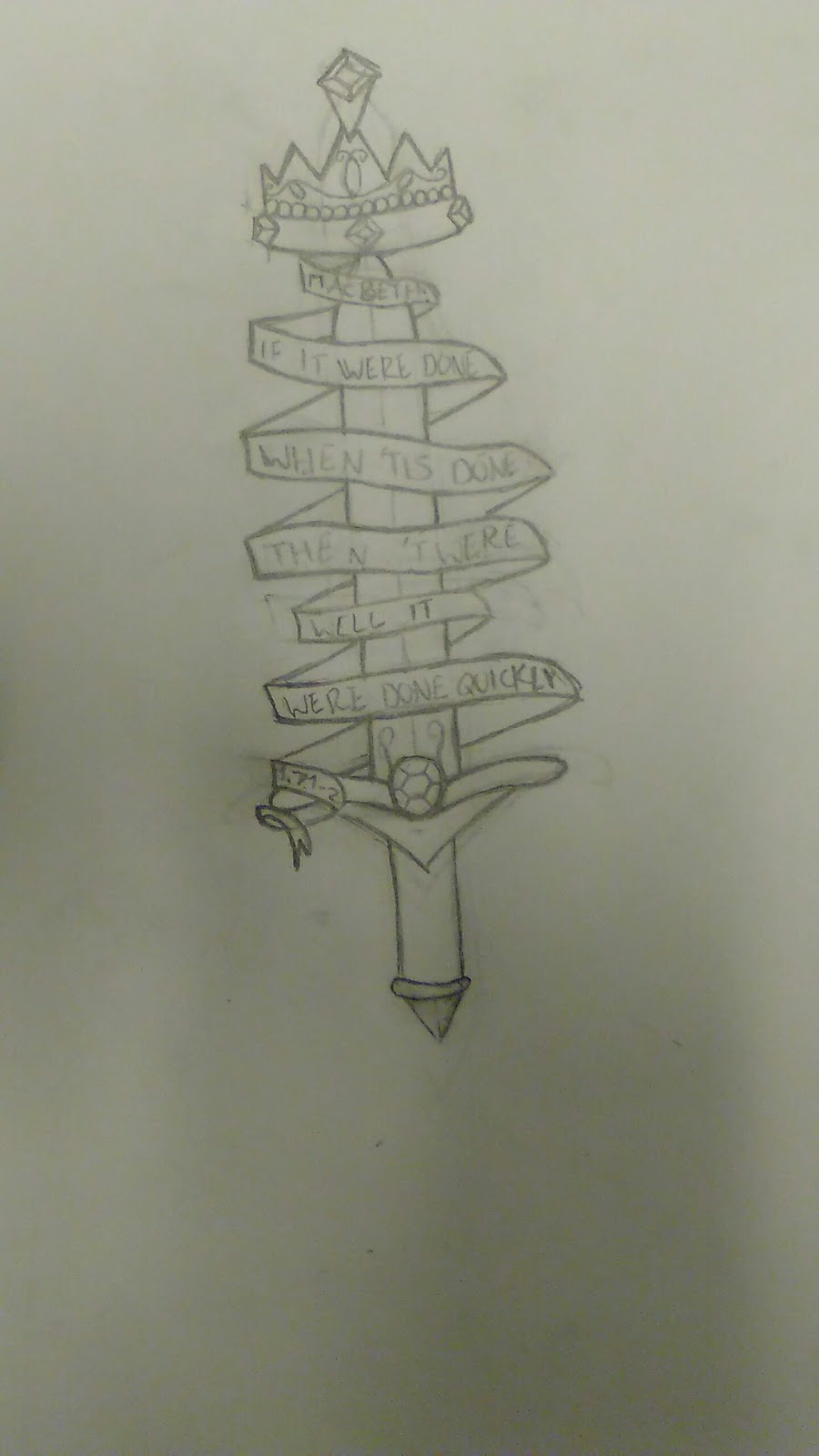
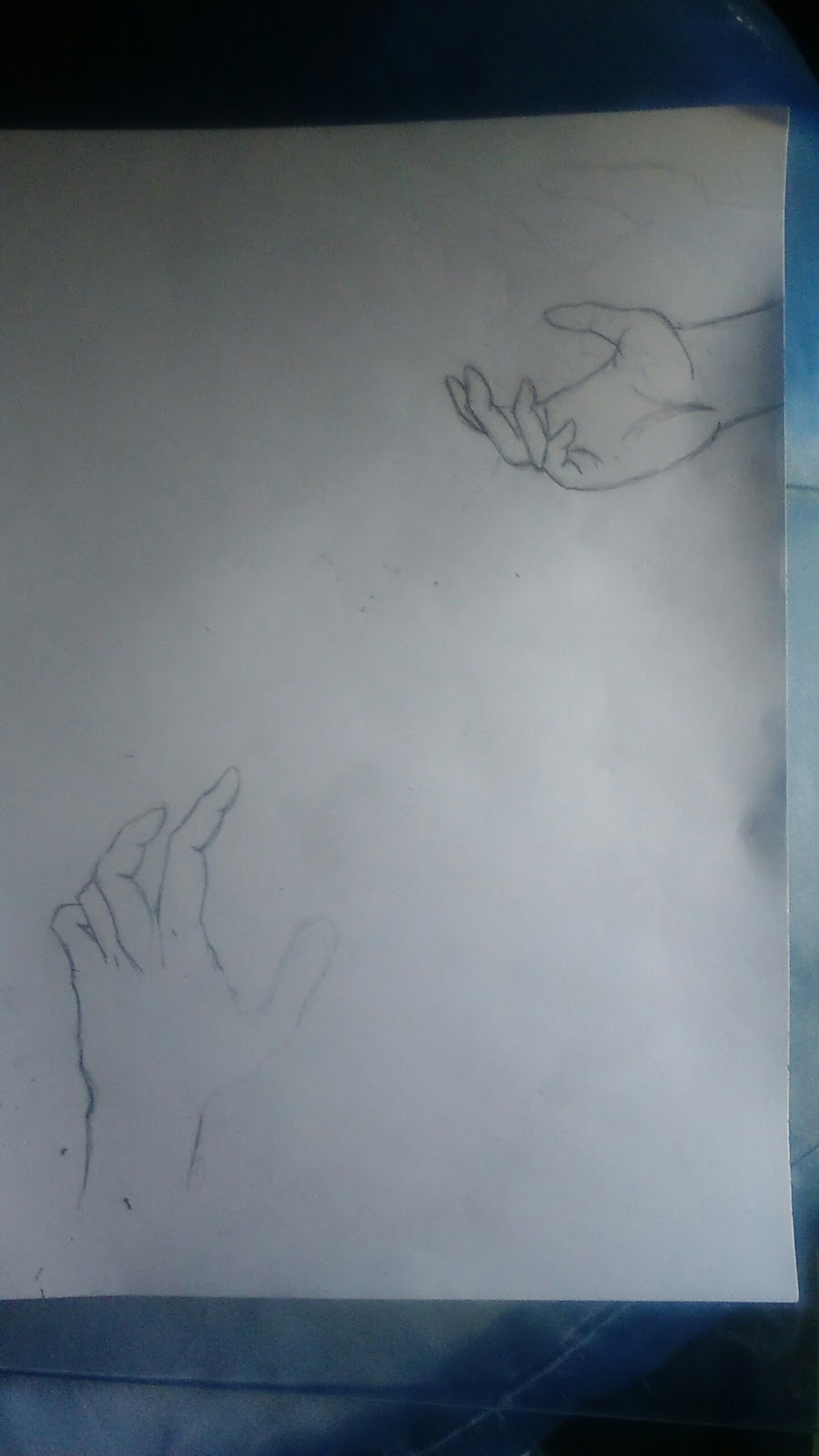
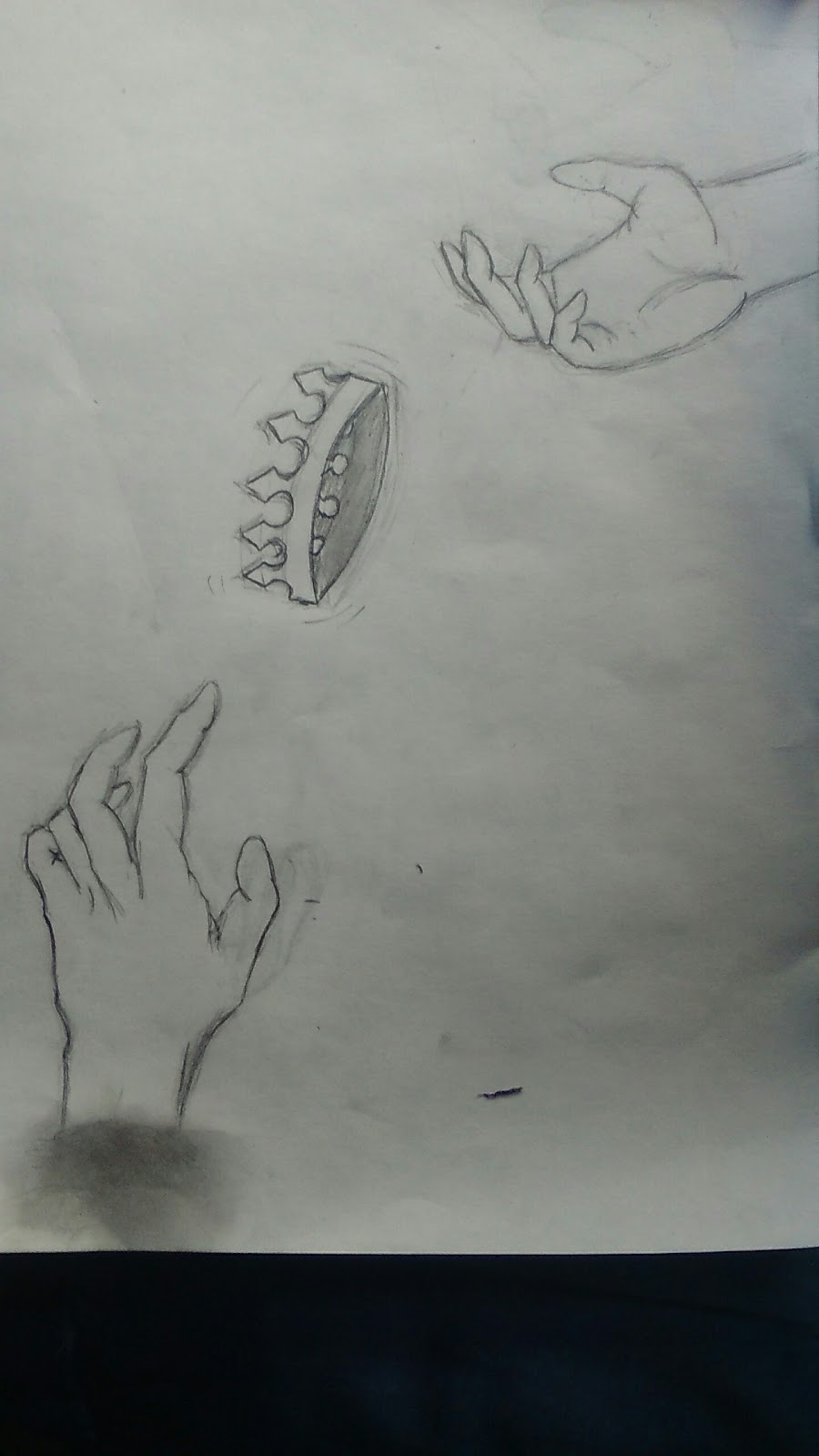
Our Process Pictures:


The Final Product: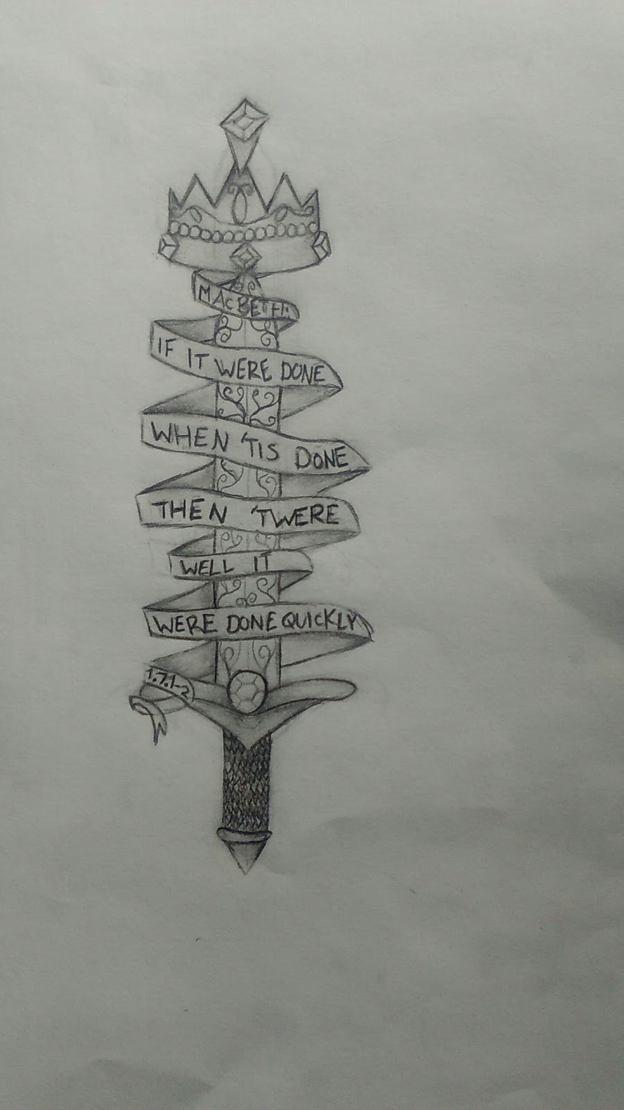


Comments (21)
Log in to post a comment.