Slide Presentation

Creating an interesting, but not overpowering slide is very difficult. When we first received this project I thought it would be very simple to create a dynamic slide about myself. Using what I learned in the two slide designing websites I attempted to create a simplistic slide about me. 

My first idea was to have a photo of me in the center of the slide and have words around it. However, when I read the Presentation Zen website I saw that slides are meant to be visual aids, not text aids. Meaning that instead of having a bunch of words, people should only have to look at your slide for a moment to understand it. The explanation should happen when you are talking. For this reason I put 3 pictures and three words underneath them that explain me in a much faster way.

On the website Slide Design I read about contrasting colors. My slide color is blue. So I thought for a contrasting color I should use red, but a red that was dark enough not to be distracting from what the words actually say. For my pictures I decided to let the two on the ends “bleed off the page”. In Presentation Zen, it says that letting your picture bleed creates the illusion that the picture is bigger than it is. This was especially helpful because I couldn’t make my pictures bigger because they kept getting blurry. 

Finally, I made my words at 80 and 68pt. font. I did this because in Slide Design  it says that bigger font catches attention and forces you to use less words. I tried to create a simple slide that explained one point about me. It wasn't an easy thing to accomplish, but I think I did the best job I could. This project has taught me a lot and will help in future presentations.


Tech Presentation
​Reflection
After listening to some of the critiques I decided to change a few things. I changed the pictures because my new pictures go better with my color scheme. I used red colors to contrast with the blue background. Then I framed the pictures and spread them apart to make the slide more interesting and more memorable. Then I made all the fonts bigger because that made them stand out more.
Tech Boom

Rafi Hares Slide Presentation

Abuhena Hares
12/4/12

Working hard is something that is an everyday part of life. Its a basic cycle that I follow everyday. It can be abbreviated with the initials SWAG. Struggle, work hard, achieve, good job. These are very simple rules that I follow. I was once known as a procrastinator but owned up to my responsibilities to become a better person.

Struggling is key in my life because it helps me learn. Whether its school work or working at home. I always jump straight into my work so I can evaluate it and try again in case that I fail. If I didn’t struggle in my work then I wouldn’t learn anything from my mistakes. Working hard is the basic essential of my life. Its putting basic effort into everything I do. Putting in this basic effort shows that I take pride in my work and attempt to make it attemptable. Achieving is the byproduct of my hard work. Its when I get praise for helping around the house or writing an analytic essay the praise helps me work harder in the future. The good job part is my self reflection. I get to take a step back and understand how I did on my work and what I can do in the future. This is an infinite cycle that will be repeated forever and beyond time itself.


Reflection:
While presenting I learned that I need to be more formal with my speech. I must not say like or yeah as much. For my slide I also learned I should have a matching color scheme and make sure that the font are the same. The most important thing I learned is that positioning is key in advertising and that the order of words and pictures can change the flow and mood of the advertisement. 
RAFFFFIII.001
RAFFFFIII.001
Rafi Tech Slide (PDF)

All About Me: Christian Moore

My slide shows a few things that I like. My favorite of different categories. This slide shows my favorite football player and basketball player. This shows that I like sports. It also shows the college that I want to go to. Since its all about me I found a picture with that bolded and put it in the center. The things that are all about me are all around it


The first thing that I added to the slide were pictures of football stuff, since this is my favorite sport. Cam Newton is my favorite player in the N.F.L so I put a picture of him doing his signature Touch Down celebration. On the opposite side diagonal to that is a picture of his cleats. Also on this slide there is a picture of a football hemet. 


In the future I want to go to the University of Oregon. So I put a picture of the Oregon logo. If I go to this college I would want to play football. This is why I have a picture of the Ducks mascot Puddles.

Its all about me

Adowa Mohamed: Media Fluency

My goal for this slide is to make it easy to understand and appealing to the eye. I made one of my pictures bleed and overlap to make it personal. I learned about these techniques from the Presentation Zen website. Another thing I added to my slide were facts and little details about my self. I believe this slide is interesting and will grasp the attention of the reader. 

I chose images that meant something to me personally. I also only chose three pictures and balanced them out diagonally across the slide.This made the slide more appealing to the eyes. I chose the Canadian Flag to because I love Canada and I also have a picture of the hunger games trilogy. The hunger games is one of my favorite trilogy. Then I have a picture of the three top colleges that I would love to attend. Also to end off my slide I added one of my favorite quotes by Malcolm X. The quote has a really good meaning to it and tell students and kids that the only way to succeed in life is to be educated.Also for my slide I left some negative space so it would not look confusing and cluttered.

  I am very pleased with the fact that I now know how to make a slide look interesting and will apply this to future assignments. These techniques are also used in advertisements. 

TECH
Edited Slide for Tech #1
Reflection:
For my new slide I focused more on one topic which is Canada and then I focused on one color. This slide is better then the previous one because the other one had to many pictures that had nothing to do with each other.  Then I also focused on the topic "Canada" and made the background of my slide the Canadian flag. This slide was nice and simple and to the point. I really feel confident that this slide is more appealing to the eyes of the reader. 

Slide Design by Bella Mezzaroba

“Always think big”, describes me perfectly. I don’t do anything small. I’m determined to succeed in everything I do and like to make things extravagant. I tried to make the slide design as appealing as possible.

I was very tempted to make this slide fancier and more detailed but less is more in this situation. The simple picture of the earth bleeds of the page giving the illusion of a larger image and the font emphasizes the importance of this slide. I used colors that flowed well together and kept the eyes of my audience focused. I also attempted to use the Rule of Thirds, and evenly distributed the words and pictures across the slide.
Screen Shot 2013-01-25 at 10.59.48 AM
From this project, I learned that visual design is an art. There are rules and regulations that you must follow for your design to be visually pleasing. I used the rule of thirds and page bleeding in my second slide.
Screen Shot 2013-01-25 at 10.59.57 AM

Kristina Scalia-Jackson - Media fluency

When I was assigned to create one slide to sum up who I am, or what represents me, I was stumped. I didn't know what I could possibly use to represent me without having a cluttered mess. I know I hate when a slide is bombarded with things. So trying to design a slide that captures everyones attention & can be quickly understood wasn't the easiest thing. 

  I made me slides with a deep blood red to represent the people I loved that I have lost. I put Victoria Secrets PINK on my slide with the caption ‘be comfortable, because I feel as if you shouldn’t have to change who you are and what you want to please other people. Adam Levine, who I love, bleeds off of the page a little to represent how much I adore him. I also have a music note half on his picture and the background. Every day I listen to music, its a big part of my life, so it needed to be expressed. Next to him I have the phrase "Love Life" with an Italian flag bleeding half off the page. It show's to that I love my life, and I love who I am. 

Lastly, in my lower right corner I have the lovely late Marilyn Monroe and with one of her many wise quotes. "The woman who is known only through a man is known wrong." I used this quote to help represent how I want to be. I don't want to be defined by a man, I want to be my own. Be myself, and independent woman.

A lot, well most of my decision making was effected on whet would represent my style the most. What would represent me the best. When I did my text size, I wanted something that could stand out and be read, while not taking the attention away from what I would be saying. Creating this slide made me realize how hard it is to keep someone attention, without boring them. 

Tech
Reflection:


Going into presentation day I thought my slide was good. That was up until I seen the criticism that my fellow classmates were getting on slides I thought were really good. But it could have been better. I have not had the chance to present and get criticism for myself, but taking into consideration of what others received, I made changes to my slide.  

Kristina Scalia-Jackson Slide

To be Lazy by: ameer forte

This slide is about how i look at my life and the way i like to do things. Im naturally a very lazy person so i included a picture of a couch potato and a saying that says, "Hard work pays off in the future Laziness pays off now". I really believe that saying is real because when i do something and really work hard on it it does pay off later on but being lazy and not doing something seems to pay off all the time. I made my name really big so that people can know the credit goes to me. I blended every color to make it easier on the eye.
Tech. slides Ameer
All about me- ameer forte
Reflection: I think my new slide is much better because i made my name bigger because its about me and i used less pictures to make it easier on the eyes.

Jackie Middleswarth - Media Fluency

12-4-12

Script:
I made the slide look the way it does which is a light blue because blue is my favorite color and it’s happy. I’m generally a happy person, so it reflects on me as a person. The text color is a darker blue so it compliments the lighter blue, and looks nice, although, I made the text, “Music,” red so it gets people’s attention. The red contrasts from the blue to make it pop. Music is very important in my life, and it’s one of my favorite hobbies. I listen to music everyday and it makes me feel better and more content with myself. The picture of me and my friends represents that I’m a goofy person most of the time and I love being surrounded by my friends and people I care about. It bleeds of the page so the text is easily read and the picture is clear to see. Also, the picture of the Nike soccer ball is present in the slide because Nike is my favorite sports brand, and soccer is my favorite sport. It also represents I like sports in general. The quotes, "All you need is love," basically describes how I see life. If you have love in your life, whether it being loving your family or friends, you'll be happy.

What influenced me to make my decision about my slide is putting what is most important to me and what I enjoy the most. I love spending my time playing sports, and hanging with friends. Listening to music daily is also important to me. As for the colors and text, I chose what was easy on the eyes, and what I would personally like if I were to see the slide.
In all, the way the slide is presented is what I thought the audience would like and what represented me.
this is me
I made the changed on my slide the way I did because the previous slide didn't really go together. The quote was small and was really too much on the eyes. It's color also didn't go with the pictures, same as the word, "Music." My slide now, I made MUSIC the focus and made sure it matched the same black as the picture. My current slide has one picture that way there isn't too much going on. My previous slide had two pictures and one of the pictures didn't go with the theme. I made sure this slide was memorable and didn't have too many words.
This is me

Media Fluency - Raz Reed

For my slide, I made sure each little portion of the visual would grab the viewer’s attention with big things. I made a picture of outer space as the background, so as to make it not only a big image, but an image of something big. I added an image of the earth in front of this background, bleeding off the edge to make it seem interesting. Its placement was important, because it helped to add depth and left lots of empty space. Finally, I added some text at the bottom of the screen to show what I had learned - “BIGGER IMAGES get your point across.” (In fact, that capital letter text was probably what you saw before you read this.) The first part of the text was bigger so as to easily communicate the subject to the reader.

Reflection: I realized the colorful background detracted from the earth, which was supposed to be the focus of the picture. I changed that by adding a different picture of space as the background, one much clearer and allowing for the earth to be noticed more. I also made the text just a bit bigger.
BIGGER_IMAGES

Gina Sorgentoni All about me!

I was never taught how to make an effect powerpoint presentation at my old school. I was told to simply bulletpoint the information you need to say, add a few pictures. Bam! I was done and when I would need to present my presentation I would read right of the slide. In this class I was taught that less is more. That blew my mind thinking about how cluttered all my past presentations were so I decided to take steps to fix that.


I chose the quote “What about second breakfast?” because I think I shows many things about me. It shows I like movies and books, it also shows that I like food. I also love what the Lord of the Rings are all about, throughout the movies you see such a strong friendship between all the members of the Fellowship. For my photo I chose the character who said this quote because I believe that by the end of Return of the King he had grown into one of the bravest characters. I feel that I could be represented by Pippin because he didn’t really take things seriously, and just went along on the journey just for laughs. But by the end of the trilogy he grows into a responsible and brave person. Something I aspire to be. I tried to make my slide simple and used simply as a visual reference. I tried to make my quote stand out by using a light color against a dark background. I also bled the picture of Pippin so things would look more natural and flow a little better. By doing this my presentation is less cluttered and my slide is now visually pleasing. I also attempted to use Rule of Thirds. I tried to keep the photo in one third and the quote in another third so that I would have an empty third between the two.


By creating this slide I took the first step to making future presentations more visual. I have learned that simplicity is key and that when in doubt make the font bigger. I believe that all of my future Powerpoint presentations will not only look alot nicer but make my talk better.


Reflection:

My old slide had a lot of negative space with small text and a low res picture. With my new slide I found a picture with a higher resolution and made the quote bigger. I tried to make the quote stand out from the background while still going with the color scheme. Throughout this process I have learned how to make a proper slide for a presentation. I have also learned about how to balance negative space and I can now navigate Keynote with ease. 


-Gina Sorgentoni
Slide3
Slide fixed 2

Jonas' Slide

 In tech class we were asked to create a slide about ourselves and present it. We learned how to create a really good slide because slides. I usually create slides that are way to cluttered and take attention off me as the speaker. I chose the images on the slide because they are things I really like, the image on the left is art from a card game called Magic the gathering and the image on the right hand side is of a yamaha 12 string guitar which I have and really enjoy playing. In this project I learned how to make my power points better.
Tech Slide
​I changed my slide to have a color scheme and I put my name on it. I made these changes so my slide would look more visually appealing, and so it would make more sense.
Jonas' Slide

All about me

Script:

My slide describes me to a “T”. I know that if someone were to look at this slide ,you would see Joie. I am in love with the color pink. I honestly believe that my slide describes me.
I used two websites to reference why I made the decisions. I spent a lot of time figuring out what belongs on a slide and what does not belong. I did not use a lot of empty space. All my blank spaces were filled with color, my favorite color. My slide was straight to the point. My slide had a purpose, it explained me.
The smiley shows how cheerful I am and how I like to brighten up everyones day. All of my other pictures are of me. These picture show how much I love my friends and how important my birthday is to me. The last picture is of my favorite store and brand.

slide
Reflection:

I learned that when you make a media fluency slide that you can not have a lot of fonts. Your fonts , colors and picture should share the same color scheme.

Improved Slide

Hikma Salhe : Media Fluency

   I tried to make this slide incredibly easy and clear to understand. This way, people would not become confused as to what the message is. Making one slide to describe myself with least amount of words possible is very difficult. At first I made it like a professional and alot of words, but i realized that it would be too much.
   When i saw the link to Presentation Zen, I realized that I was doing it wrong. I needed to do techniques to make it simple yet effective.For my slide I chose many techniques to make my slide personal. One thing I did was to "bleed" the image. I found out about this technique from the website about Presentation Zen.


REFLECTION:

From the criticism I heard of my peers slides, I realized that I shouldn't overwhelm the people who are looking at it and the slide its self. I now know that I shouldn't add too many words and pictures. I have to  make my slide simple yet effective. If there are too many things at once, the focus of the slide will be lost. I did not make much changes and instead kept it very similar to my old slide. 
TECH

Media Fluency

​Introduction:
In technology class we learned how to make poster, slides or any other form of media look better. This is called media fluency. Some of these techniques include; bleeding images of the side to make the slide look bigger, pushing the letters closer together... and so on.

Script:

My name is Angelo. I am a very free-sprited person. Music is one of the only things that helps me to focus and calm myself down. You will almost always see me with my headphones on. The picture of the music note with wings that i put on my slide represents me listening to music and being free to do what I want. The afro picture i found a little funny but i used it because i was born with this hair so I might as well make the most out of it.

My Slide
​----------------------------------------------------------------------------------------------------------------------------

I edited this slide so that the font is fancier making it more eye-appealing. I used a white background with a border to really bring out the black and gold colors of the variables. I put in a different afro clip art because I felt like the first one was to weird, and I made the letters closer together because due to the big font there was lots of space between the letters. Overall I learned that slide design matters and knowing how to do it is only the beginning. :-)
Improved Slide

Heaven Mendez- Media Fluency

When most people think of themselves, they try to picture things that they like, personal interests, musical tastes, favorite colors, things of that sort.  However, do they ever think of things that can describe them as a whole? After receiving an assignment in tech class and playing around a bit, on keynote, I've came up with this slide, describing not only myself, currently, but also my experiences at SLA. This assignment called for a slide made with inspiration from a few websites, that depicted something about the student. Basically, some personal aspect of that student. Although this is pretty small, this is something that can describe me as a whole!
The design, although simple, took a large amount of thought placed into it. For example, the slide is a mixture of different blues. Originally, I wanted the slide to have a multitude of different bright colors, but people would only be transfixed on the color, and not on the words, or meaning, from the text placed at the bottom. I wanted to find something, not only simple, but fitting for the message written at the bottom. How fitting is adorable rows of different stars, under a positive message? It only makes sense! The color isn't very eye catching, however, it is very bright, allowing others to look long enough to admire the design, as well as the statement below, which is what everyone hopes for, when creating anything for public viewing. 
The text, was also a big decision in the process. I couldn't decide whether to use a humorous phrase, or a logistical phrase. Then, it hit me. Because the slide was about me, why not use something that one, people can relate to, and two, something that I've learned, as a ninth grader? After much thought, I produced the sentence, "Everyone's a star, you just got to let your light shine,' in reference to the many positive pieces of advice given to me throughout my first few months in high school. I know the phrase may be overused, and said probably a million times, but it's important for people to remember. Everyone has that one thing that sets them apart from everyone else, therefore, making them unique. The only thing is, they shouldn't be afraid to let that, 'light,' shine, and stand out of the crowd. Taking both the ideas of empty space, simplicity, and a positive message, this is how I came up with the slide, describing me! 
It's been only a few months here, but I'm learning a lot about myself. The lessons taken from SLA, and even tech class will stay with me for a long time, even after I graduate from SLA! Anyone can do anything, as long as they have confidence in themselves, that's certain.


Tech_Project1
-Reflection-

I made a slight change to the original slide. The text was off toward the side in the first one, which didn't allow the slide to be as, quote on quote, 'good,' as it should've been. I also played around with how the background image was, in order to have the entire image shown, and have less pieces of it cut off. 
Tech_Project2

Kevin Le

Hi, guys my name is Kevin Le. I made it like this because these pictures describe what I like and love to do. People and billboards influenced in making me presentation because "Presentations are a 'glance media' and should let the reader have a glance and be able to catch the idea of what you saying easily.

Reflection: 
I learned to make the slide appealing and make sure the pictures are not pixelated. I also learned to make the slide not have not to much info but just enough. Also to make the font big enough so people can read it.
Kevin Le
Kevin

Media Fluency


In technology class, we had to make a slide all about us using the links given about how to design a good looking slide. The slide was supposed to show that we understood what the links were saying. 
For my “All About Me Slide,” I wanted to make a slide that looked plain, yet eye-catching. On the slide design link, it says to use large font sizes and colors with a lot of contrast. Thats why I went with a white background and a bright blue heading. Also, Zach Holman says his slides aren’t made to be looked at by people who didn’t see his talk in person. To anyone who just looks at my slide, they see my name and pictures. Thats how I wanted it to be, so that people had to listen to what I have to say in order to understand what I wrote. From the Presentation Zen link, I learned to make my slide visual. That means to make it noticeable, understandable, and rememberable. The link also says that slides are visual aids, not “text aids.” That is exactly why I made my slide with pictures and no full sentences.

Improved:

From the presentations last week, I learned to keep things extremely simple and spaced out. My slide was already simple, so I had to change the spacing of the letters in my name. I made it so that they aren't so close together, so now there isn't as much of an empty space. 

yes slide yes
slide.improved.final

Media Fluency

Tech
I wrote an incredibly simple slide about the oh so wonderful me.

​For my slide about myself I chose to use to variety of things to make mine personal. Bleeding was used for all pictures and the title for a sense of mystery, also to catch the viewers attention. Few words are written to keep the readers attention and not draw their attention away from the speaker/presenter. 

Here are the sources I used to help me on this assignment.
Presentation Zen Link

Slide Design Link


Reflection.
 I learned that you can't overpower the slide with too many words and a lot of pictures. Also that you have to keep it simple and coordinate colors in the slide with everything else.
Slide

Alex's Slide

TechSlide
How I created the slide.

I decided on a contrast theme. I happened to like Keynote’s blueprint theme and changed the text to green. I used the Project, Name, and Date forms creatively as a description of myself. I decided the pictures should do the rest for me and added a terminal (my second home) and a picture of Dr Who’s Tardis to make my slide look like a computer screen. For a finishing touch I added one of my favorite quotes. My slide isn't very minimal but it communicates me very well and is neat, clean, and eye-catching.


My new Slide
TechSlide
​I decided to get rid of unnecessary additions and just keep a terminal as the whole image. I also added shadowed text that blended in with the terminal

Nebil's Slide

My name is Nebil Ibrahim and this picture represents me because I don't like to play it safe all the time and I like to take a chance. It is important for people so they can become more individualistic and learn to be unique. I chose this picture because it has high contrast, it doesn't take up too much of the slide, and because it follows the rule of thirds.

Nebil Ibrahim Technology 2 edit
After watching people go up and change their size I learned that I should add a shadow to words. Also I learned that making my font bigger and contrast is very important. So I changed my font by 4 sizes bigger and I added a shadow.
Nebil Ibrahim Technology 2 edit

Bella's Slide

I created a slide about myself. i used websites to learn about how to make a good slide. On the first web site they taught us to make the words big and bold. They also said to bleed the image. I also contrasted colors to make my slide look interesting.This is the finished product.

Sources:
http://zachholman.com/posts/slide-design-for-developers/
http://www.presentationzen.com/presentationzen/2008/08/learning-from-the-design-around-you-ikea.html

food
food

Our Duty As People: The Fight Against Brain Cancer

As a citizen of the world, it is imperative for us to recognize the struggles of others and  take actions to improve their current situations. A struggle that affects the lives of millions globally is cancer, but more specifically, brain cancer. Brain cancer starts out as a tumor in the brain, and it becomes larger and larger as it spreads throughout it. No cure has yet been found for this type of cancer, but doctors still are able to treat it through radiation. Though, it does not always permanently suppress the disease; it can grow back.

Brain tumors are created by abnormal division of cells, in the brain itself. They can also grow outside of the brain: on the skull, in blood vessels, and can also spread into other organs. Brain tumors are life threatening because there is little room for the tumor to grow, which forces it to push the brain to one side due to limited space. Hirnmetastase_MRT-T1_KM

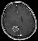
The skull is around the brain so unlike other tumors, you cannot act on the tumor until it is formed. That then causes unexplained symptoms. Brain tumors are about the trickiest to work on because it is risky to operate on the brain, especially after the patient is weak from prior surgery.

My best friend's fat

her has brain cancer, and cancer in his stomach. Everyday after school in November, I went to Lankenau Hospital to support my friend and her father. On November 30 of this year, he was released from the hospital. The cancer had finally spread to the entirety of his stomach and brain; there was nothing else that the doctors could for him except try to comfort him, and give him pain pills. He was far too weak for surgery; it would’ve been very risky to perform it on him at that stage in.


Being there, I learned much more about brain cancer, and just cancer in general. It then became clear to me that it is very important to raise awareness on this disease because it could affect us at any given time in our lives. This is why I chose brain cancer as my topic- I hope to inform people because it is a disease that can heavily impact our lives. I have personally witnessed someone I that I care about forget his own name, due to cancer. I am personally affected by it because I’ve seen its effects as recently as yesterday.

I plan to raise awareness thro

ugh trendy things such as t-shirts and buttons (pins)-things that teens could catch on to. That sort of advertisement, in my opinion, would be the most effective way to raise awareness to that one specific audience. Though to target a larger demographic, I would have to incorporate interests that mi

ght appeal to that group. However, there isn’t much anyone can do to stop cancer in general, until a cure is found. But what matters is showing just the extent to which cancer can affect the lives of the patient as well as his or her family. Being caring and supportive people is what matters. 


Brain tumors are one of every one out of one hundred cancers diagnosed in just the United States every year. These being the most deadly tumors because there is no room for it to go inside of your skull. Which in turn causes the cancer to spread which is the most fatal part to having this kind of cancer. The person in which I had initially done this blog on has since passed it is going on almost a month now since the passing of my friend’s dad. It was most painful to watch someone die so slow over the course of a year. It was probably even more painful for him knowing that he was also going away and he watched his family and friends try to do anything to save him. In fact there was nothing anyone could do at all. The chances of him even surviving this illness were slim to none already. 


Most of what I am writing is based off of opinion since I witnessed first hand what it was like to see someone going through such a painful illness. The entire time he expressed that he just wanted to live which was horrible to hear because he was in fact begging for something that no one could aside from make him comfortable and wait around until that one day where everything shuts down because your body is so sick of fighting. I recall him asking for constant pain medication and something to make this headache go away. Later, the cancer had officially spread through his entire body which made everyone give up hope.  I was unaware at exactly how fatal this form of cancer was and why once it had spread they let him come home. I was numb to the fact that this deadly strain of cancer which most people do not survive was killing him and once someone is gone you can not get them back.


I tend to take a more opinionated stance on this subject because it directly affected me. I look at the facts and understand them but at the same time I feel like for all cancer it is really a matter of luck whether you survive or not because it is so rough on the body it really takes a toll on the whatever organs it decides to spread to next leaving the body weak; so weak that you cannot even perform surgery on it to directly go after where the cancer is. The entire idea of cancer is tricky, especially brain cancer. This is scary because he was perfectly healthy the cancer essentially came out of no where. One out of twelve people in my survey knew/know someone who has had cancer.


Types of cancer brought up in the survey were brain, breast, and lung; along with other cancers which were listed under “other”. 80% of people who did know someone with a form of cancer did not not survive. Eight out of twelve people said they would be open to donating money to cures for cancer of all sorts. Eight out of twelve people have also never donated to cures for cancer, but would be open to doing it. Finally one out of twelve people said that cancer has had an impact on their life.


Here is the link to my b

ibliography.


More Like Drop In, Than Drop Out (YATW)

2010 GED Graduation - 11 participants

Hello my name is Marcus Cruz and seeing and growing up in a world of such young, uneducated people who have achieved no goal neither have plans to complete any others. I have decided to shine some light on the idea of preventing dropping out of school. I think this is sad thought, and a waste of precious potential. In 2008 there was 80 percent of students graduated. That 20 percent didn’t, what happened to them? This shouldn’t be ignored.We right now as young adults have to know what is out there if we take the wrong path and choose to drop out, well at least know the consequences. Thousands of people all across the United States drop out. This is sad for being one of the most powerful countries in the world, here is something to think about. If the youth are next in line to lead this country, who will be leading it if so many student are dropping out?

I talked to someone that has dropped out around tenth grade. (He asked for his name not to be stated) He told me living life now with a tenth grade education isn’t getting him anywhere. He said“...I’m stuck man, these kids don’t even understand what they have in school with all that technology and s***t, you know. I can only imagine how easy right now I’d be if I had just stayed in school...” This man isn’t just the only one, there are many others who could tell you the same thing.
Resources say that students who drop out usually become criminals. An article from the Las Vegas Sun, The report states that high school dropouts are 3 1/2 times more likely than high school graduates to be arrested and eight times as likely to be in jail or prison.” As student you should imagine yourself down this path, being locked up, is this what you want for yourself? Being put as a standard, and just a statistic, even at that I’d rather be that among the 80% that graduated then the 20% that did not.
However, together starting with one could turn into a hundred and hopefully even more than that, to make a change in peoples lives that will not only help them now, but help them prosper in the future. I have planned to go to different programs, such as NorthStar, El Centro Del Estudiantes, big brother and sister foundations, counseling to help prevent our youth from ruining their lives.
Not only will I be helping out to prevent students from dropping out I also help other who have dropped obtain their GED, even helping them go back to High School. Maybe, as we know some are not ready to take the step and head back to school. I will be going to different programs and speak to these people to possibly change their lives.
Everyone wants that moment where they have achieved their goal, finishing school, having everyone be proud of them. This would be amazing.
imagesClick this link for myAnnotated Bib.

Click here for my blog post 2.

5665731482_0c42714758

No Me Importa?!

Lulu: Pedro, Pedro. Tengo que contar una historia. Cuando estaba en el Museo de arte, vi algo. Probablemente esté pensando lo "que el infierno?" Pero está bien. Yo pensaría así también. Pues, he visto besando a su primo. 

*Él no tiene una reacción*

Pedro: Y?

Lulu: ¿Y? ¿Por qué no tiene una reacción?

Pedro: Porque no me importa.

Lulu: No le importa?! ¿En serio? Sería como esperate! Yo actuaría como una mujer loca. Si yo estuviera en su lugar, yo me preocuparía. Yo no le dejaría ir por fácilmente. 

going-crazy
going-crazy

Acceptable use policy:

created by: Jade, Alex, Shaion, and Kevin

Technology class :Terms of acceptable usage

1. The three major differences of SLA, SDP, TFI are.....

SLA: The only real restrictions are for social media, media sharing, and pornography.

SDP: Everything that has media sharing, social networking, pornography, file sharing, bit torrenting, spam/hacking sites, and entertainment.

TFI: You cannot go onto shopping site, pornography sites, social networking, file/media sharing, spam/hacking, entertainment, and job searching sites.              


2. The most unfair rule out of all of them (applying to SDP and TFI) are the rules against using a bittorrent, because you can use that type of torrent, to download important information, and programs.


3. A change that could be made to the AUP are as follows:

 - Making is so that certain types of file sharing is enabled so that files, and media are transferable from student to student.

- Another thing that could be changed is the uses of social media. Not all social media but stuff like instagram and tumblr that could help with publishing peoples artwork.

- Also with games that need to be installed via internet,because they can cause viruses that can damage your computer and the software.

4.  Now imagine you have children write an AUP for you homework with your group. Our AUP would block simple things that children should not be on like pornography and illegal downloading  sites that could result in trouble with the government.

Children’s AUP:

No downloading ANYTHING without the password to the computer (which only le parents have)
No a Watching anything pornographic, or sexually inapropriate.
Check with le parents BEFORE making accounts on social media websites.
No bit-torrentin