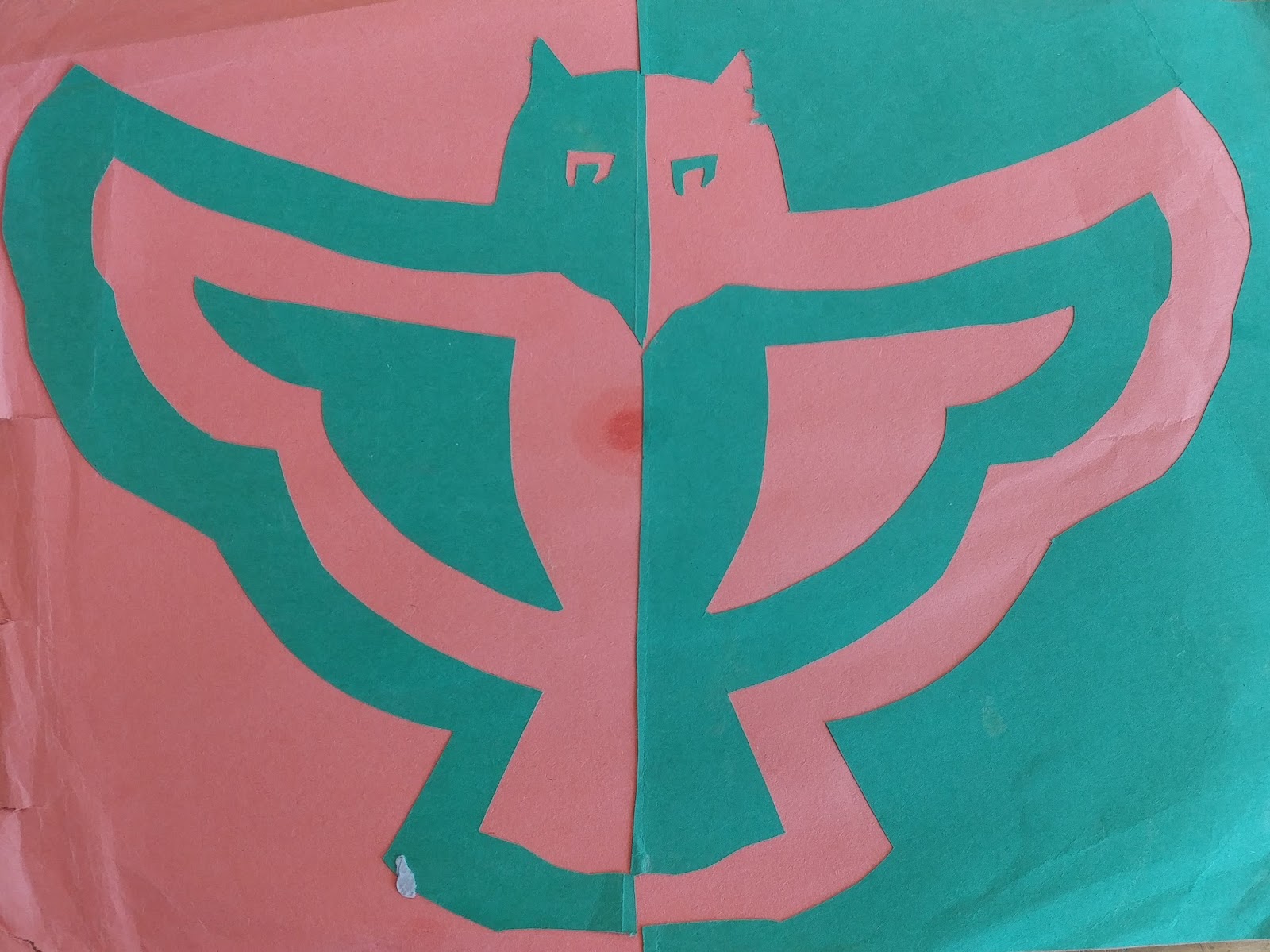
Final Stamp Editor

Goofy. The word I picked to describe me and as my stamp is goofy. The reason I picked this word is because it is an unique word that can be illustrated in many different ways. The image and drawing I chose for the word goofy was a jester hat. The reason I put a jester hat and the word goofy together is because during medieval times, jesters were the clowns of the village. They would make fun of themselves and wear silly clothes with random colors to make the village and especially the king laugh. The whole reason for the jester is to please the king. Make him happy and laugh. I honestly enjoy making everyone laugh. It's an great sight seeing people laugh because it makes you feel like they're happy now because of you. The reason I chose to do the hat of an jester instead of an outfit or his scepter is because the hat has an easy design and shape. The scepter is an very thin staff that would take to much to look at or enlarge. The outfit is too much and would look like a normal outfit with the negative and positive areas. It just wouldn't look right. I think that me choosing to do the jester hat isn't really original but it is very unique and creative. 

Final Stamp Design

Rubber Stamp
Rubber Stamp
Out of my 10 words to gather ideas for my stamp I chose the words, Gamer, Enthusiastic, and Pal. I incorporated these words through image and text to create a design for a stamp that I'm very pleased with. The words state Pal, cause I figured this was the best way to incorporate it into my drawing. Also I added a thumbs up to show I'm enthusiastic and encouraging. The letters on my finger tips, the battery slot, and the analog stick. Each represents my interest in gaming. 

The design I was happy from the start with, however I went through many frustrating design choices with the circle, the words, and the positive/negative space. The one thing I was sure about from the start was the circle with "SAL-PAL APPROVED" going around each design. Overall my designs varied between a thumbs up, a smiley face, and a few iterations of a tv screen. In the end I decided to do the thumb because it was the most pleasing, and seemed more challenging and detailed than the other designs. However, negative and positive space soon became an issue. I at one point removed the letters because it wouldn't work with the negative space. Eventually I decided it was worth the risk and decided to see how the final outcome turned out. 

I learned that especially with words, its very hard to do negative and positive space and portray them, as well as the detail on the hands and fingers. One issue I had was making the mistake of rushing through mistaking the wrong date and misreading the instructions. This made my first final more like a rough which helped me make some crucial design choices, and allowed a neater and nicer finish. It helped me make a important decision with negative and positive spacing on the design. Having lines become positive space, and the rest would become negative with few exceptions. This allows me to show and incorporate more detail into the hand, the words, and the overall image of the stamp.

Final Stamp Design

FullSizeRender (10)
FullSizeRender (10)

When we started this project I had to choose between three words and immediately the first three words that came to mind were impatient, overachieving and leader. Out of those three words I choose the word impatient as the word to symbolize me the most. If you were to ask someone to describe me, one of the first things they would say is that I am a impatient person and that is not necessarily a good thing, but it is what makes me. As I was starting to design the actual symbol I was searched up the word impatient and images of clocks kept showing up so I decided to use an image of a clock to symbolize me. For me the clock symbolized time passing which to me means something that has to go by fast. I sketched out the design and then passed it on to construction paper.

The positive and negative space in my design was used as a way to contrast and symbolize how I want the time to go by fast , the negative space was white, and it won’t because time is time, the positive space. It also helped to pop out the colors and form the figure of the clock. In My opinion having both positive and negative space is really important to make a image pop. Whether that negative space forms odd shapes or forms that shape the conveys a message the contrast should be there. Positive space is just as important it helps the colors contrast against the negative space. It is a tool that is very useful.


Final Stamp Design

IMG_1238.JPG


In this process I struggled. I had a hard time understanding what to cut and what to glue. In the end product I guess I can say I finish better than I thought I would. This stamp represents me because I would describe myself as a skinny, imperfect, and delicate person. When brainstorming I used words such as; unique, imperfect, pretty, intelligent, etc.

Throughout this assignment I learned what the background and steps of the stamp. At first we practice with cutting out a design already made. I did it wrong at first so I had to do it again, until I finally finished successfully. I finally understood that the negative and positive space we had in each picture. We made our very own designs.We learned they couldn’t just have lines, everything had to be shapes. I figured finally how to cut out my imperfect flower and it turned out pretty good.  

Final Stamp Design


Hello! My name is Asnain Khan and I did this project for my Art class. For this project, we had to brainstorm 10 words that represent us, pick three words and make them into a visual representation of us. Then, we sketched out our stamp and created a 7x7” rubber stamp in our sketchbooks the with correct negative and positive space. After that, we took our final rubber stamp design and cut it out of a single piece of construction paper. Which we then took the positive space of the rubber stamp design cut out and glued it into our sketchbooks.

When I was brainstorming, I used words such as, thoughtful, honest, hard worker, reliable, responsible, talented, successful, supportive, supportive, passionate, and open-minded. I chose the word honest. My stamp is a logo that represents honesty. This logo represents how honest I am. As you can see, this logo is in positive space. Positive space refers to the main focus of a picture. Negative space refers to the background of the picture. To end up with positive space, I cut out the negative space. Everything that is black is the positive space of my picture.

When I was sketching my design, I had a couple of problems. First, I didn’t know what to draw that represent honesty. Then, I thought about doing this. I had a problem figuring out how I can get positive space. But I figured out how after a while. This is how I got my logo.

I learned a lot about positive and negative space. I learned that positive and negative space play an important role in determining the overall composition in a work of art. I also learned that, positive space is best described as the areas in a work of art that are the subjects, or areas of interest and negative space is area around the subjects, or areas of interest. I enjoyed creating both positive and negative space.


My Stamp

In this stamp, I made a personal logo of a coffee cup, cutting out the negative space to outline the positive space. First, let me explain what positive and negative space are. Positive space is any space in a picture where there is something, it's your subject. Negative space is the opposite, the space where there is nothing. It outlines the positive space, the way it forms my coffee cup. 

This project was done over the course of a few days. The first day, I was told to come up with a list of words to describe me, then to research and brainstorm image ideas for this stamp. This stamp represents me as a coffee-lover. I think that coffee seems to represent me, because some people like me and others don't, but the ones who like me appreciate me a lot. It also represents me as a barista, a job that I love. 

After brainstorming, I sketched my design. My first idea was too small at first, so I had to blow it up a bit. That's how I came up with this idea. I made my coffee cup bigger and added some steam coming off of it. Then, I cut out the negative space of my design on construction paper using an exacto knife. Finally, I glued my negative space onto a piece of pink construction paper and glued the whole thing into my sketchbook.

Final Stamp Design

FullSizeRender (6)
FullSizeRender (6)
In my art project I thought it would be best to use the three main parts. I started out with a list of 10 things that I thought described me the best. I was not sure which ones I wanted to keep and get rid of, so I asked some of my friends to help me out. In the end I finished with three main components of my life. My Irish heritage, running/athletics, and of course, gaming. My first design looked nothing of what I had intended it to be. I had to redo my project I believe three times before I finally got what I was looking for. The reason for so many redos was that my positive and negative spaces where not clear. I started out with a basketball hoop instead of a gaming controller, but the positive space would not have shown. But on my final design everything was clear and good looking. You can clearly see the difference in the picture above, in my original draft that was not the case. This was very important because without the difference in spaces the picture doesn't look as good as it could. So I feel that my project is really the best project I could put together.

Just for all you people out there like me who can't tell the difference between positive and negative space, this paragraph is for you. When you think about what negative space, in my mind I at least I think of outer space. It is the same concept with negative space. When the area around objects is a different color than the base, then that is negative space. Positive space is when the objects are a different color than the background. So positive space is the showing of the objects. So if you're confused like me, hopefully this helped you.

Final Stamp Design -- Zivia

Doe
Doe

At the beginning of this project, we were asked to brainstorm some words the describe ourselves and then choose three main ones to focus on. The three words I chose were creative, Integrity (integrous), and loving. While these are not the only words I would use to describe myself, they are some of the more powerful words. We then had to turn these words into images in our heads and then into a sketch. For this, I drew a lot of inspiration from my name, which means doe (a female deer) in Hebrew. Does stay with their young for about 200 day, which is around 28 ½ weeks. While this may seem short to us, this is a lot longer than most in the animal kingdom. This animal fulfilled my hopes for the word loving.

For the word integrous, I chose to add a wing to my deer. Integrity is about having a strong moral backbone to be able to rise above selfishness and immaturity. Birds, despite having thin, hollow bones, are able to catch wind currents and fly above our capitalist and fraught society and see the beautiful whole. While I am not free of these strains, I do feel that integrity is one of my core values and the wing carries my hopes for truth and justice forward.

As for the word creativity, drawing and writing are my strongest passions and those both start with a pencil. WIth a pencil you can create worlds and character, images and music. A whole new dimension opens when one picks up a pencil. When one can tap into this dimension for a time, I feel they are truly creative.

However, the main images and their positive space (main focus) are one of two aspects of my piece. The negative space around them plays a key part in bring the image to life. In my stamp, negative space was used in three ways: as a background, as an outline, and as an accent. The first is the most obvious as it is found behind the image. The yellow deer has a black background, which is the absence of focus in the image. This then makes the main image pop. As for the outline aspect, negative space turned my pencil sketch lines into shapes. It helped to show the individual feathers of the wing, and differentiate between the deer and the vine circle encompassing her. Finally the accent aspect. This is mostly found in the deer’s face and the veins in the leaves. Negative space allowed me to add in the detail of the eye, nose, jaw bone and eyebrow. Without this lack of positive space, these details would have been lost, causing the deer to looks more like a blobby silhouette then an actual creature.

The last thing I want to touch on is the process of seeing negative and positive space. I didn’t really need to learn to understand it, as seeing it has just been an innate thing I do.  But anyway, when it comes to seeing and then using negative and positive space there is, while not a process, a flip. Yes, negative space is used to make the positive pop, but at times there is a flip when negative space becomes a main focus, and therefore becomes positive space. Looking at the eye, to reference the deer's face again, we know there is something there. That is not an empty socket. Yet, I used negative space to show the eyelid and lashes and it works. You know there is an eye there. This flip is my process, and it allows me to give both positive and negative space other definitions and uses.


Final Stamp Design

17 - 1
17 - 1
The reason the Stamp symbolizes me, is mainly because of the two things inside the ring, the sparrow and the pencil it is holding.  I chose to use the sparrow because birds are my favorite type of animal and that they typically represent freedom.  But I chose the pencil because it represents most of what I love, drawing.  Put them together and you could say it represents the freedom of drawing whatever I want.  
The first step of this project was to choose three things that represent me.  The first two I chose were, of course, drawing and freedom, but the last one was a little bit more subtle.  It was being a perfectionist.  That's why I wanted to make the stamp look as professional as possible, making it take a little bit longer than expected.
Negative and Positive Space are very important to making a picture pop and making it more noticeable.  I thought I used this very well because the colors contrast from each other so much.  Throughout the creation, I got stuck a couple of times.  The most notable point was when I accidently cut through the ring.  I had to think fast, so I decided to just redo the ring all over again.  
Before this project, I didn't really know or at least remember anything about Negative and Positive Space.  But now I know how truly important these techniques are both in drawing and photography.

Final Stamp Design

This is my final stamp design. The assignment is to create a stamp that related to you and it has to show the negative space and positive space. My first step was to pick out three words that described me " Affectionate, adventurous and trustworthy". Then I start to look all the words up, I found a ton of different stamp and then I combined it together to get into my final stamp.
I created this stamp to represent that I affectionate, trustworthy and adventurous. The hands holding the heart shows trustworthy and affectionate. And the zig zag lines outside shows adventurous. I made my stamp really simple because I think if I make it too complicated then people will not understand it. 
I used negative space and positive space to shows that life is short and dangerous, and you should respect what you have right now. The zig zag lines are really short, and thin so that represent the short and dangerous. The hands holding the heart represent how important things is in our life and people should respect what they have.
This assignment is really hard for me because you need to take a lot of time to combined different stamp together to create your own. And the cutting part, my zig zag lines are really hard to cut, that take me awhile to do it. But the most difficult part is to decide where is the positive space and negative space.
Attachment-1 (3)
Attachment-1 (3)

Final Stamp Design

20170511_082235-01
20170511_082235-01

So the purpose of this assignment was to create a stamp that represents you. So the way to start the process was to think of ten words that describes me and pick three of those words (My three words being intelligent, simplistic, and distinguish). So after the three words are chosen, I started sketching some ideas for stamps (glasses, an owl, and a peace sign). After that, I decided to do the glasses. So the hardest part for me was to make sure I was able to get the image in my mind out without using so much detail. For example, I used many small lines to create a cracked glass, but they were too small to really cut out. So what I had to do was get rid of the cracked glass idea and drew it in a way so it looked like a piece of the glass is missing. I wouldn’t have never payed attention to that if it wasn’t for negative and positive spacing. Negative and positive spacing helps define a subject and bring balance to the composition. So I had to think if the cracks will do or not. After a while, I decided that it will not and it will be disturbing to the eyes. So to understand negative and positive spacing, I had to read A LOT about it. What really confused me was which was positive spacing and which was negative spacing, so I had to ask others about it and read a bit more. After I got some practice with it, I realized that it depends on how you see it and what the subject is. What I learned from negative and positive spacing was negative and positive spacing helps you figure out if the image has a balanced composition. This stamp is supposed to represent three traits that people described me with, which are intelligent, simplistic, and distinguish. The way my rubber stamp represent my intelligence is by being glasses, since most nerd stereotype is a person wearing glasses. The way my rubber stamp represent simplistic is by the shape of the glasses, since many glasses comes in different shapes and forms and rectangular glasses seems to be the simplistic design of glasses. The way my rubber stamp represent me being distinguished is by half of the glasses being in good shape and the other half in bad condition, since you mostly see either glasses in bad conditions and glasses in good conditions. So I think seeing half of the glasses (or anything in general) is in good condition while the other half hasn't been something different from what it’s usually seen.


Final Stamp Design

​This stamp symbolizes me because I am an artist and a poet, and those are two important sides of me. Symbols that represent art and writing were represented on both sides of the M for my name, showing that these hobbies are important to me. This art piece was created after my brainstorm of words that represent my personality. I used the words artsy, poet, and stylish from my brainstorm, and incorporated them into my final piece. Within other assignments, I brainstormed complex art pieces involving snapping fingers for poetry, and a giant M with intricate designs on the pen and paintbrush behind it. From those, I realized that I needed to emphasize positive and negative space, and separated the pen and paintbrush from the M. This brought me to my final drawing, that ended up being symbolic of two parts of me that are equally important. Negative and positive space was important in my design, because when it was intricate and the pen and paintbrush were hidden behind the M, negative space was hard to determine since it was concealed and the details weren't seen. But, my final piece represents space nicely, because the details are separated for emphasis. I had solved the problem of my details not being seen by pulling the art utensils out, and exposing every detail, by cutting them up into pieces and sections. Figuring out how negative and positive space must be presented in art was hard, but the process of cutting out my art piece by hand made me realize the details more. 

Stamp Cut Out Maya Kohl

20170511_082801-01
20170511_082801-01
Maya Kohl
For this art project we started by making a list of words that described yourself. From this list you were to pick your top three and create symbols for each word. With each symbol we made it into one. This one symbol representing the top three words would be drawn out to perfection, and cut out into positive space of construction paper. Later we will carve out symbol into foam and we will be making prints with it, like a stamp. 
I create this symbol to represent that I am musical, loving and adventurous. The outer shape of this symbol creates a heart for loving with the well know musical symbol the treble clef. I put it upside down to create the heart effect look. To represent adventurous I have tringle coming from one side of the heart to be like mountains. I had tried some more detailed looks like sheet music for a cut out but this is going to be made into a stamp so it needed to be more simple. So I tried more realistic images to put together but soon realized it is what symbol I believe represents my word. So it became easier to express my final sketch. 
These words symbolize me because I love to be on edge and have fun being outgoing. I have been involved with music my whole life and with most songs I can express a part of myself or I can understand the lyrics. I have a lot of love and care my friends and family and pets. I would do anything I could to help a friend. So I consider myself loving.
This project was a challenge becasue of how limited it was, being able to express these words in our own symbols is sluc a creative thing with so many options, so when I know it will be hard to carve into foam later I try not to make it so hard. So having to not go into as much detail as I would like to in my symbol was hard. I also found it a challenged cutting out my treble clef to create the negative space effect, becasue normally in music it's drawn a line so making it bubble bold was a challenge with all the swirls. By making it bolder made it easier to see the positive and negative space. It was important to show inside the swirls of the treble clef to show the space. without it it wouldn't correct. 

Art - Week 5 Day 2: Final Stamp Design

    On the bottom of this post is my final stamp design. The assignment was to manipulate negative and positive space to create a pleasing stamp that related to you.My process for creating this art was very complex. I began by creating complex designs with a ton of objects on the stamp. As I went on, I realized that did not suit me. I wanted to go for a more simple design after many failures because I am a simple person. 
     I decided that I would have to include my initials, which is what the bottom cutout is. Also, the "K" was meant to represent how much I text. I usually respond with very short replies, so I wanted to portray that while making it relatable to others. I purposely did not center the "K" so the eye would be bothered by it not in the middle. This seems like a bad approach, but I wanted to try and disrupt the normal patterns where objects are placed dead in the center. 
     Finally, I decided to cut out the space that was more prominent because it would be confusing if not. There would be no borders or backgrounds to support the simple design. If this were the case, it would not look like a complete piece of art. Orange construction paper was my choice. Orange is a very dynamic color. I thought the eye would try to focus more on the white space, which contains the imagery that describes me more. I also did not occur any complications when working with positive and negative spaces. There was no confusion for me. They are very clear skills.
Final Stamp Design

Final Stamp Design

finalstamp
finalstamp

The three words I chose to describe me are rowing, scouts and busy. This symbolizes me because those two activities take up a majority of my life. That also describes why I used the word busy, because like I said they take up all of my life. I used the oar to stand for rowing, the hand which shows the scout salute, for scouting, and the square on the wrist is a watch showing that I have no time. (0:00 is meant to be engraved on the watch)

You can use negative and positive space to give your art more dimension and contrast. You can also use to show what you want to be the main focal point. In my piece the positive space is the outline and the details of my piece. What originally confused me about negative and positive space was what I needed to cut out. Sometimes it was hard to determine which was which, so therefore it confused me when cutting things out. I learned that negative and positive space is used to enhance art in many ways.


Mi familia y yo

De Hong Kong

Vivo en America

Tengo un hermano gemelo

Tengo quince años


Veo el cielo azul

Oigo el sonido del océano

Huelo y saboreo comida cocina de mi madre

Toco mi creación


Hago tarea

Juego el juego con mi amigos

Visitar a mis abuelos

jugando al fútbol


Hablamos cantonés

todo gafas

Mi mamá hablar un poco español

Mi papá es gordo


Final Stamp Design

While making this piece I had to brainstorm ideas and words that represent me and who I am. Some of the words that I thought of were, caring, friendly, flexible, tall, outgoing, and book lover. Although from first glance you may not be able to tell why this symbol represents me, knowing the words involved and meaning behind it, will make it easier to understand. While making this stamp I wanted to have flexibility involved. Life can throw many things your way, and sometimes plans can change at last minute, and I can be really tolerant of that. So I incorporated the circle to represent my flexibility. For friendly, I try to be as nice as I can to everyone, and I have lots of friends, which the lines that connect to me outer circle are. Lots of lines mean lots of friends, and I’m a pretty friendly person. The flower in the middle is supposed to represent my caring. I have lots of empathy for people I meet, and will always look out for a friend. When I think of flowers, I think of gentle and caring things.


The assignments were to brainstorm about 10 words that described us, mine you can find here. Our next assignment was to sketch out our ideas in our sketch book, and pick the one we like best, than today we would cut out the positive and negative spaces and paste it into our sketchbook.


Positive and negative space play large roles in this stamp project. If I were to just draw lines without and space to them, I wouldn't have shapes, only cuts in paper. Thinking about it in the form of a stamp, if I were to put the stamp into ink, it wouldn't pick any up, and would be just a blob of ink.

When Mrs. Hull explained positive and negative space to the classroom, I thought I understood it well, and it was easy to understand, but it wasn’t. I tried to make a few positive space drawings, and they never turned out quite how positive space really is. I asked mr. Herrera how it should look, and he explained it well to me. Also, looking at pictures of negative space, like the one here, helped me understand. That is what I learned about positive and negative space.


20170510_212915.jpg


E1 U5 Poema

Soy yo

El hija de padres ciudadano

No soy clandestino

Menor hermana

Producto de Estados Unidos


Veo mi amigas y familia

Saboreo mi cultura

Huelo mi horneando de mi hermana

Oigo la risa de mi madre

Toco y abrazo mi familia


Tocar el piano

Tocar el guitar

Tocar el ukelele

Me encanta cantar y musica


Mi familia es Mezclado

Estamos contentos

Estoy contentos


Final Stamp Design

My image represents me because it shows a combination of my interests and passions and it also reflects my personal aesthetic. The words I chose to create my stamp were, adventurous, movies, flowers and simplicity.  I love all types of art, but in particular I love simple minimalistic designs, and thats what I created in my stamp. In my cut out you can see three distinct sectors, the top and middle are meant to represent a sunset, and the bottom sector features a mountain range. Inside the mountain range is a simple rose design. My image also encompasses two suns, one in the top section and one in the middle, these two suns represent my love for movies and hint at the two suns in star wars’ Tatooine. The rose represents my love for flowers and the mountain range/sunset shows my passion for adventure. 

When we first started learning about negative and positive space, I was confused and i had a hard time telling the two apart, but once we started cutting and making prints on our own it all came together for me. This project in particular really helped me get the hang of negative and positive space, and I feel that that skill is represented in my work. I used this skill to separate the sectors clearly, and to create an interesting balance in my image. For example one of my suns is in the positive and one is in the negative, this affect allows the viewer to clearly see the contrast in my design. Overall I feel that this project helped train my eyes to see the difference between negative and positive space. It also helped me create a unique design that reflects my personality.


FullSizeRender
FullSizeRender

Minors Running Away

For my final english one project we were assigned the You and The World (Y&TH) project.The purpose of this project is to learn about a current event that connects to ourselves and raise awareness about the topic by researching and making a positive change based off of the new information learned about the topic of our choosing . For my project I decided to do the DC crisis about the missing Black and Latina girls. In DC the new commander of the Metropolitan Police Department posted pictures of the missing girls and made the hashtag #MissingDCGIrls. Knowing social media is an outlet  to spread news quickly in the 21st century , the hashtag got around to many people all over the country. According to an article found on the Cable News Network Social media responded with outrage that not enough was being done to find the children by law enforcement” I chose this current event because I am a young Black female in this society and to know that young girls just like me are missing and no one was putting as much effort as they could to find them makes me furious. As my research continued I soon found out that the DC crisis wasn't a crisis. By researching the topic more I learned that the commander was just raising awareness of the missing girls. My research has brought me to a extened issue. My official issue is minors running away from home. Minors running away from home is an equally important current event but studies show that there has been no spark in missing persons in DC.

Based off the research I have done so far minors that run away are running from something or someone. There are many reasons on why minors run away from home. A very important thing that young people don't know is that running away is illegal. Most people don't know that running away is illegal , when a minor gets caught running away police can take a them into custody and it will result in having to go to family court. My research so far has impacted me because it taught me new facts about a subject that matters to me, that not a lot of people know enough about. Something that is important to fix this problem is focusing on what is making minors run away. If we focus on who or what is making minors run away as a whole community everyone could help face the problem head on. For the rest of my upcoming research I will be looking into ways to stop minors from running away. Also I will be looking at organizations that help minors get through issues that may lead them to running away. Stay tuned for a second blog post about minors running away. For more information look at my annotated bibliography.


You and The World
You and The World

E1 U5 Mi Familia

Lamar Reed

Yo soy muy guapo

Tengo un gato

Vivo con mi mama

Y tengo un hermano

Vivo en Filadelfia
Tengo catorce años

Y soy muy muy extraño


En la casa veo mama

Oigo un gato

Toco videojuegos

Y saboreo muchos pollos


Juego videojuegos

Para ganar los sellos

Juego con mi gato

En la cama yo duermo


Comemos muchos pollos

Pescado no tenemos

Somos Americano

Nosotros es loco


E1 U5 Mi Familia

Zeke Maitin

Soy yo el nieto de dos inmigrantes,

Niño de Italia,

Producto de Italia,

Un ave que emigra.


Veo Claro, Cielo Azules, y Montañas,

Saboreo Dulce y Comestible,

Oigo Fuente, Gente, y Niños,

Huelo Bosce, Fresco, y Limpiar,

Toco Rústico, Histórico, y Antiguo.


Jugar con las reglas.

Hablo ingles con mi familia.

Trabajo en mi vida.

Necesito mi familia, muy importante.


Somos productos de Americano.

Somos Americanos.

Hablamos Americano:

La lengua de Papas Fritas y Hamburguesas.

No somos extraño.

Somos talla mediana.

Somos muy divertido.

No somos normal.


Negative Space and Positive Space

20170510_083027-01.jpeg


  1. Negative Space is the area of an image that is not part of the main image(Center Image)

  2. I found the negative space by finding the image then identifying the areas that are not the image.

  3. It gives them more skill as a photographer or drawer because it develops the skill of finding the center image.

  4. Yes, because it makes it much easier to find the center image.

8fer

Everything Wrong With the Fast and Furious Franchise

The original The Fast and the Furious, back in 2001, was a poorly made summer film in which Paul Walker and Vin Diesel did a lot of driving, yelling, and dirty looks. The plot was only there to support the film’s many street racing scenes, where there was no real display of skill except for that generated by CGI. The Fast and Furious movies are all very exaggerated and unrealistic.

In the sequel, 2 Fast 2 Furious, Walker went solo and the film itself was basically a copy of the first one with way more up misogyny. For example, in the first race scene, Paul walker and 3 other characters (never seen again after the race scene.) are preparing to race. The camera focuses on the car of the only black driver in the race as a barely dressed woman walks up to him. She takes his hand and puts it on her breast and says, “this is your win or lose. But if you win, you get her too” she points at another poorly dressed woman. This scene is also slightly racist as only the black man has the longing for women.

After  2 more stereotypical street racing movies, the fifth installment in the series, Fast Five, earned an oddly large amount of positivity and good reviews, even from those who has previously disliked the movies. Fast Five is “certified fresh” on Rotten Tomatoes, with 77% positive reviews, and critics saying that it :injects new life into the franchise.

Fast Five begins where the fourth film, Fast and Furious left off. After helping Dom escape from a prison bus, Brian and his girlfriend who happens to be Dom’s sister Mia move to Rio to hide out. However, as soon as they arrive they get involved with a crazy theft supercars from a moving passenger train which ends with Dom and Paul driving a car off a 100 foot tall cliff and jumping into a lake right before impact without a scratch. After this, a typical tough-guy DSS (diplomatic security special agent), played by the rock comes into play, causing the main characters a lot of difficulty throughout the movie. Meanwhile, they discover that the theft was not for the cars, but for a small chip inside one of the cars with  details of a dangerous drug cartel. When Dom and Brian realize how rich the cartel’s leader is, they decide to stage a daring heist.

Here’s where the story gets interesting. We see the standard heist movie scenes of gathering a crew, planning the heist, talking about what they’ll do with their cut, and then towards the end of the movie, we find out that we never really knew what the whole plan included. The train chase scene that op Fast Five is well made and gripping for the audience. So is its closing heist, where two cars pull a huge vault around the streets of Rio, wreaking havoc all along the way. There’s a car chase scene towards the beginning of  Furious 6 that is also very well made. The closing scene, that includes the gang stopping the antagonists from escaping on a plane, is also a good scene.

Even though these movies do have gripping scenes, most of them are very unrealistic and cartoon like. For example, The Rock falls almost 15 feet onto the top of a car, then is launched from it, and lands in the middle of the road,then starts shooting at the car without showing any evidence of injury. Vin Diesel jumps from one car to another to save Letty, and makes it look like ha can fly and land on a car 15 feet away while holding letty without a scratch. Most importantly, the final action scene with the plane chase takes about 15 minutes, meaning the runway had to be at least 100 miles long.

Here’s the primary concern, all of the movies have two well crafted and gripping action scenes(beginning and end), but the meat of the movies is just a bunch of tough-guy nonsense. Both films run about two hours and ten minutes, and there's just no reason for that,  because that means lots of scenes of things going boom, yes, but that also means lots of scenes of people talking to each other, and those scenes tend to bore an audience of an action movie.

This is my best 2fer ever, because I put a lot of work into this one. I researched for hours and watched a lot of the Fast and Furious movies to analyze them. This also took me way longer than it should have, because I wanted to make sure it was crisp and well said.   


Works Cited

http://jalopnik.com/the-ten-most-unrealistic-scenes-from-the-fast-furious-1695885893

https://www.rottentomatoes.com/m/fast_five/

https://www.rottentomatoes.com/m/fast_and_furious_6/