World of 100
Shelby Harcher
When looking through the data that the class came up with, the actual averages and my own, I was pretty shocked. When doing this survey, I tried to keep in mind that not all countries are like America but also not all are the complete opposite either. When it came to the question "Those who do not have access to clean drinking water." and "Those who have access to drinking water." it took me awhile to come up with percentages. At first, I wanted to give a high percentage to those who do have access to clean water, but then I remembered that come countries/places do not, so I lowered my percentage.
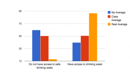
After comparing my percentages to the classes, I thought "okay, well we're pretty much on the same page." Once i saw how low the percentage was for those who do not have access to drinking water, I was shocked. I expected it to be higher, but then I was glad because the percentage I had was high. Not only were my percentages high for this graph, but I placed a high percentage for males who would have a secondary education.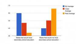
From my understanding, most people complete high school. I didn't have knowledge for those who were in other countries, but I assumed that more people would attend school than not. When I looked at the class average, mine was higher. Once I looked at the actual averages I was confused. The real average is much higher than the class' average and as well as my own. About 65% of males do not attend secondary education, which is shocking. However, once I went on to look at my next graph (poverty) it made sense as to why the numbers come out the way they do .
I said that more people lived on more than $2 a day than those who lived on less than $2 a day. 2 dollars isn't much and yearly, it comes out to about $730. In the United States this is beyond poor.
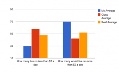
When looking at the class average, it was split close to the middle as usual. But when looking at the real averages, it was almost split down the middle between the two as well. I didn't expect for that to happen, but when I realized how much poverty there is, it made more sense as to why the secondary education averages came out to how they did .
For my graphs, I wasn't really accurate for any of them but the closest one was for poverty. Most of my knowledge is off of what I experience in my country besides things I've seen in movies or hear about. As mention ed, the graph for secondary education shocked me the most because I just assumed that most people went to high school, but once seeing the poverty it made sense. Not knowing about other places and countries threw me off and I was just going by what I experience myself and things I've heard.
When looking through the data that the class came up with, the actual averages and my own, I was pretty shocked. When doing this survey, I tried to keep in mind that not all countries are like America but also not all are the complete opposite either. When it came to the question "Those who do not have access to clean drinking water." and "Those who have access to drinking water." it took me awhile to come up with percentages. At first, I wanted to give a high percentage to those who do have access to clean water, but then I remembered that come countries/places do not, so I lowered my percentage.
After comparing my percentages to the classes, I thought "okay, well we're pretty much on the same page." Once i saw how low the percentage was for those who do not have access to drinking water, I was shocked. I expected it to be higher, but then I was glad because the percentage I had was high. Not only were my percentages high for this graph, but I placed a high percentage for males who would have a secondary education.
From my understanding, most people complete high school. I didn't have knowledge for those who were in other countries, but I assumed that more people would attend school than not. When I looked at the class average, mine was higher. Once I looked at the actual averages I was confused. The real average is much higher than the class' average and as well as my own. About 65% of males do not attend secondary education, which is shocking. However, once I went on to look at my next graph (poverty) it made sense as to why the numbers come out the way they do .
I said that more people lived on more than $2 a day than those who lived on less than $2 a day. 2 dollars isn't much and yearly, it comes out to about $730. In the United States this is beyond poor.
When looking at the class average, it was split close to the middle as usual. But when looking at the real averages, it was almost split down the middle between the two as well. I didn't expect for that to happen, but when I realized how much poverty there is, it made more sense as to why the secondary education averages came out to how they did .
For my graphs, I wasn't really accurate for any of them but the closest one was for poverty. Most of my knowledge is off of what I experience in my country besides things I've seen in movies or hear about. As mention ed, the graph for secondary education shocked me the most because I just assumed that most people went to high school, but once seeing the poverty it made sense. Not knowing about other places and countries threw me off and I was just going by what I experience myself and things I've heard.
Comments
No comments have been posted yet.
Log in to post a comment.