Uyen Nguyen (WORLD OF 100 WS AND ANSWERS)
Fig. #1 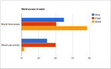
Bar graph of Water sources in a world of 100:
The graph above represent the percents of people in the world that have access to safe/clean water vs. the number of people that does not have access to clean water from three different point of views. Base on the giving data from the chart, it shows that my estimate was way off from the actual world data. However, it was not far off as the class data. In this case my opinion was the total opposite of what it's being shown in the world for access to water. Because we are living here in the first world country, I thought that it was reasonable for everyone to have access to clean water. However, it's doesn't seem to be the same world wise since there are part of the world without the same access as the United State. Therefore, it would be reasonable for a number of people to have access to clean water but not all are. But by looking at this graph, most of the students are having the same opinion about this situation. Perhaps we all have the same thoughts about the situation.
Fig. #2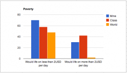
Bar graph of poverty in a world of 100:
The following chart is a data of poverty and the numbers of people that are living in poverty based on three different point of views. In my opinion, there will be more poverty in the world vs. non. However, it was the total opposite on this one due to the fact that where I'm looking at is just at today's stage for the United State. But it's not really the case for other country around the world. Therefore, my opinion was off from what the world is based on. This graph shows that the actual statistic is the opposite of the people's opinion.
Fig. #3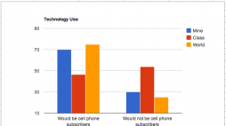
Bar graph of Technology in a world of 100:
For this graph, my estimate was about right compare to the number of the world out of 100 as well as the opinion of the class. It's far to say that almost or all of us have access to technology around the world today. It's apart of society in which at least more than half of the world can have access to these items. Therefore, it's reasonable to say that many of us do have access to the world' technology uses.
Part #4
Over all, I was off by a lot in certain categories and was only correct in a couple of categories. It seem like that as a system we assumed that everything around us work the same way. However, it's not the case for the world based on this game. Base on the game, it has proved that my mind is really narrowed to what is really going on around the world. From playing this game and to actually have to think about what I think the world look like as to compare it to the real solutions. It's really shocking to compare my knowledge to everything that is going on around. One of the guess that I thought would be accurate but instead it's the total opposite was Poverty. In my opinion I thought that 70% of the people around the world would be living under poverty and only about 30% of the people will actually living above poverty. However, only about 2% of the world is living under poverty as to the status right now. It's really shocking due to the fact that the United State is high on unemployment rate. But since the percent of people that are living above poverty is high, it's not the case in the world right now. Another categories that I guessed correct but still seem shocking to me was Gender. Since we are living in a norma society today where we have a mixture of both genders. It's approviate to say that we do have an even amount of both genders in the world. This fact is true but shocking because we are still hearing news about more male than female around the world. Over all, the game was pretty tricky but yet interesting because it's a challenge that we have to do to fun out the possibles in between.
Comments
No comments have been posted yet.
Log in to post a comment.