• Log In
  • Log In
Science Leadership Academy @ Center City
Science Leadership Academy @ Center City Learn · Create · Lead
  • Students
    • Mission and Vision
  • Parents
  • Community
    • Mission and Vision
  • Calendar

Emily Maggiano Public Feed

Photo's

Posted by Emily Maggiano in Art - Senior Art - Hull on Saturday, June 4, 2011 at 4:18 pm
These are the pictures that I chose to show you. None of them are edited, because I felt comfortable and I thought they were already pretty good without having to be edited. The one of the hat, is probably my favorite, because it was an accident. I was at a concert in the middle of a mosh pit and my arm got hit mid shot and that's what I ended up capturing. So I thought that was pretty cool. Three of the  pictures, are from when I was in New York City. Its my favorite place, so I thought I'd share the pictures that I could get off my camera. I'll probably end up doing some before and after pictures, maybe play with the lighting some...but for now I just wanted to put some of them up.
frrrozenhotchocolate
Times Square
World of Disney Store


bridge
Concert


Drawing By A Famous Artist:

Photo on 2011-06-04 at 14.51


This is the drawing that I did, I tried to re-do a drawing by Alex Pardee. This is the heart off The Used album In Love And Death. It's one of my favorite albums by them, and I absolutely love the album cover. The problem that I have, is I don't give myself enough space when I draw. I'll draw to close to the edge of the paper, or I'll just draw to big to where I'll have to cut parts out of my drawings. This sadly happened when I was trying to do the album cover.
http://www.whokilledbambi.co.uk/public/2008/02/loveanddeath.jpg
As you can see by looking at their album cover, the heart is ha nging by a old tree, I wasn't able to include that in my drawing because I didn't give myself enough room to work. I was going to start over , but I thought that this turned out really well...for not being exactly what I wanted. Alex Pardee is one of my favorite artist. I love his style so much, and I only wish that one day I can be as good as him. So I've been practicing a lot lately draw ing in his style.

Bike Drawings:
Photo on 2011-06-04 at 15.52
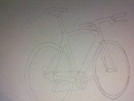
This is my line drawing of the bike that you gave us to draw in the art room. It's not finished, and  left out some details like the little light that was on the front wheel and what i think might of been a bike lock on the body of the bike. I found this both easy and challenging at the same time. I'm not very good with drawing lines, because they never come out looking straight...but the actual bike wasn't as hard as I thought it was going to be.

Photo on 2011-06-04 at 16.07
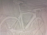
This was my attempt at a negative space bike. I'm not sure if I even did it right, because I never did one before. If I did, then I think it's kind of similar to line drawings. just you're drawing the spaces around the bike.

Be the first to comment.

Globalization in Philadelphia-Emily Maggiano

Posted by Emily Maggiano in Globalization - Laufenberg on Wednesday, June 1, 2011 at 9:36 am
​This is my benchmark

When working on this benchmark the thing that I found to be most challenging was finding and taking pictures that pertained to the topics that I wanted to focus on. Going around the city trying to find things that are all over the world and not just in Philly was probably the hardest thing for me to do.
When I ventured out to take pictures, I started at the places closest to school...like the flags on the parkway, Mütter Museum, Museum of Natural Sciences etc. After I got those I did some research and then headed to China Town, since I was able to get a lot of my pictures from there alone. Since I broke all my cameras I had to take most of the pictures with my phone and that made the process a lot more challenging then I thought it was going to be.
Out of all 10 pictures that I took, I think my favorite would have to be the flags on the parkway I think that the parkway flags came out really nice and it shows a lot about Philadelphia, not only did I get most of the flags in the picture but I also got William Penn. It was also the first picture and the first topic that I wrote my information on. So for those reasons, that is my favorite picture.
After being in this globalization class, I'm able to look at my different surroundings and see the evidence of globalization all around me. I'm sure there is a lot more places and things that have or show evidence of globalization, I just have to take my time and really look. But for just being one city, I think Philadelphia shows a lot of good effects and evidence of globalization.
Be the first to comment.

A Day In The Life

Posted by Emily Maggiano in Globalization - Laufenberg on Wednesday, April 13, 2011 at 9:02 pm
​Here's my story
Be the first to comment.

3rd Quarter Benchmark drawings

Posted by Emily Maggiano in Art - Senior Art - Hull on Friday, April 8, 2011 at 4:21 pm
Photo on 2011-04-08 at 15.01 #2Photo on 2011-04-08 at 15.02Photo on 2011-04-08 at 15.01
these are the three drawings that I did for my quarter 3 benchmark art project. I picked an artist by the name of Rik Lee to mimic I guess you could say. I picked him because his art work is kind of out there, but at the same time it's normal and really pretty. He incorporates some words in his drawings and only uses hits of color. When I'm drawing I don't like using color, because I feel it ruins the drawing. So it was nice that I found someone whom shared that feeling. I probably could of added more to each drawing, but to be perfectly honest I'm quite proud by the way the turned out overall. I also found it fun, that I got to inquorate my style of drawing in and at the same time learn new styles of art. This was definitely my favorite project so far.
Be the first to comment.

Emaggiano Q3 History Benchmark

Posted by Emily Maggiano in Globalization - Laufenberg on Wednesday, March 30, 2011 at 8:51 am
History benchmark on Colombia and Singapore

For my 3rd quarter benchmark project I picked Colombia and Singapore to study and review their collapse-ability. Colombia is located in South America and Singapore is located in South East Asia, they are both countries that are developing and trying to cope with the changing world. I thought they were similar enough to have some problems that would be the same, but different to the point that it wouldn't be boring.
I first started to research on Colombia first because I knew more about Colombia then I did Singapore. I knew for a fact that cocaine was one of the main contributes to their environmental problems and the steps that they were taken to kill the cocaine plants highly impacted their climate. So finding information was fairly easy. Singapore on the other hand, didn't have many problems that I was able to find and research. They didn't have any hostile neighbors that I could find and overall Singapore is a country that sticks to themselves and doesn't bother anyone as long as they're not bothered themselves.
I thought after reading Collapse the five-point-framework was kind of straightforward. I knew what was being asked and I was able to answer them to the best of my abilities. Yes, some were harder to find information on then others, for example I had trouble with hostile neighbors for both of my countries, I found old information(countries that they were fighting with in the past) but it was hard for me to find updated stuff that I could use in my Iweb. Also the last question we had to answer, how they are dealing with their environmental problems gave me a little trouble as well, because sadly Colombia wasn't dealing with them in a way that would possibly save their environment. Cocaine is their main source of money, so they're going to continue to grow and sell it, in their eyes it's doing more good then harm.
Now, if I was given the opportunity to do this project over again I would probably try and find more information then I did, I would of dug deeper. Also, I probably would of picked a country other then Singapore, because they don't have enough problems to make for a very interesting place to do my benchmark on.
Be the first to comment.

South America

Posted by Emily Maggiano in Globalization - Laufenberg on Wednesday, March 16, 2011 at 7:16 pm
​https://docs.google.com/document/pub?id=1Jlysed7s41c4d1ZM5zUQO6MJ0m_YQG62_xIBDO6SPUk
Be the first to comment.

Hand Drawing

Posted by Emily Maggiano in Art - Senior Art - Hull on Friday, January 21, 2011 at 1:48 pm
IMAGE0001
In art class we were assigned to draw one picture a week, starting on Tuesday and working on them all class period up until Friday. The first picture we were assigned to draw was a pencil sketch of our hand. We had to draw it on an 8x11 piece of paper, trying to use as much of the paper as possible. After we got the design and shape of our hands down, we added shadows and shading to them too. We were to make them as realistic as possible, no cartoon hands. This is the end result of my hand. [Click image for bigger more clear picture]

Week two: Pencil Self portrait

Photo on 2011-02-03 at 19.03 2
So this is my self portrait, I'm actually quite proud of it even though it's lacking a few main features. Yes, the eyes aren't there...but it was really diffcult for me to draw my eyes and have glasses on at the same time. Every time I would try, it would look weird or they would be uneven. It was a mess. Also I didn't really shade anything or had any highlights to my hair and everything. I save that for last, when I'm completely satisfied with the results...and this picture I don't believe is done to the best of my abilities. I'll keep adding to it, and upload more pictures as I go along.[Click image for bigger more clear picture]

Week Three: Bigger Self Portrait
P1030837
This is the result of my bigger self portrait. I've come to the conclusion that drawing big isn't my strongest point. This was also supposed to be done with charcoal. The outline of the drawing is, but I didn't shade or do anything to make it "pop" form the page. I get scared that if one mistake and the whole thing is going to be ruined. So I try to make them as simple and basic as possible. I'll eventually add more  to the drawing, if I have time. For now that's what it looks like. I'm sort of pleased with it. In a way it resembles me. [Click image for bigger more clear picture]

Week Four: Drawing of someone in class
P1030852P1030854
This is my attempt at a full body drawing. Again, I'm afraid that big isn't really my cup of tea. I feel much more comfortable drawing small. Also, Drawing faces and people is my least favorite thing to draw. Maybe that has a lot to do with why it's so unfinished looking. I try so hard to make them perfect, or as close to real life as I can, that I lose track of time and then I have to rush through it so it's done and I have something to show for my work. I'm also very afraid that I'm going to offend the person somehow, if I draw them bad. Which, is how I feel about this drawing. Kim, in no way shape or form looks like this. I wish I wasn't so judgmental about my work, I think that this could be pretty good, if I gave myself credit and actually stoped worrying about what it looked like. [Click image for bigger more clear picture]

Week Five: Still Life

*Pictures and artist statement coming soon.*

Week Six: Small clear object (cup)
P1030883
Sorry for the bad quality of the photo. This is the drawing I did of my starbucks cup. This was actually a pretty fun one for me to do. Since I was aloud to pick any clear object, I decided that a Starbucks cup would be nice. The hardest thing about drawing this, was making it look 3D and not 2D, I wanted to create the look that there was something behind the logo of the cup. That it was an actual cup. I believe I did a pretty good job with that. [Click image for bigger more clear picture]

Week Seven: Bigger drawing of clear object (Cup)
P1030839
[Click image for bigger more clear picture]
Be the first to comment.

Emily Maggiano-Second Quarter Art Benchmark

Posted by Emily Maggiano in Art - Senior Art - Hull on Friday, January 7, 2011 at 1:07 pm

Edited Pictures From Q1:[Photo's by Brett Chapman]

Screen shot 2011-01-04 at 8.40.32 PMScreen shot 2011-01-04 at 8.40.53 PMScreen shot 2011-01-04 at 8.41.10 PMScreen shot 2011-01-04 at 8.41.28 PMScreen shot 2011-01-04 at 8.41.41 PM

   .:Quarter Two Benchmark:.

.:Sketches:.

Outline of deathly hallowsFinal draft of Deathly hallowsFinal Draft of Inception poem

Finished Posters:

Photo on 2011-01-07 at 14.35

Artist Statement:

For this quarters art benchmark, I decided to make posters for Harry Potter and the deathly Hallows and Inception. At first, I only did the Deathly Hallows symbol. Harry potter, I've been a fan of since the very  beginning. Out of all the books, the part about the Deathly Hallows was my favorite. The story behind it was so amazing, and I always thought the actual icon/symbol was really cool looking. After seeing the movie, I go the idea to do the art work and have the trees, and the moon and sun inside the symbol. The quote I wanted to incorporate somehow, so I though that if I made it go along the outer rim of the drawing it would look nice. The font was probably the most difficult thing for me to do, since my handwriting to begin with isn't the best. Also, I had some trouble with blending the colors together. Since I've only done that one in my 8th grade art class, it turned out better then I thought it was going to. I'm pleased with the final result of the drawing. I wish, I could of made it all even, because the triangle is lopsided in some places, but people that have seen it said they couldn't tell. The second picture was a line from the movie Inception, it's one of my favorite movies. I took the riddle from the movie that Cobb and Mal used to say together. it goes like "You're waiting for a train, a train that will take you far away. You know where you hope this train will take you, but you can't be sure...but it doesn't matter, because we'll be together. I thought that doing word art would be cooler. I added a train and all of the main charterers totems at the bottom. I also thought that if I did word art, it would help me improve my  handwriting.

Be the first to comment.

Emily Maggiano's Bottle cap flowers~

Posted by Emily Maggiano in Art - Senior Art - Hull on Friday, November 5, 2010 at 11:20 am

.:Artist Statement:.

In our senior art class, we were exploring the topic of recycling and the environment, primarily focusing our attention on bottle caps. For my project I choose to make flowers out of bottle caps. Unlike plastic bottle caps, beer-bottle caps can be recycled. Beer-bottle caps are made from steel, as evidenced by their attraction to magnets, and steel is a recyclable material. I wanted to make flowers out of the bottle caps, because quite frankly I think real flowers are a waste of money-they’re beautiful for about a week and then they die. So this bottle cap flowers last for as long as you want. You won’t feel bad about throwing them out either because they can be recycled. My dad helped me with the cutting and flattening of the bottle caps, because he didn't want me working with power tools...but I glued and tied the red bottle caps on the big flower and the medium one.


Work in progress:

Photo on 2010-10-27 at 17.24Photo on 2010-11-03 at 15.44


Steps:
  1. Cleaned the bottle caps
  2. Flattened some of them, and cut some of them
  3. Drilled little holes in some so I could connect them to each other
  4. Some I super glued, like the bigger one
  5. Cut the edges off of some so they fit together in and on the body of the flower.
  6. Got stems for my flowers, and cut out the bottom of them so they would connect and super glued them together for more support.


.:The Finished Product of my art benchmark:.

Photo on 2010-11-05 at 11.00Photo on 2010-11-05 at 11.00 #2Photo on 2010-11-05 at 11.00 #3
The pictures above are the less flattering pictures that I first took of my art project. When I started to get such good feedback and complements on the pictures from my classmates and Mrs. Hull, I decided that I should take an individual picture of each flower, since they're all different.
I picked a black background, because I've always loved photographs like that. I think that when the background is black, and there is a flash on the camera the it brings out the subject in a really pretty way.
photophoto(3)photo(2)photo(6)photo(5)photo(7)photo(4)
3 Comments
RSS
Science Leadership Academy @ Center City · Location: 1482 Green St · Shipping: 550 N. Broad St Suite 202 · Philadelphia, PA 19130 · (215) 400-7830 (phone)
×

Log In