Advanced Art - Hull Public Feed
Q3 Advanced Art- Schiavoni, Natalee
Art Journal
For Q3 advanced art, I used a different style to bring most of my drawings to life. One of the artist tools that mainly are presented in my artwork is the use of pencil. I enjoy incorporating pencil into many of my drawings because I like to add shading and shadow textures. I love giving my drawings a more realistic feel so that my observers can actually get a taste of my art work and how I have improved over the last 1Q and 2Q. Overall I am very impressed with the styles I used and the progress that has come all this way from finishing all the artwork.
Self - portrait:
In this portrait that I have drawn of myself, I feel I could of done a better job at more of the shading aspect of the picture. I think there is room for improving this picture with more of the shadowing and shading around the eye area. The texture of the hair was my favorite part when I was creating this part of the portrait. I like giving things a texture and drawing it to seem realistic.
Texture Drawings:
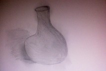
Texture drawing is what I mainly progress in more of my detailed explanations about my drawings because it was a big part of the act of style I was incorporations into each of my drawings. In this picture I used a vase that I drew in order to show the process of shading and the use of shadowing. I like drawing still figures with good lighting because I am able to catch every aspect of angles to allow shading and shadowing.
Shading Practice:
Here are a few shading practice drawings that I have done to improve my shadowing and to allow the viewpoints of each of the different shading. My favorite part about shading in the different textures is blending in the final product.
Niyala Brownlee Art Work Quarter 3
I think that the thing i liked most was making the fur picture. I love cats, but I've always been bad at drawing them, but it actually turned out pretty nice. I dont think that painting is really my strong point. When we had known we we going to do a color wheel, I was actually super exited and commingup with all these ideas of how I was going to present mine in an abstract way. I had sketched my stuff out and the critisized my work. Though soon i started to procrastinate once again, and actuallly painted it on the last day of art of the third quarter. I think i have gotten much better at drawing realistic eyes, though creating a full face with a nice eye is something I have to work on. I think one of my strong points is to draaw by seeing another work. Its hard for me to sketch things from my own head, but it is easy to come up with them. Most of the time anyway.
All of my photos are also on my twitter page incase they dont upload here.
https://twitter.com/#!/miyu_loverz
All of my photos are also on my twitter page incase they dont upload here.
https://twitter.com/#!/miyu_loverz
Sabrina Stewart-McDonald_Q3
I think I work best in pencil; I am getting better at shading and when I work with other things, such as the water color paints, I feel like I do not have as much control. I was most proud of my hair drawing because I believe it looks very well and almost realistic; I love the way the shading turned out. At first I didn't think I could do it, but once I tried it and tried the shading in it, I found that I could make it work.
Self-Portrait: I like the shading in the picture, but it doesn't really look too much like me. I showed my mom and she said it looks like me when I was younger, so that makes me think that I see myself as younger than I really look. I really like the eyes, also. Each time I draw eyes, I think they get more and more realistic looking. I also practice drawing them in my spare time.
Self-Portrait: I like the shading in the picture, but it doesn't really look too much like me. I showed my mom and she said it looks like me when I was younger, so that makes me think that I see myself as younger than I really look. I really like the eyes, also. Each time I draw eyes, I think they get more and more realistic looking. I also practice drawing them in my spare time.
Color Wheel: I really like color and was excited when I saw one of the projects was a color wheel, but one of the things I worried about was the fact we had to use watercolor paints, which I have little to no experience with. I kinda dove into it headfirst to see what would come out and though the paint bled a bit, I believe it came out quite well. I didn't think I would be able to mix the colors, but in the end I was quite good at it.
Texture Drawings: A main aspect of the texture drawings is shading, so I felt good about putting my shading abilities to the test to see how things would end up. I think I did quite well with the hair, but I think the water drawing could use some improvement. I see it as something I will try to work on more in the future to try to improve my shading abilities even more.
2-Point Perspective: I haven't done two point perspective in a while, so I felt challenged attempting to do one. In the end, I feel like it turned out well, but I felt like I couldn't really add too much detail to it because every time I tried to, it looked a little strange. I will continue to practice doing them and in the future I hope to attempt a project like this again and be able to add detail to it (to the point where the detail will follow the perspective).
Shading Practice: I liked the shading practices because they gave me an idea of what level I was on when it came to shading. I'm not very advanced and I could obviously use more practice, but I feel like I get the general idea of how to shade and how to blend.
The following are just leisure drawings that I have done during this quarter.
Artist Statement Q3 - Breeanna Noi
During this quarter, we focused more on realistic artwork.
I worked on my self portrait that didn't quite end up looking like me because I chose features of my face from different pictures. So my self portrait looks good TO me, but it doesn't look LIKE me.
The next piece of art was the 2 point perspective that is shown to be very rough. I'm not very good at drawing landscapes so when I get frustrated with drawing specific detail of a sky or of the ground, I just turn everything into a rough shadow of the entire landscape.
Afterwards, I worked on my color wheel using the primary colors of water colors. It was fun because I felt like I was back in elementary school using my general knowledge of colors to match it up to the color wheel.
As for the textures and drawing hair, I'm not too experienced at drawing realistic looking features. My features look cartoonized in a way. However, I looked at an image of a braid and I tried my best to show a realistic sketch. My strokes were hidden from my over-shading so it isn't how I wanted it to turn out.
My other pieces are various works of art I've worked on during the quarter. The girl's back and her hair is something that is the most realistic I'll get in a picture. My "Batman" looking image was something simple that I wanted to try out, so I did. Lastily, I drew Stewie as a nerd because Stewie has always been a challenge for me to draw. His head was either too round or too oblong, but with this sketch, I'm finally content with Stewie's head.
Danny Wirt- Q3 work
For this quarter in art class, we focused on shading, working with different colors and a little bit of prospectives. We were required to draw some self portraits, paint a color wheel, working on perspectives and shading. The use of the paint was a little difficult for me because i am not much of a painter. I did however put effort into trying to make it work and I am satisfied with the result. With my self portraits i don't feel as though i really captured what i look like, however it is all up to observation. The shading portion of this quarter I found to be fairly simple. I feel like shading has always been rather simple for me and i found the exercises to be quite fun. The two point perspective i found to be rather difficult. I find myself having difficulty with making buildings. I get the concept of how the windows look with the two point perspective, however, i feel i am not good at making lines work well to make buildings look real. It was a bit out of my comfort zone, but overall I am happy with my work.
Charles Norman Artist Statement
I opted out of art class in Q3, so I do not have any art to show. I used this band as a get myself together period. Sometimes I would do work, and other times I would take walks around the school. I using this period as like a free period, but I'm now ready to come back to class, and do some Art. Q4 I will not opt out of art class, I want to come to class to draw somethins, and complete all assignments.
Kimberly Cayamcela: Quarter 3 Art Work
-Self Portrait Drawings
-Color Wheel
-Hair
-2 Point Perspective
-Shading
-I really enjoyed drawing my 2 point perspective because I'm naturally good at drawing buildings and such. My favorite part was drawing the shadow.
-The shading within the shapes was definitely not my strongest drawings. I tried to over and over again and the below pictures were the best I could do. I don't know why shading was difficult with drawing these shapes if I can do a good job when drawing hair. Perhaps I just need better eye sight and need to learn how to work with pencil more.Over all I see that I'm improving with my drawing little by little and hope to continue doing so next quarter!
-Color Wheel
-Hair
-2 Point Perspective
-Shading
-This 3rd quarter I found some difficulties in my drawings. I thought it would be easy to draw myself since it is I, myself who is drawing. But, that wasn't the case. The first self portrait was not too bad nut not too good. I expected to be more realistic with my face. My second attempt improved a lot. The way in which I drew my nose looks more real and accurate than my first attempt. Also, the lips look more real. My shading has improved this quarter, I believe. I have learned different ways to make shading more realistic, such as rubbing it with an eraser and spitting on the paper and smothering it. This drawing resembles me quite well because my hair is almost always covering one side of my face.
-I was not satisfied with my color wheel. But, it's not that bad. I was a little confused in mixing the colors together and making it blend in like a rainbow.
-Like I said above, I have incorporated shading techniques now that I know of them. Usually when I draw, I just scribble over and over again to make it look like hair. Now, when drawing hair, I color in the hair as if I was coloring a picture with crayola and smear it.
-I really enjoyed drawing my 2 point perspective because I'm naturally good at drawing buildings and such. My favorite part was drawing the shadow.
-The shading within the shapes was definitely not my strongest drawings. I tried to over and over again and the below pictures were the best I could do. I don't know why shading was difficult with drawing these shapes if I can do a good job when drawing hair. Perhaps I just need better eye sight and need to learn how to work with pencil more.
Quarter Three Work
TEACHER ACTION GROUP LOGO
This quarter, I focused mostly on logo design. For the most part, designing a logo for Philadelphia's Teacher Action Group took up my time and energy. I started this project by following the concept that was given to me by the group. This consisted of the name of the group in bold font, Philadelphia is thin lettering underneath, colored backing, and sunburst rays shooting out of the text. I came up with the following design and several variations just in case:
This quarter, I focused mostly on logo design. For the most part, designing a logo for Philadelphia's Teacher Action Group took up my time and energy. I started this project by following the concept that was given to me by the group. This consisted of the name of the group in bold font, Philadelphia is thin lettering underneath, colored backing, and sunburst rays shooting out of the text. I came up with the following design and several variations just in case:
Eventually, I edited the design until I came up with this somewhat-final design:
Accompanying the design(s) I created based on The Teacher Action Group's guidelines, I designed two logos that I was inspired to create for the organization. I drew my inspiration from protest, considering that The Teacher Action Group is all about fighting for teacher rights and making sure that teachers' needs are met, and that they get the resources they require. My design is focused on the exclamation mark, which is easily the most renown symbol of reaction and energy, which are essential emotions for protest.
I started by incorporating the name (Teacher Action Group) into the longer component of an exclamation mark, and then I added a smaller exclamation mark into the smaller component of the larger exclamation mark. After some editing, I didn't like the smaller exclamation mark in the larger exclamation mark, because it seemed a little too repetitive. I came up with the concept of illustrating the Philadelphia skyline into the smaller component of the exclamation mark. After playing around with that idea, I found a final design I felt content with.
I started by incorporating the name (Teacher Action Group) into the longer component of an exclamation mark, and then I added a smaller exclamation mark into the smaller component of the larger exclamation mark. After some editing, I didn't like the smaller exclamation mark in the larger exclamation mark, because it seemed a little too repetitive. I came up with the concept of illustrating the Philadelphia skyline into the smaller component of the exclamation mark. After playing around with that idea, I found a final design I felt content with.
Below are the final two designs that I came up with based on the exclamation mark concept. I created two logos instead of just one, because they both serve different purposes. The horizontal logo is geared more so towards branding on websites and banners, whereas the vertical design is geared towards apparel such as t-shirts.
Here is a picture of a t-shirt model that I photoshopped the vertical exclamation mark logo onto. I believe the design would be quite eye-catching, just enough so to intrigue people without being obnoxiously attention seeking.
Notes:
- I created these designs using Adobe Illustrator and Adobe Photoshop.
- The project is not completely finished just yet.
MS. RAMI'S LOGO
A couple weeks ago, I began to design a logo for a blog Ms. Rami will be using. I started by playing around with the lettering of her name, and came up with several concept sketches which are shown below:
MS. RAMI'S LOGO
A couple weeks ago, I began to design a logo for a blog Ms. Rami will be using. I started by playing around with the lettering of her name, and came up with several concept sketches which are shown below:
After I sketched the concepts shown above, I started translating them to Adobe Illustrator and I came up with these two rough designs so far:
I really liked the concept of combining her initials to create a symbol. The two designs above will just be the beginning of this concept.
Obviously, this project is ongoing, and will take a considerable amount of time to complete. Along with designing the branding of Ms. Rami's website, I will also be designing the layout of the site. I am really excited to be designing for Ms. Rami, and I can't wait to really start exploring more aspects of graphic design through application and self-learning.
Obviously, this project is ongoing, and will take a considerable amount of time to complete. Along with designing the branding of Ms. Rami's website, I will also be designing the layout of the site. I am really excited to be designing for Ms. Rami, and I can't wait to really start exploring more aspects of graphic design through application and self-learning.
Q3 Art Work From Kamilah
So for the third quarter I made a:
- Self Portrait
This was the first thing I drew for the quarter cause i felt as though I had done it before enough to be comfortable with. To draw this picture i took a picture of myself and then just drew what I saw. The hardest part (always) of drawing people for me is trying to draw them accurately. I always seem to disproportion certain parts and lines so that it's hard to tell who the picture is supposed to represent.
- Color Wheel (Tree)
The color wheel is the last thing I did the quarter because I spent wanted to find a way to make it creative, interesting, and different while still capturing the point of it. The hardest part of this was the coloring. I deciding on crayons because I knew they'd give a texture to the tree that I liked and i could use the rub off of the crayons to look like leaves of the tree. I got the idea from a picture I saw of a rainbow leaf tree glowing in the night.
- Sketch of Hair
Drawing the hair was the easier part of this quarter i think because all it is is just a collection of lines flowing together. The thing that makes it difficult is determining how many lines, how thick should they be, and in which direction do they have to flow
- Scales (on a snake)
Drawing the scales on the snake was really tedious and hard but as the rows of scales started to form it began to look better. The hardest part of this was the head and eyes because I really wanted to make it look like a real snake would.
- Two Point Perspective (Sketch of my school)