Hi my name is Alejandro and my project is about global warming. In English we are doing a project called you and the world where we pick an issue in the world to talk about. For my issue I chose global warming.
Global warming is a huge well known problem, that many people are aware of yet they do not do anything about this terrible issue in the world. Global warming causes the polar ice caps to melt causing death to a lot of earth's animals and ecosystems.
 Above, melting ice caps (source).
I’m interested in this topic about the issues in the world because i hear of this issue for a long that i wanted to learn more about it and I wanted to know what happens to the earth every year and what would happened if it keeps going on in the world.

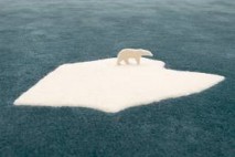
Above, polar bear on broken ice (source).
The Global Warming started as known from the scientist approximately about the 1500’s and kept going until now 2012, over the time it changed the and switch the earth temperature and made the earth hotter melting glaciers, damaging ecosystems, nature and animals too.
Some of the causes of global warming are: green house gasses, cars, industries, electronics, smoke and fossil fuels. Sometimes even the smallest things that we do not even think about can cause global warming. For example, turning on and off a light switch.
Some small things that you can do every day to prevent global warming.
Are to not watch as much TV, to not turn lights on as often, to ride your bike or walk more often, because they burn fuel. These things are helpful to the ecosystem and the Ozone layer.
Throughout my project I will learn more about how I can help the earth, and put a stop to global warming, and I will educate the readers on global warming and how to stop it. Thank you for reading, and I will post my second blog entry soon.
Click here to view my bibliography.
