Blog Feed
My Home Network
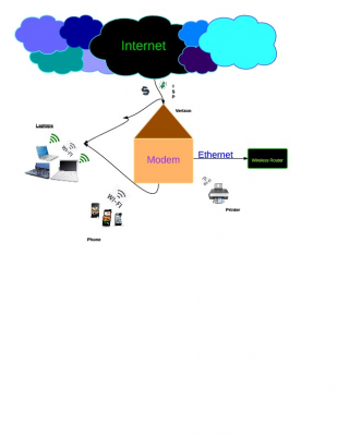
For this project we had to create a drawing of our home internet network. The goal was to help us understand what the internet actually is and where the codes go to bring you the information you need. The next part of the unit was understanding Acceptable Use Policies. We read both the SLA AUP as well as the SDP AUP so we could further understand what acceptable internet use looks like.
Internet AUP
In this first quarter in Tech, we learned about the internet and what we do on it. Ms. Hull taught us about the troubles you can get into and how to use the internet wisely. She also taught us about the connections of the internet we have for our devices. This is a picture of how the internet connects to the different devices in my home.
Brandon's Quarter
During the first quarter we talked about acceptable use policy for our school and the School District of Philadelphia. We also read a book involving internet security. I feel as though this unit was very productive.
I really enjoyed this quarter.
I really enjoyed this quarter.

Home Networking
I learned about networking and how to be safe with the Internet. I also learned about the acceptable use policy for the school district and S.L.A. I now understand how my Home Network runs through all of the devices in my home. I also learned about cyberspace and the process that information goes through when you send someone an email. It gets packaged, then codes itself and goes through a whole process of security checks. These security checks are a bit like the ones we go through at an airport. When a file is not allowed to go through it gets destroyed. There are many firewalls that information has to pass through. For this project I had to create a Lucid Chart of my Home Networking system. I showed where each device was in my house and how they were connected. All of the devices are connected to a wireless modem. My server is Comcast so I have an Coax cable. This is a chart that I made, it demonstrates all of the devices in my home and how they are connected. I made this chart because it helped me understand how my network works. In this chart you can see that for each room devices are listed and the arrows show that they are all connected to a netgear Modem which lets the devices run on a wireless network.
Internet connection
This project helped me see how my electronic devices really work. Before, I knew nothing about how these devices were working and what helped them work. For all I new they could have been working "magically". But now I know there are different wires and connections that have the internet work and the device alone to power on. We also learned about the application Lucid chart which we used to create our internet connection document. Now we have more knowledge on the different programs that we have access to on the SLA website.
Ona Brown
In the first quarter of Tech, Ms.Hull taught us a great deal about the concept of the Internet.We learned the difference between SLA AUP and PSD AUP.We also Learned about how we are able to get the internet and how it operates the electronic devices we own.This diagram below shows how my Internet enters my house and connects to my electronic devices in my house.This activity was very fun. I never really thought about how my tablet allows me to get on the internet.I just knew I was on, now I know the reasoning behind it.
MY INTERNET AUP
During the first marking period in Tech. we learned about the internet and how mistakes people made on the internet. SLA internet policy is more reasonable than The School District. They have some similarity like no porn, no downloading, no personal files, but I believe SLA gives you more freedom to expand our work to the world than the School District. As we learned about the internet policy we also read a book called "LOL OMG". The book is about mistake people made on the internet and how it effected their personal lives. The book teaches us to be more careful on what we say on the internet. This lesson is for us to figure stuff out and to learn more about our internet and where it comes from. Overall I learned to be more careful on the internet and to think twice before we post.
Quarter 1 Aaron Watson-Sharer
This quarter we learned many things, from how our internet works to the School districts AUP. The districts AUP was very specific in what we can and can not do. There are big consequences if you are caught violating these rules. We learned a little bit on how some computers communicate in 1's and 0's. I had a god time reading about idiots on the internet. Now we all know to be more careful.
My Home Network
During the first quarter of Tech, we first drew a diagram of how the internet works in our home. From there, Ms.Hull taught us the rules of SLA's and the school district's acceptable use policy and we looked at the similarities and differences between the two. We read a book about the dangers of the internet, and how to use it in a positive way. Here is a diagram of how the internet travels through my home. It was frustrating to create at first, but in the end, I got it completed.
My Home Internet
In this quarter, we learned about where our internet comes from in our homes. Because of this, we also had to learn about the different Acceptable Use Policies (AUP) that we, as SLA students, are held under. We learned about the School District of Philadelphia AUP and SLA's AUP. After learning about the AUPs, we discussed about how to make smart decisions when using the internet. To me, this was very insightful because I never knew that my activities on the internet were being monitored. This was a reality check and it kept me informed.
Lucid Chart
Today in Tech, Orange stream had to use the online application "Lucidchart" to create a flowchart showing the online network in our homes. We did this to:
1. Learn more about our home and the internet by knowing how it works (to an extent) and
2. To learn more about Lucidchart, so that we may utilize it for our classes.
We had previously been taught about the differences between the AUP (Acceptable Use Policy) for SLA and the School District of Philadelphia. In general, the school district's seemed to be more strict.
In other news, I forgot to bring in lunch today.
Colin's Home Network
In the beginning of the first quarter, Ms. Hull had us research and create a diagram of our home network. The purpose of the assignment was for us to get a better understanding of how exactly the internet worked, and to give us an idea of how the school's wi-fi worked. In my diagram I have a Comcast Co-Ax cable coming into my house and connecting to my modem. Then, the modem connects to my router through an ethernet cable, and the router connects to all of my family's devices using a wireless network. The router also connects to a signal extender, which transmits to my PS3 and Wii, which are out of range of the regular network. There is no connection to the laptop in the lower-left corner of the diagram because it's too old to install wi-fi drivers on.
Katarina's network
In tech class, we are making lucid-charts of our network connections. Each person had to draw a picture first and then convert it into a lucid-chart document. We are doing this to learn more about the world of internet and technology all around us.
Home Network
We were given a assignment a couple weeks ago, with the task of figuring out and drawing our home networks. I went home and tried finding the connected wires to my internet connection. I had to find all the devices connected by wireless, which came with a whole lot of devices since there are five people, including myself, in my household. With figuring out my home network, I was able to find the uses of the ethernet wires and airport. I figured out how internet is used and how large it really is. I figured out the price for what my parents pay every month for wireless. I came to a conclusion, the internet is a wonderful thing and everyone should know where it comes from and what it stands for.
div style="width: 480px; height: 360px; margin: 10px; position: relative;">
Obviously you not that good if I’m still in this bitch. Can you please tell the judge I am sorry for what I have done, I didn’t mean to kill him it was just a reactive situation. Pretty please with a stac of money? Wait, why I am begging you? Your job is to get me outta here, so hurry up and do it please. (Smiles and walks away with attitude)
Artículo 1: Canal de Panamá y Un Alcalde
22-11-13
Quarter 2
Quarter 2
Alejandro Marothy
Señorita Manuel
Canal de Panamá y Un Alcalde
El Canal de Panamá es un gran canal para barcos. Se conecta los océanos atlántico y pacifico. Mucho de comercio internacional se lleva a cabo a través del canal. El canal remonta a primeros exploradores europeos. Ellos tenían la gran idea para conectar los océanos. Vieron el puente tierra entre Norteamérica y Sudamérica y pensado un canal.
Ahora el canal va a ser ampliado porque Vicepresidente Joe Biden dice que va a obtener trabajos. Un canal más grande permitiría que los barcos más grandes y muchos más. Comercio más rápido. Más comercio. Más trabajos.
Alcalde Nutter dice es una buena oportunidad para América y para Filadelfia. Nutter va al canal con Biden para observar el sitio y contribuir en el debate. También dijo que esto es bueno para el puerto de Filadelfia porque se va a hacer a la economía mejor y hará trabajos. Biden y Nutter claramente están haciendo grandes cosas. Están haciendo importantes cosas suceden.
Creo que todo es genial. Más trabajos que me hace más feliz. Si quieren un canal más profundo, bien. Si quieren barcos más grandes, bien. Pero sólo si la economía se mejora. Si todo esto no era para nada, voy a estar infeliz. Tal vez enojado.
En conclusión, canales son buenos.
Número de Palabras: 208
Trabajo Citado
EFE. "Latino News and Opinion." Alcalde Nutter visitó Canal de Panamá - . Al Día, 20 Nov. 2013. Web. 21 Nov. 2013. http://www.pontealdia.com/philadelphia/alcalde-nutter-visito-canal-de-panama.html
Chhievling's Home Network
During my quarter one in Tech, I had learned many things; from reading about people who had made huge mistakes online, then onto learning about the School District's and SLA's AUP. Ms. Hull had guided us well in understanding how the source "internet" can be such an advantage, but in order for the internet to be something we use in a positive way, we must understand it. Here is the creation of my home network (picture below) that I had made on LucidChart. I had never used LucidChart before, and Ms.Hull had left my classmate and I to figure it out ourselves. In the end, I did figured out how to use it , otherwise there wouldn't be a picture to blog about. After all of Ms. Hull's lessons, I realized that the purpose of it was for us to be wise and understand what we are using. For example, the purpose of drawing my home network was for me to understand how the internet work in my house. Then, to transfer the drawings onto LucidChart, and then blog about it without her guidance was to teach us how to be an intelligent independent thinker.
Mexicanos y dominicanos, los más pobres entre latinos de NY
Aaron Tang
Spanish
Reflection # 1 Quarter 2
Ms. Manuel
Los Mexicanos lograron reducir niveles de pobreza. Universidad de Nueva York (CUNY). En Nueva York, hay 32,6% en 1990 y 30.4% en dos mil once. Latinos están en la pobreza porque en dos mil siete, nosotros tenemos la crisis económica. Africanos Americanos son pobres y la segunda grupo fue son Mexicanos. El profesor de Laird Bergad enseña estudios los Latinos Americanos. El ingreso promedio en los hogares de Nueva York en 1990-2011. Hay muchos pobrezas de los Mexicanos en ciudad. El artículo dijo más Mexicanos no van a la escuela.
Aprendí en California, hay muchos Mexicanos y Latinos viven en So-California. Amigos de mi tia tiene tres hijos, su madre, su padre. Ellos tienen una casa pequeña con dos dormitorios y una patio. Los hijos dormían en una dormitorio con los abuelos. Yo estaba feliz de que son pobres porque ellos tienen una casa. Yo pienso familias en California, comida y cosas eran caras. El impuesto es 9.75%! Una familia con un padre, una madre y una niña pequeña ellos preguntaron por dinero. Estaba triste porque ello tenían hambre. Mi tía dijo ella no tiene dinero porque ella tiene que comprar comida por mi familia. Fue muy triste.
"Latino News and Opinion." Mexicanos, Los Más Pobres Entre Latinos De NY - . N.p., n.d. Web. 21 Nov. 2013. <http://www.pontealdia.com/estados-unidos/mexicanos-y-dominicanos-los-mas-pobres-entre-latinos-de-ny.html>.
The Afterthought
Scene Opens to a locker room everyone is chatting, and getting dressed
Okay you know how to do this one leg at a time. Are the shin pads tight enough? Ya they are on good.
Now to put the skates on the longest part. How is everyone already done I was the first one here?
Just ignore them, let them talk, you need to focus. put your skates on grab the strings pull, grab the next ones and pull, pull, pull, pull until you have nothing left in you to pull with.
Okay the skates are on, what did I forget, I feel like I am forgetting something?
Oh ya….that…..the thing that shows everyone that I am weak, that I am vulnerable. Should I use it and face the stares or skip it a risk an asthma attack out on the ice where it counts?
You know what, who cares what they think of me, if it makes me a better player than I need to use it!
Okay shake it up, don’t draw too much attention to yourself, take the cap off, take a deep breath in……...and out……...now before they realize take a puff. POOF! Wow that was loud, and they noticed, they are looking, what do I do?
I need another puff but now I’m vulnerable like a deer caught in headlights, I am already halfway across the street but maybe if I stay here the car will stop and turn around so I can keep going in privacy.
Nope, I am not so lucky. The car is staring right at me waiting for me to make my move, so I guess that I should continue not ever looking back.
Breath in……..and out……...in…….and out…….here it comes…...PUFF!
Thank god that’s over, and here comes the coach ready to provide his words of wisdom.
-----------
That’s it, that’s all you got!?!? Play hard he says, pass the puck he says. Gee thanks coach, couldn’t have thought of those on my own.
What time is it?
Oh it’s game time, we gotta go.
Stand up make sure everything feel good, loose yet tight, that’s what to look for.
Where is my stick? Oh of course, right next to me. My glowing red stick was hiding in plain sight.
----------
Step out onto the ice and scan the scene. The first thing to always look at is the opponent. How big are they, do they wear glasses, are there any girls on their team, how many players are there.
I always need to know just how intimidated I should be.
So lets see, they are huge and in more ways than one. Holy crap there must be twenty of them and they each must be six feet tall each, I can only imagine how the younger kids on my team must feel.
They don’t look nervous. If they aren’t nervous, then why should I be nervous? Am I just a panicky person, or are they ignorant.
Oh well, I need to shake this off and focus, it’s time to put everything aside and play the game.
----------
Coach is announcing the lines, he will probably put me out first, I played really well last week and I think he finally noticed.
Doug, Pat and Murph. Pat, Murph, and Doug. Murph, Doug and Pat. No mention of me. Never a mention of me.
How hard do I have to work just to show I am as good as everyone else. No one works harder than me, no one has more skills than me and yet week after week it’s as if I am a ghost.
Do I have to score 10 goals in a game just to be an afterthought?
---------
Okay it’s my turn, here comes my teammate, I am going out to the promised land! The welcoming ice glows. Where is the puck, wait…..is that it? It is up for grabs, right in front of me! Reach out and take it, it want you as much as you want it. Is someone coming? I feel like someone is…...boom! Where did he come from? Where am I now?
Gather your thoughts stand up and hit him back. Of course, he doesn’t fall, but at least I hit him enough to steal the puck back.
Now I am on a break away, there is one guy in front of me. Get low, left right….ooooohhh I just made him look silly. In I go and I see another guy ahead. I begin to make my move when I hear my teammate.
“I’m open!” He says.
Do I pass it and let him have the glory or try it myself.
Would he pass to me? Definitely not. So why should I do the same?
I go to make the move and it works but not fast enough because I’ve been caught from behind. Now I have no choice. I quickly get the puck away from me as I crumple to the ice and to my open teammate who scores.
We win! We are going to the finals! Everyone surrounds him, congratulating him.
He is the hero. Not me, I am an afterthought.
My Mistake I Can't Get Back
Imani Weeks
Mir, he was my first love, well after we had sex of course. It was still love though, the very first person to make me feel like I never had before. Like I can just be myself around him and not a stuck up pop star I’m getting paid to be. I can tell him anything, he know how my mom got me into this business, which I’m embarrassed to say, but I felt comfortable telling him. I gave him all of me and everything piece of my heart that I had. That can really keep a girl around forever you know? Have you ever felt that way before? Nevermind, probably not you're too old. Oh yeah back to the story, he should’ve been happy that he had me as a girlfriend. I was famous. Most beautiful, richest, and youngest person in the music industry. I know it was for publicity and all but I know he loved me deep down inside and he knew exactly how I felt about him because I told him every chance I got.
He took advantage of that. He broke me. Basically ended my career that night. That night changed everything.... I got out limbo with a glass of champagne in my hand, my heels clicking to the side walk every step of the way. I stopped and noticed that my lights were on but then I remembered I told my mom she can come by and get her things and never come back. So I walked right up to my bedroom when I heard silence, I knew something was wrong if my mother wasn’t making any noise. I decided to leave it alone though, I didn’t really care what she was doing and who with until I tried to call Mir, I heard a ringing from my moms room. It could’ve been her cell phone but I had a bad feeling that it wasn’t so I walked in and found my boyfriends phone on her damn bed. The shower was running and I heard moaning, I walked right in her bathroom to see a two bodies through the glass. When I opened it up I seen that bitch and my boyfriend fucking. Fucking in the damn shower. I didn’t know what else to do. I was so angry, betrayed and so hurt. I gave him my everything and he was giving my everything to my damn mom. A while later he gave back around the way, Yeah I let him in because we had to work things out but something took over me. I couldn’t control my actions, so I stepped right on his throat with my heel. I can’t lie though I miss him especially the late night... conversations.
Yeah I know I won’t have anymore chances but that’s something I don’t deserve but I seriously need to get out of this place. They made me pee in front of everybody. There wasn’t even a curtain I could hang up. The ladies was just staring at my goodies. The guards treated me like I was nothing, I have a fan base of over a billion kids and adults that copy my style. They better recognize I’m the shit. That’s exactly why I can’t be stuck in this nasty, dirty, hot, smelly hell hole. I’m a pop star dammit I don’t need this shit, I have money to make.
Don’t tell me what I should've thought of. At the time I was thinking of killing that bastard and I did when I really should’ve killed the bitch that birthed me. How can you do that to your own child? Would you do that to your daughter? No because you're not a hoe. I know she seduced him though, she’s a slut that’s what she do. Well anyway she’ll never get a check from me again. You can never really trust people not even your own mother. That’s the worst part about it. I learned that when I first got into this industry and I’m sixteen now. Do the math.
Yeah I grew up fast but anyways yo can you please like talk to the judge or something. Fuck am I paying you for? (picks up paper on the desk and throws them in the air)
Obviously you not that good if I’m still in this bitch. Can you please tell the judge I am sorry for what I have done, I didn’t mean to kill him it was just a reactive situation. Pretty please with a stac of money? Wait, why I am begging you? Your job is to get me outta here, so hurry up and do it please. (Smiles and walks away with attitude)
HUNGRY FOR PENNIES
[Man sits on a milk crate against a wall. He is near enough to an subway entrance to catch the commuters coming and going. He holds a mostly empty cup.]
MAN
Excuse me sir. Pardon me, ma’am, can you spare some change? No?
Could you spare a few coins, miss? I- I could really use a meal
Alright well have a wonderful day, miss.
[The man reaches out and grabs three coins, which the woman dropped while passing.]
MAN
Oh, uh excuse me miss! Excuse me. Excuse me!
[The man stands, and gestures to the coins.]
MAN
HEY, LADY. I’M TRYING TO GIVE YOU BACK YOUR MONEY!
[He grabs her arm roughly, attempting to get her attention. He lets go quickly, looking surprised by his actions.]
MAN
Don’t be frightened, don’t be frightened Miss. I just- how often does someone chase you down the street trying to give you money, right? (He laughs, and notices that she doesn’t) I, (pause) I believe you dropped these coins. Here, take them. They’re yours. Maybe you can spend them on a side of fries or a Sprite, or, oh I’m sorry, is fast food too low for you? I mean for God’s sake, lady, if you can afford to drop money behind you without a second thought, treat yourself to a steak! A steak...
Do you know? I see you every day. Do you even see me? Every day you clamber up those subway steps, you run a hand through your beautiful hair, you check your smartphone, you turn and you tell me that you don’t have any change for me. Look at these quarters. You people leak money, but there’s never enough for me. There will never be enough for me.
How, though? Tell me how. Tell me how you can trot your way to get lunch, passing me and never looking back. Are you so saturated with pocket change that in your eyes it’s valueless? I had money once. I remember. When I had money, I kept a jar of pennies on my desk and never touched them. Why bother? I couldn’t see how anyone would value something so crushingly inconsequential. Can you not see, lady? Can you not see the hunger in my eyes? I’m hungry for food, I’m hungry for those pennies. (pause) Can you not see? Or is it what you see? Is it my appearance? Do I frighten you? When my chapped palms reach up from the ground, does it startle you? Or am I just another lazy, panhandling addict, looking for my next fix? You wouldn’t want to enable me, would you? God forbid. Well I may not smell it, but I’m clean, lady. Do you know? I taught. History. I was a professor. I never touched a narcotic in my life. I don’t even drink.
Even now.
So I’m not an addict. There’s no excuse there. I’m probably a criminal, though, right? You’d probably just be funding my next underhanded misdemeanor. I’m not evil, lady, I’m just poor! You have no excuse not to help me. YOU HAVE NO EXCUSE NOT TO HELP ME.
No excuse.
But look at me. Look at me. Screaming my head off like a lunatic. Look at me. I’m shaking.
I’m sorry- I…
I’ve scared you.
[The man looks up, looking for her eyes. She is gone.]
MAN
Look at me. I just want you to see me. I lived my life right. I went to school. I did my job. This is what I get.
[The man looks down at the coins in disgust, and tosses them as far away as he can.]
The Greatest Country on Earth
The Greatest Country On Earth
(MIN-JUN walks into his small apartment, visibly tired after a day of work. He sighs, takes off his jacket, and walks over to a small desk in the corner of his room. He picks up a small, foam, earth-shaped stress ball, and moves it around in his hand. He walks over to his bed and sits down on the edge of it. He continues to fiddle with the ball.)
I used to think I was living in the greatest country on Earth. A “worker’s paradise”, with beautiful monuments, and the finest art. I used to think that we were ahead. That our people were more intelligent than the rest of the world, because of what we watch and read – history books, mostly. I used to think that I would not want to ever be anywhere else but North Korea, that the rest of the world was useless to me. I did, genuinely, wholeheartedly believe in the legacy of our leaders. But that was all before I knew anything real about the outside world.
(Looks up periodically to audience while talking.)
I got this little thing from an American visitor, trying to learn more about our life here. His efforts were in vain; we did the same thing we do to every foreigner. I had to “show him around the country,” even though I was only allowed to take him to expensive restaurants and our best monuments–the only part of the real North Korea he saw was out bus windows. I am sure to most of you, this little toy would be a throwaway, insignificant after a day or two of possession. But to me, it is a symbol of everything I could know, and everything I help the government to hide.
Ever since I was a young man of 20, I have been working as a government minder–essentially, this means I am to monitor a foreign visitor at all times when they are visiting our country. This goes as far as leaving my hotel room’s door open just so I can see if they try to leave. Originally, I felt honored to be a part of such a wonderful government. But slowly, over the years, I began to realize how fake our country’s image was.
While my job does pay well, and helps me to meet interesting people, I can’t help but be reminded every day of the terrible and oppressive conditions that I help to enforce in our country. I know I might sound like I am complaining, but every day, I must sit with the fact that our country’s citizens think that they are becoming cultured when they go to the library and watch the select few Russian Communist movies and Military Propaganda videos that they are allowed to watch, but they’re about 40 years behind. If I knew as little as they do, or as little as I used to, I would be completely and wholly devoted to my country. But knowing that if I leave my job I will most likely lose my apartment, but staying there is just such a cruel betrayal towards my country’s people...it just...it kills me inside. I feel like our government is a prison, and I’m just another cell door–not significant enough to change anything, but nevertheless helping the central goal of withholding cultural, intellectual, and global information from our people. Every day I think about it more and more...could this really ever be the greatest country on Earth?
A Rough Case in the life of a Hero
(Character picks up eviction note from their front door.)
Ohh my lord, is this for me??? Bob Schmucks!?
(Opens the envelope.)
To hell with it, I have to call the landlord.
(Reads it a bit before immediately rushing to the phone.)
Lemme just see…
(Dials buttons with immediate quickness and puts phone to his ear as he starts the discussion off murmuring.)
Hello..HELLO!
(For the first 10 seconds there is silence from the other side of the line and then a monotone voice could be heard.)
Well sir, this is Bob Schmucks and I got a dilemma here. I got an eviction notice on this paper directing from this number, so ya think you could inform me a little ON WHY THE HELL THIS DAMN THING IS HERE.
(The man on the other end assertively tied the discussion to his advantage as he began thoroughly explaining the cause of his upcoming eviction)
I never paid the bill? What? I’VE BEEN PAYING THIS MORTGAGE, THIS LAND BILL AND THIS WATER BILL EVER SINCE I BOUGHT THE DAMN PLACE.
(The man on the other end’s talking speed increases as he tries to retaliate to Bob’s flurry of words to the point he nearly began to mumble)
(The character waves both arms in the air, placing one on his chest and begins pressing his chest with a hand slowly as a signaling gesture to calm himself)
(Character puts phone down)
Woohh Bob..Woooh. Saah. Because if god so help me I don't calm down I'll lose this house for indeciency.
(After a moment of silence, the character picks up the phone once again, but no voice was heard so he redialed the number. Eventually a voice could be heard once again.)
..Yes..sir, this is Bob. So I just wanted to tell you that I DID fax those papers to you, the monthly bills. And it clearly shows a record of all the paid due fees. Please check, your accountant should see them. (He gulps simulateously at the end of his statement as if he were wrong for saying this.)
(There was silence on the other line, then the voice immediately ran on, an apology could be heard on the other end as the words such as ''cancel the eviction and the writ as soon as possible, we must have had the wrong individual.''And then another series of apologetic phrases.)
Thank the lord…! (He takes a deep breathe, but immediately ending the call and placing the phone back in its original position.)
(He bows his head down and his enthusiastic expression fades as he steadily sat himself on the chair; in a moment's notice he rotates his head towards the eviction note, tearing it into pieces.)
I realize I don't deserve this. I didn't ACTUALLY pay these bills, I stole Jimmy Joe's paid bills and faxed them with his name precluded. Here, here, here are my real bills! (He opens a drawer and lifts up the almost texture rough stack of papers. His actual bills, he did not pay a single one for nearly 2 years.)
(He pulled up a cigar and pressed them on his lips, sucking in the tainted air. He blew it out as the vapor was visible in the air before him.)
I know I didn't deserve it, but all I wanted was what's best for my family, if it wasn't for my family…Well I'd…I'd, spend every single dime on my cigars. My deceased wife, my son and daughter. I did this for them!
Please please, just tell me what you would do if you were in my position Laury. Without you here anymore, I got no wisdom, no direction and most importantly no charge.
And the only wish I truly desire is…Well all I'm asking is..W-well lord just give me strength.
Barbershop Blues
As always, this place has nobody in it. (Shakes head) I don’t know how much longer I’ll be able to take care of this place anymore without any help. Someone help me please! (Walks over to chair and takes a seat) Oh, this chair. I chopped up so much hair in this chair. The bank thinks they can just tell me I have to leave. They want me to leave my legacy, leave my career. Where am I gonna go? What am I gonna do for a living? How will I survive without this place? I’ve lived here all my life. Am I just gonna live the rest of my days rotting in the street. No! Well at least I hope not. Ugh. (Stands up and wanders around the shop) Grandpa always used to tell me that this place wouldn't lose business. Look at it now. Abandoned...
(Pause)
I've let my family down, because of you. You're the only reason I ever had any passion, or any will to live at all for that matter. Now I'm all burnt out. Without you nothing makes sense. Nothing, not even waking up in the morning. I need help. More employes, but how would I pay them with no money. Oh my god! Something needs to change. The only reason that i'm standing here in this spot today is to say I tried! Isn’t that enough! I’m tryin’ honey, i’m tryin’. I thought that my efforts would have been good enough, but I guess not. What else is left for me? You and the kids were my life. What do I have now? An outdated barber shop and a one bedroom apartment above it. Even that's gonna be taken from me soon. I just can’t win, they might as well take away my soul too. (Customer knocks on the door) "Hey are you guys open. I need a fresh cut"
go away
Wilson Biggs
*walks into view*
*cups ear as if listening* *looks at watch* Is it really time to go to school? Whatever. I’m not gonna go today. Not because I don't like school, but because I don't really care about school. I have no reason to. The only thing that’s accomplished at all is getting a day closer to college. To spending forty thousand dollars to get a part time job at Taco Bell. Stressing out to the point of breaking down, which happens at least once a week, isn’t worth that. I’d only go to college get a job anyway, which I’d only do to try and survive while I actually do something I enjoy. It’s not worth it. I want to be creative, not serve Doritos Tacos to people in a train station. That’s definitely not something I aspire to do. *sigh*
There’s really no point in thinking about this, anyway. I'd rather just lay face-down in bed and do nothing. You know what? I think I will. And after I do that for a long time, maybe I'll stare at the wall. I don't care enough to be bored by it. Or maybe I’ll sit at my computer and do nothing productive for a while. That sounds okay. I’ll do that for a bit, actually.
*on computer* Heh. A picture of Tom Hiddleston saying something vaguely philosophical. Reblog. A gifset of a TV show I haven’t seen since 2004. Like. What does that say? “wow. such doge.” Reblog. Oh look, someone’s pizza man started singing to another pizza man or something. I don’t know. Like. *humming pompeii*
Well, great. My mom's yelling at me to come downstairs and go to school. *yelling down* No. Because there’s no point. I’m really tired. I don’t want to go. Everyone there hates me. Leave me alone. I don’t care about school. I don’t care about anything anymore. *stops*
Eh, whatever. I'll just go shut and lock the door. Put headphones on. Listen to some loud music. Go back to sleep. That sounds pretty good. I don’t really care if I get in trouble. It’s not like that would be the worst problem in my life anyway. *sigh* I’ll set my alarm for 3pm. I need the sleep anyway. I was up until two in the morning studying for a test about some stupid equations that I’ll never use anyway. Whatever. Sleep. Yeah.
*walks out of view*