Rationale, William Huang and Shilo Kendall
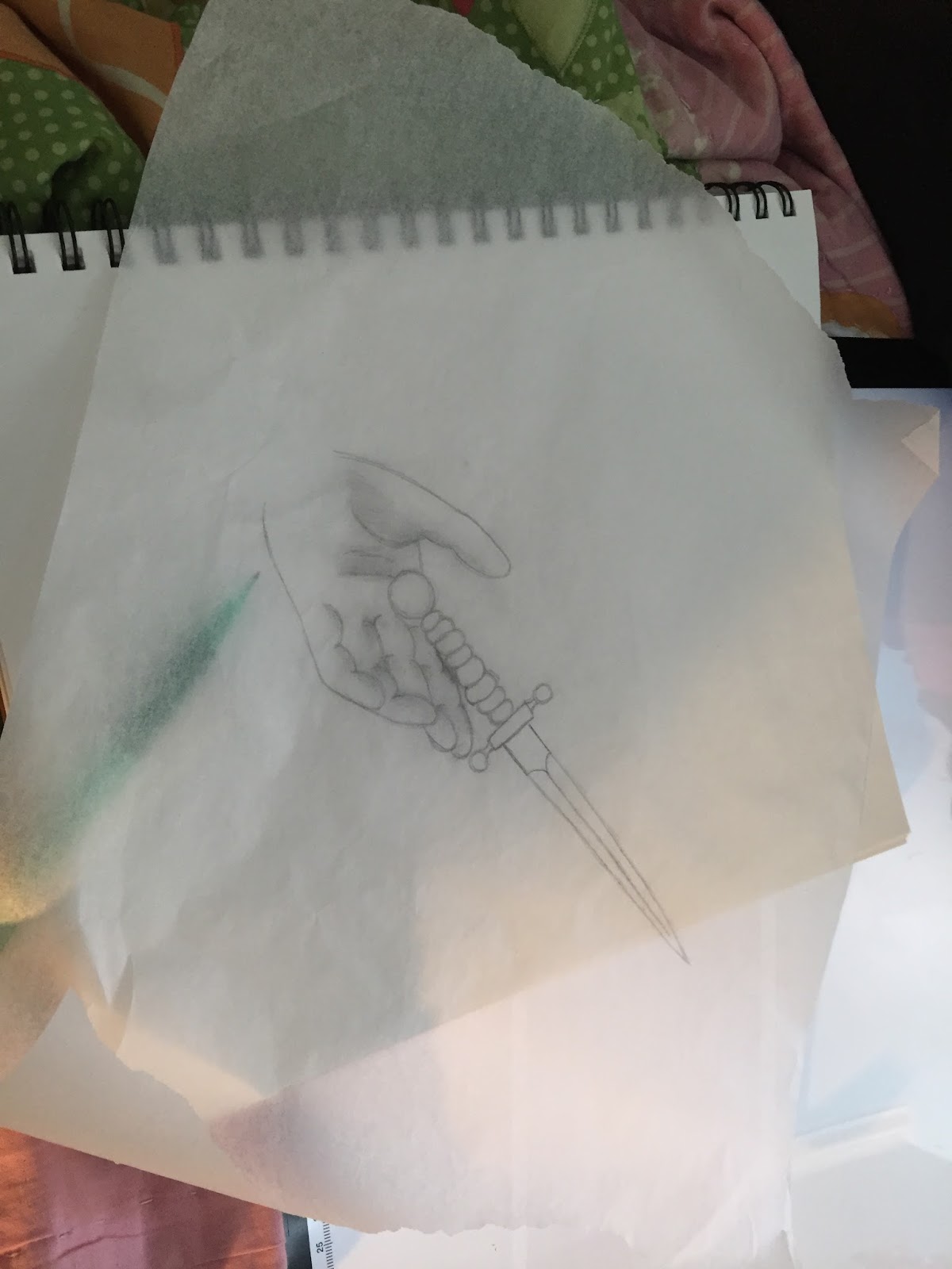
The purpose of this project was to show our knowledge of Macbeth in a creative outlet. My partner was William. We decided that we would start with the idea for the cover first. We had a debate between a sea turning red, a hand reaching for a dagger, or a combination of both. We then finally decided to do Macbeth’s hand reaching for the dagger because it was our favorite scene. We did not incorporate the sea because there would be too much going on at once. With the cover, we decided to have it hand-drawn because we thought it would be the easiest to do it in that manner. We then moved on to the characters. We decided to completely make up the characters so that we could be super creative with their bios. We also decided to have Macbeth performed at the Arden Theatre because it’s a local theater we would like to support. After that, we decided who would do what and when they should do it with a calendar that we made.
Shilo William
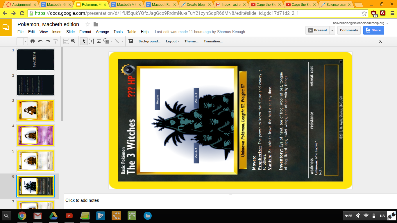
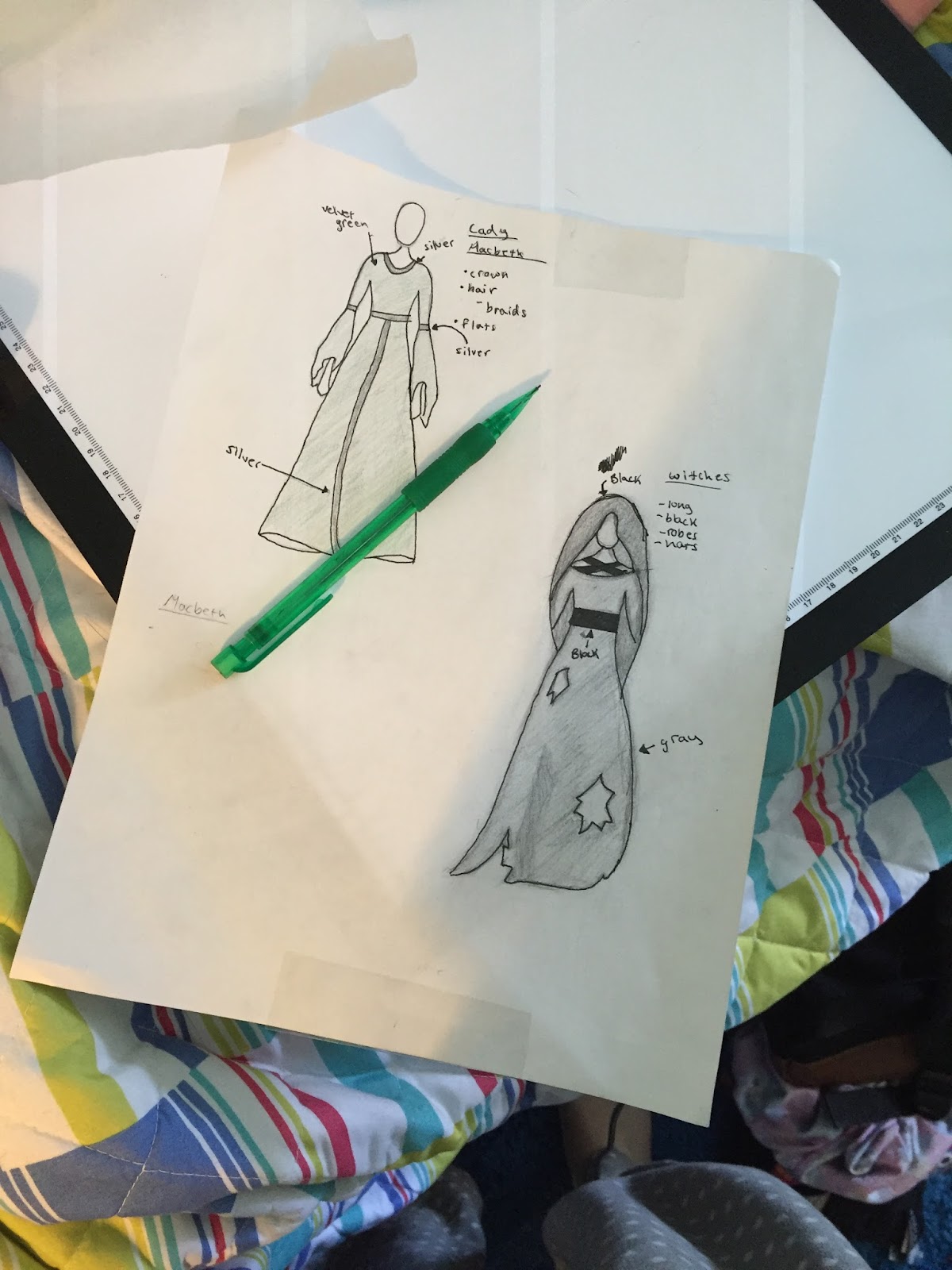
character descriptions and drawings - description and drawings of stages
design layout - summary
characters bio - design layout
rationale - rationale
advertisements - some of the character description
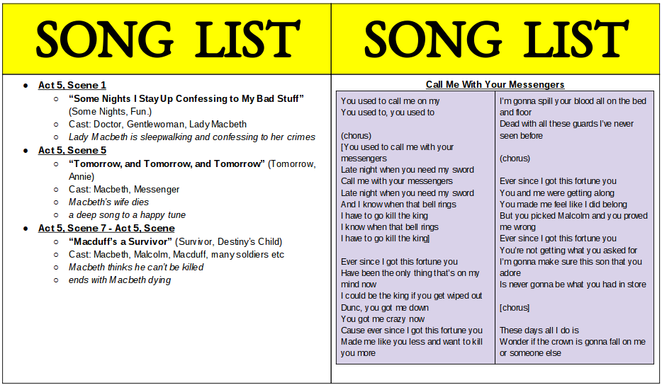
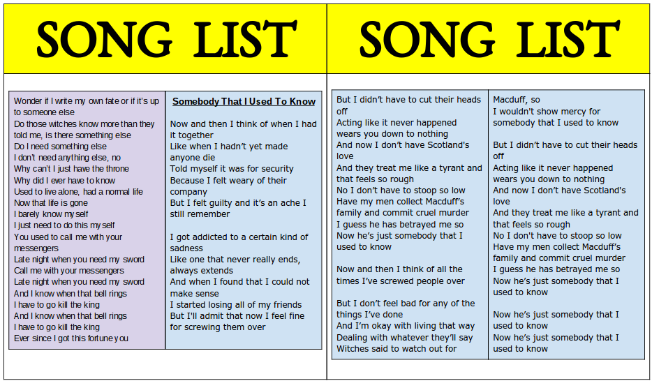
We chose Macbeth, Lady Macbeth, The Witches, and Macduff to create descriptions and drawings for because they are all very important aspects of the play. They cause conflict, insanity, etc. The settings we chose are as follows: outside Macbeth’s castle before and after Duncan’s death, Macbeth’s castle, Macduff’s castle, cave where the witches were hiding, murder scene of Duncan, and forest where Banquo and Fleance were pursued (war ground is the same forest). We choose these because these were the main settings throughout the play. Typically speaking, people only watch a play when they already know the story behind it. There is a summary found on the back of the playbill, but it is only a general overview.
With the advertisements, we wanted to showcase the local bars, pubs, restaurants, and stores in the Arden Theatre area because it made the most sense. We wouldn’t want to advertise something in Columbus, Ohio when we are in Philadelphia. Also I have been to the Arden Theatre before and I have seen some the advertisements they have, which were all local shops and such in the area.
The stage is designed for everyone in the room to be able to see the action. It consists of course of the main stage, curtains in the front for scene changes, a screen as the backdrop for easy background changes, and four columns of seats with exits in between each.
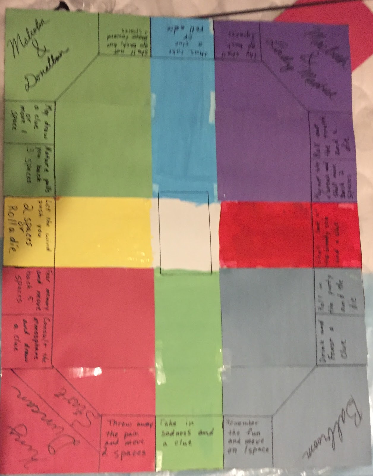
The audience is welcomed into the production by the Rota Fortunae, or wheel of fortune. As the opening set, it is meant to reappear whenever Macbeth does something to change his fate. The wheel is shown each time with a rotating animation created with the screen backdrop. The shield with the "M" represents Macbeth. Whenever something good happens to him, his shield slowly moves toward the top of the wheel. Whenever something bad happens, his shield starts to rotate to the bottom. When his life comes to an end, the shield falls off of the wheel.
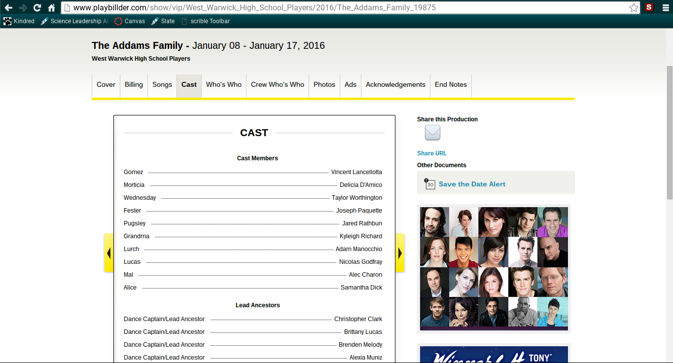
We looked at several examples of different playbills to base the design and layout of the components. After trying google presentations, we changed to using lucidpress. We found easier to set up the playbill and it looks nicer. This was pretty much our decision-making process.

https://www.lucidpress.com/documents/edit/b13c791d-5601-49f1-b1d8-f5fc35fec47f#?=undefined