Kayla Kelly 3/17/18
English 9
Ms. Giknis
You and the world projet
I have an animosity to animal abuse;I am ardent in stopping animal abuse
My Dog
Before After

How many animals get abused in the U.S
https://www.petsafe.net/learn/help-prevent-animal-cruelty
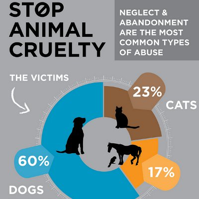
The Numbers are high considering the chart, 60% of all abused animal victims and 60% of them are dogs, 83% are cats and dogs, and if you think how many people abuse animal across the united state.The SPCA is is a good choice , because most time they have to euthanize animals if they don’t have enough room, but They said the don’t ethinzia adoptable animals, and they try to save as many animal as much they can which is also why it is also a good choice, and they are getting less animals in so they don’t have ethinize as much, and maybe more room. And animal abuse is a very serious problem, and SPCA is still good because they try to help as much as they can, it is like me trying to help every homeless person of the street and taking them in to my home I can’t do that to all of them, I don’t have enough room to do that, not to mention I have small house, so I would have to let go of some people like what SPCA does, but now they probably don’t do it as much ( they do not accept birds , dogs, cats, small animals). An the ACCT is a good choice too because like my interviewer said the ACCT is an open it take shelter,so they will take any animal bird, cats, dogs, etc. So if you know you can’t take care of an animal please take it to ACCT, or any shelter, because if you know you can’t take care of it it is a form of abuse and it is better off in any shelter. She also said that abuse is what they regularly see so don’t be afraid to take the animal in , but if it would be related to the police like your neighbor is the abuser then call the PSPCA.And if you help lessen the number of animal coming in , and to help people take care of animals, and if you don’t know how to take care of an animal but you enough money to take care of one then you can look on web sites and ask for help, don’t be embarrassed, there is more people like that than you think.and my other interviewer said that all my question where more for PSPCA for an iterview, but I was already running out of time for that when I got her response. My interviewer teeling me that I could hep ACCT with my agent of change
.
the other interview that said PSPCA was a better coice to interview fo r my questions

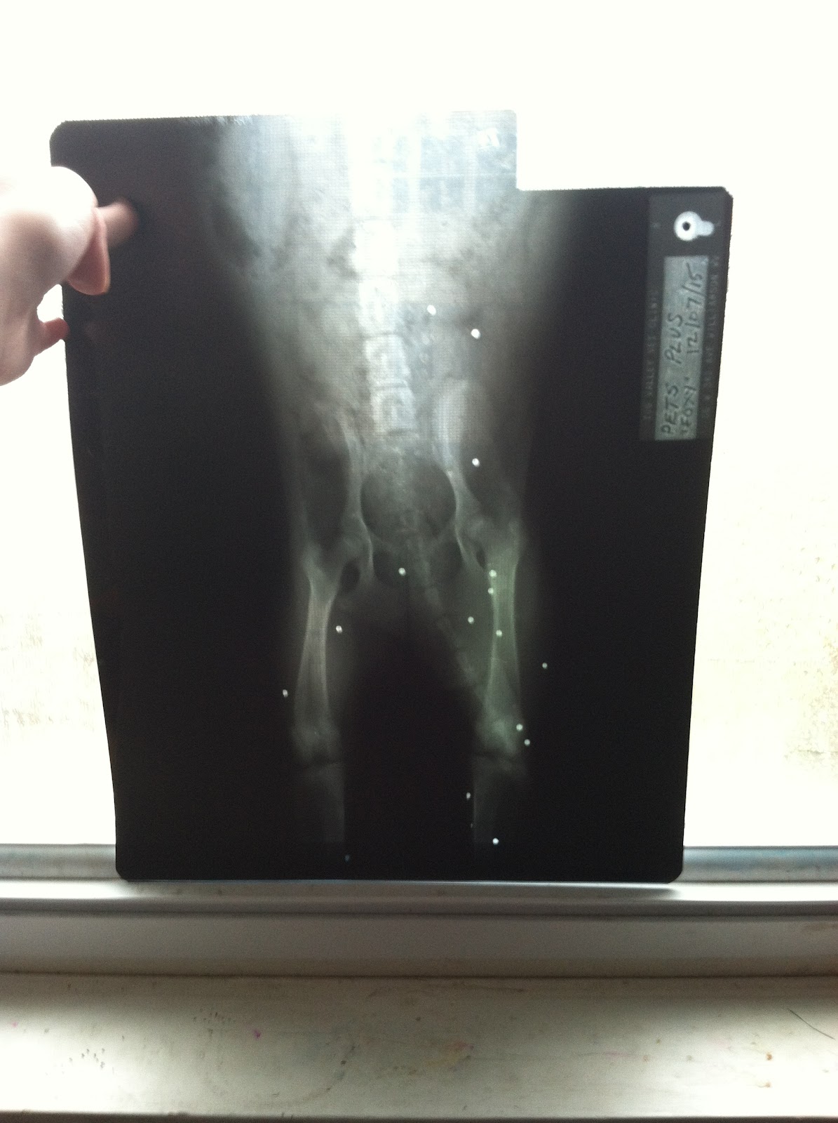
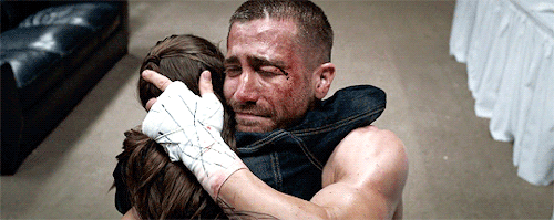
But Anyway, I have a dog(the first picture above) that is probably been through that, Although we don’t,know her back story besides her being shot 16 times and her being still here, not to mentions she had a couple of disease before the adoption center got her, and usually dog adapt and if she was wild she probably would not have a disease, but who knows she may have escaped, but I mean she is in my family's care for about 2 years in march 12th and she is very happy and she is always wagging her tail, beside when she goes for a car ride, tha vacuum goes on , and if we put on a tv show that has a gun shooting a one point like a mystery show,or if there is a fake gun like a nerf gun near, which would be the trama, but that is kind f why i am doing this.
Rabies: why most people terrorize dogs.
https://www.tes.com/lessons/ZfjkR0gtFqB-jQ/animal-rights
Dog are Abused 20% More Than any Other Animals in the U.S
But Abuse can’t get unnoticed, and that means we have to start speaking up, I mean the abuser doesn't have to know a thing, most calls are autonomous, and you don’t have to tell the person that you going to tell, like almost every one of my site say to do, because it is important.And what is even more important is that 100% of people who commit sexual homicide has a history of animal abuse which is kind of bothering that a lot of them do that, and it doesn't mean the other way around so if there is a neighbor who is abusing an animal doesn't mean they will commit sexual homicide so don’t be afraid to do your own actions and report them.Not to mention abusers, abusers don’t give the animals enough room for them sometime to breathe and grow, or give them too much room, like the whole yard but can’t use all of the yard because they are chained up from the picture in many sites. Which is again terrible, considering the effect, which is physical and mental health issues.Or animal hoarder, I mean they collect animals and are like I can take care of them even though they obviously cannot, but they completely think they can handle everything but they have a lot cats, dog, etc.
And to kind of wrap this up a bit, I read the laws(which I suggest for you if you care for animal, because one of my site suggests it too in one of the steps for reporting animal abuse). first, animal abuse penalty includes the officer to file a felony charge(a felony is a severe crime and is viewed severely by the society, and can include murder, robbery, kidnapping, etc)dog t fighting is already a felony, and breaks down into different grade pentaly’s base on how hard the abuse is. And veterinarians have civil immunity( where you don’t get served the punishment) now I don’t get too much of this but if they actually harm animals I think they will get charged because rules are rules, I think it is only for checking things from the dog and stuff. And a little bit obvious but if they commit animal abuse they will have to give animals. And did you know there is a new law that if someone abuse horse’s they will be charge the same charge as abusing dog and cats.
For my Agent of change I was thinking of having a bake sale and and giving the money to ACCT, and I will be ecpically easy because my interviewer is working in funraising and money depratment. I had limited chocies to do think, because I can’t just walk up to a person like hay your and animal abuser I will call the cops and make sure this animal is safe, and there is volenteer options but that means I might have to do it way more than I thought. I have students run philly style, durring saturdays an hour after school on mondays tuesdays and thursdays, and also have robotics, not to metion I also have green season in running which means I have to practice in the summer, and all of that make My time very limited, and I don’t know what hours they would like me to go in, plus I don’t know how to get there, I haven’t even travel in there over there a thousand time on the train but I haven’y been in there, not to metion it is know where neer the train station and the close septa there is 53 an I don’t even know where I could even catch that, and I can definatl not get another dog, my dog is j same way about elouse with other dogs and she is a nut case, we can take care of her but with my grandma, my grandma would be going nut, my grandma already freaks out over pretty much any thing we do (my dad, mom, brother, and me ,feel the her, way protective, always want to cleans, too much, but we love her any way). I could sent care packages, but I can’t take car of that, mostly likely my dog will rip up ANYTHING, money is better, she hates money and metal, when I show her money she is nor tempted to eat it.
Annotated bibliography
“Animal Cruelty”Learning to give,https://www.learningtogive.org/resources/animal-cruelty
The definition of animal abuse is the acts of violence or negling the animal on purpose or at least mostly on purpose.and it is important to know which ones are which because, police or animal control will know and asses the problem, like if it is dog fighting, and you say i don’t know abusing an animal in a backyard, they might think oh only one and not bring enough equipment, to ring them to a shelter. This abuse can cause physical and emotional pain, considering my dog whenever she hears gunshots(even on TV, plus we live near an country club that has an gun range) she gets scared and when we first got her she was jumpy and whenever and man/boy try to take her collar off she would growl, but when me or my mom took it off she did nothing(she is fine now and is very happy and understands that we will not hurt her and stuff because now my dad and brother can take her collar off) so that memory will live on.
Animal abuse is very cruel and hurtful to other animals (I do not trust SPCA because if they run out of room for animals, they ethiniza some animals)
It is very horrible because animal are just like us, they have feeling just like us, so it is very unfair for someone to do that to an animal.
2.“Animal abuse and Human Abuse: Partners in crime” PETA,https://www.peta.org/issues/companion-animal-issues/companion-animals-factsheets/animal-abuse-human-abuse-partners-crime/
Studies have shown that aggressive animal are likely to be abused because people are afraid and a coward. 100% of sexual homicide has a history of animal abuse.Albert Desalvo killed 13 women and abused puppies so it can back up my reasoning.
It is very usual for a sexual homicide person to abuse animals
And I am not surprised that aggressive animal get abused more,because again people are cowards
3.“Animal Abuse”Amarican Human https://www.americanhumane.org/fact-sheet/animal-abuse/
4.I didn't know that there was steps, I kind of knew some signs but I am not sure whether I will recognize the signs.owners often neglect their pets because they don’t know there pets need, but most of neglect is on purpose.but outrageous because human system can take calls right at that minute, but they get a lot calls so they will not take the call right at the moment.
“Reasons for abuse” wildlife rescue and rehabilitation http://wildlife-rescue.org/services/advocacy/animal-abuse/
5.Actions can be active and passive, like hurting the animal and not doing anything for the animal. Like some kid decapitated dog and stuff and setting fire on their tails and butts.Passive actions can cause severe pain to a dog or cat
“ U.S Animal Abuse records deleted-What we stand to lose”National geographics.https://news.nationalgeographic.com/2017/02/wildlife-watch-usda-animal-welfare-trump-records/
The roadside Zoo neglected the animals including premature death. And making the monkey Dehydrated while performing experiment on them that is just rude.and whipping elephants and changing them.
Extra websites:
http://placerspca.org/wp-content/uploads/2014/09/faqs.pdf
http://criminal.findlaw.com/criminal-law-basics/what-distinguishes-a-misdemeanor-from-a-felony.html
http://www.philly.com/philly/news/animal-cruelty-pennsylvania-libres-law-20170628.html
https://www.today.com/pets/aspca-adoption-euthanasia-s-down-animal-shelters-t109029


