Blog Feed
Lust for life
So what I tend to do is to think
of today as the past
Its funny when you comin in first
but you hope...
that it last
you just hope....
that it lasts.
of today as the past
Its funny when you comin in first
but you hope...
that it last
you just hope....
that it lasts.
Capstone
It's been established that my artists won't be able to draw what I originally intended by the deadline. So i'm gonna finish out my script till the end of the first arc and make a presentation for that and the pages that are already done (and those that will be done by that point.
Edit pic
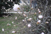
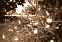
These are the picture I took with in the week. I like them because they were about some of the things I like. But I couldn't do much with photoshop im still a beginner so I did what I could with them. I really like what I did with car i think it looks so much better. Also with the food one. I really think it just looks funny to me but im sorry the words didn't come out bigger I had a problem with it.
A Day in the Life - New Zealand
I made a timeline showing a day in the life of an average 12 year old girl living in New Zealand.
This isn't very similar to my life when I was 12, but it's not so vastly different that I can't understand it. I've never lived in a coastal area, so right there are some differences, because I would never have had the chance to do many of the activities people in New Zealand can in their free time. I also have always lived in the United States, so some things like free public health care are completely alien to me, but pretty typical for the average New Zealander.
Many of the things will have stayed the same even at 40 that they were at 12. However, a typical person in New Zealand will have been long out of school by 40, and they will be working instead of going to class. Other than that the health care still applies, as do many of the activities available.
ManipulateMe.
In this project, we are supposed to use an editing software and manipulate our pictures. I used Picasa.
I took some of my pictures from my iPhoto but also some from my Flickr page.
I took some of my pictures from my iPhoto but also some from my Flickr page.
My 3 Photos.
For this project we were to take 3 simple photos and photoshop them. For all the pictures I edited I basically added a blue & pink type of gradient and dimmed it down. I also added lens flare, and different filters to each.
200 Photos Ian McClendon
Click here to view my photos!
Captured by: Ian McClendon, with help from Maura McClendon, and thanks to Catherine McClendon for letting me use her camera.
Captured by: Ian McClendon, with help from Maura McClendon, and thanks to Catherine McClendon for letting me use her camera.
Day In A Life: Fiji
I think a day in the life of a 12 yo girl in Fiji would be a bit tough because Fiji has been a source of children trafficked for commercial sexual exploitation and also a place for a few women from China and India to be trafficked too. They're forced to do labor and also sexual exploitation. I'm not exactly sure how old these women are or how old is too young for a person to be trafficked but I can imagine it not even being a problem.
If the child was going to school instead, I could imagine it still being a bit rough, even though the ministry of education is steadily trying to uplift Fiji's education system. The Fiji Education System is taken care of by the government, so is health care. "The Ministry of Education in Fiji is taking major steps to subsidize the educational fees and other costs related to it and hence bringing it under the affordability of everyone." But Fiji's economy is totally decreasing because tourism is down and sugar exports are in danger. And most kids usually miss out on primary schooling.
Die Bilder hier
The pictures below are probably my favorite simply because they are of my Harley. The top picture is the original and the on below this is the one I edited using an app called Pixelmator.
Well that just sucked.
Well i sung in the library again and when it was my turn to go up every left and it was so empty and i was so upset that i didn't do the whole song so. I'm extremely disappointed in myself. maybe next time i won't go up i don't know i'm just very upset now.
and now for Education....
Exxon-Valdez Oil Spill: Luna's Reflection
What went well?
I felt that all of us, as a group, were able to be flexible and listen to each others' opinions. We also did a lot of good research. I thought that our infographic had a lot of good information on it.
What did not?
Although we had a lot of ideas, we were not able to carry through with all of them. Mostly, this was because of some time management issues. We worked hard on the project every day during class, but did not work on it at home or outside of class.
What would you do differently next time?
I would put more time into the project outside of class. I would also try to incorporate more charts or graphs; we had text but no data representations.
How did you do for the 10 infographic tips:
I think that our group was most successful in being different (because our spiral with photos was a unique idea), being attractive (because our design was elegant in black and white!), and being accurate (because our information was spot-on).
I think we could have done a lot better in being visual (because, although we had photos, most of our info was text), being varies (because we just had text and photos), and being concise (because we had little paragraphs at the bottom).
Exxon Oil Spill
By: Trevor H
Sade S
Amber A
Alissa D
Sade S
Amber A
Alissa D
Exxon Oil Spill
Trevor H
Sade S
Alissa D
Amber A
Sade S
Alissa D
Amber A
Essays
I can't take doing this essay anymore T.T
PIZZA!
Papa John's > Domino's > Pizza Hut
2 Weeks from today
Prom is two weeks from today and I just went to get fitted for my tux yesterday. It felt as if no one had what I wanted. I went to 11th and arch with my Aunt, they didn't have anything. Then we made our way to Cottman Ave, where they only carried one type of tuxedos. Finally we went to a Men's Warehouse and Tux farther down Cottman Ave where they had what I wanted. Tomorrow I'm going to get fitted.
Graduation
39 days away ... seems so long
The Love Canal By: Emilisa Lopez, Jason Davis, Daniel Mambu
Worst man made disaster in US history: Tennessee Coal ash spill
This is a screen shot of our history project; our project consists of the governments handle of the situation, whats going on now and the who, what, where, when and why involved. Our topic was the worst man made disaster in US history the Tennessee Coal Ash Spill.
Reflection:
Our group had a slow start with this project but in the end we pulled through. I learned a lot about the Tennessee Coal Ash Spill and much about the disasters that other students presented. We had a few ups and downs, especially meeting deadlines we set for each other but we collaborated and found incredible amounts of information to learn from. I think if we could have been a little more organized if we practiced before presenting but it was a lot better the second time around.
Because most of us were doing individual research and it was all put together by one person, while presenting we were a little unorganized. However by the second time we had everything together and could tell our story. I think that if everyone would be a little more creative during the infograph part it would have made our project much more attractive.
Be Concise
Be Visual
Be Smarter
Be Transparent
Be Different
Be Accurate
Be Attractive
Be Varied
Be Gracious
Be Creative
I think we worked very well with being concise, different, smarter, accurate, visual, varied, creative, and attractive. Maybe not so much in the transparent and gracious, because as I said before the first group we presented to was a little messy but got a lot better after the that. I dont think we put up enough information in order to be transparent and im not sure how we could have been gracious in this project.
By Marina Stuart
Group Mates: Elona M, Shi F, and Mustapha I.Elona Myftaraj
Marina Stuart
Shakeelah Finney
Mustapha Idriss
Three Mile Island Infographic: Natalie, Barry, Tyrone
Natalie's Review:
I think that my group did a really good job of getting our information onto the graphic in a clean and attractive way. I definitely feel that our infographic is very C-R-A-Py. This is one of the things that we did very well: the organization and presentation of our infographic. I think that we could have done a better job of communicating things amongst ourselves and getting things done in a timely manner. Next time, I would start researching our topic with my group a about a week before the visual is due. Though we did this individually, we had a hard time getting things done on time for the whole group because we were not working together when creating the infographics. This is because we divided the job up in three. Everyone in the group had to research one thing and create a visual with our findings. Though we completed these int he end, and were able to bring them all together on our final infographic, I feel that it would have been less stressful on all of us if we would have communicated a little more about our progress.
Ten tips to effective infographics:
1.) Be concise: Try to represent your point through pictures/visuals more than you present it with your words. After a while, people are going to get tired of reading, so if you can get them to understand your point with a picture, this will be more interesting to them.
2.) Be visual: Visuals catch a person's eye, so try to use pictures as your primordial means of presentation.
3.) Be smarter: Try to tell a story with your visual. If you can do this, you will have an effective infographic.
4.) Be transparent: Tell the truth on your infographic. This is not the place to hide things or leave things out. Your should always put all of the most important information on your graphic.
5.) Be different: Try to think of designs or visuals that other people have not thought of yet. Make it interesting and original.
6.) Be accurate: Be sure that all of the facts that you put on the infograhic is correct. After seeing how professional your infographic is, people are going to believe the things on it, so make sure that the information you are feeding the public is true and accurate.
7.) Be attractive: Though you want to use pictures as your primordial means of information, organize them in a neat way. You can't have too many or too little pictures on your infographic. You have to have a balance. Also, use attractive and bright colors or colors that mesh well. This will make your infographic pretty and enjoyable for other people to look at.
8.)Be Varied: Use different kinds of graphics, use signs, and other kinds of visuals on your infographic, also, try to place the different visuals on your graphic in different locations to catch the reader's eye. This will catch their attention even more.
9.)Be Gracious: Though you want to be concise with your information, you also want to give them enough information for them to know what is going on. Do this in a professional and kindly manner.
10.) Be Creative: Try presenting your information in different types of ways like with cartoons or placing your visuals in way that they form the shape of something. Be creative with your information.
I think that my group did really well in giving the public plenty of information and making the visual look organized and neat. I don't think we were as creative as we could have been. I think this had a lot to do with the fact that we did not have enough time to have fun with the graphic and we were trying to place our visuals together on one whole infographic in the neatest and most professional way that we could.
Anniston, Alabama PCB Poisoning
Group 7:
Vichhay Roeung
Nikhail
Semaj
http://tinyurl.com/3ow2gev
Our project focused on the PCB Poisoning in Anniston, Alabama, that were caused by the chemical corporate giant Monsanto. For years corporate giant Monsanto have been dumping the toxic chemical (PCB) into the surrounding environment of Anniston. Infecting the citizens of Anniston’s livestock, food source, and water supply. Creating hazardous environmental issues the city of Anniston.
During the project, the things that went well were the research aspects of the project. As there was a lot of information, most not so useful but still good background information to complete the story of the disaster. What did not go well was the amount of group collaboration as the final product was completed with only one member’s part of the project. What I would do differently is have better group collaboration and punishment for incomplete parts of a group member.
Be Concise - 9
Be Visual - 8
Be Smarter - 8
Be Transparent - 7
Be Different - 6
Be Accurate - 9
Be Attractive - 8
Be Varied - 6
Be Gracious - 7
Be Creative - 7
Picher, Oklahoma Lead Contamination
TJ Nicolella, Emma Hersh, Nailah Adam
click picture below to see it larger
click picture below to see it larger
Haiku
Born from the islands
The ocean drowned in her tongue
She be my grandma