Blog Feed
Ben Fink Capstone
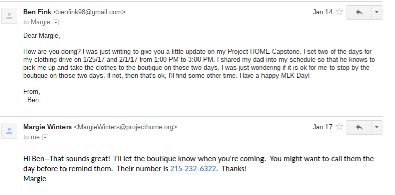
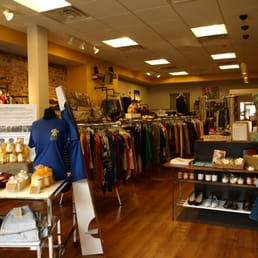
For two weeks during the summer of 2016, I volunteered at Project HOME, a Philadelphia-based homeless advocacy organization that provides homeless people with food, housing, job training, medical care, and education. While my work was largely shredding old documents in the medical clinic, my experience working with Project HOME inspired me to do more to help combat homelessness in Philadelphia. Thus, I took it upon myself to dedicate my CAPSTONE project to supporting the organization. For two weeks in a row, on Wednesday after school hours, I had set up a clothing drive, wherein I had my fellow students bring in any new or gently used clothing for me to donate to the Project HOME boutique. I managed to get them to know about my clothing drive both by pasting flyers throughout the school and writing about it on facebook. In the end, I ended up donating more than a dozen bags of clothing to the boutique, both from my fellow students and from friends outside of school. While I worked on my clothing drive and frequently checked in with my CAPSTONE mentor, Margie Winters (who was the director of the two-week program I was working for last summer), I also did some research and learned many interesting (and very disturbing) facts about homelessness. For instance, I learned that in Philadelphia, an average middle-class worker has to work 81 hours a week at a minimum wage of $7.25 just to pay the rent for a single-bedroom apartment. I also learned that at a national level, 800,000 more children were in poverty in 2004 than in 2003, with 1.2 million more living without health insurance. This research helped me to realize just how horrible a problem homelessness is, and strengthened my conviction to lend the homeless a helping hand in any way I could. I realize that my clothing drive may be very small (and only works at a municipal level), but I am confident that every little act of kindness can help to end the problem of poverty once and for all.
Sources Cited
"About Us." National Coalition for the Homeless. National Coalition for the Homeless, 2014. Web. 28 Dec. 2016. <http://nationalhomeless.org/about-us/>.
The National Coalition for the Homeless is another organization that advocates for the rights of homeless people. This one is composed of currently or formerly homeless people, activists, and community service providers dedicated to ending the problem of homelessness. The "about us" section of their website will help me to demonstrate how people are working the solve the problem of homelessness at a national level, rather than simply in Philadelphia. It will also encourage them to donate to or support more than one organization that helps the homeless.
"Criminalization of Homelessness Increases in U.S. Cities." National Low Income Housing Coalition. November 21, 2016. Accessed February 01, 2017. http://nlihc.org/article/criminalization-homelessness-increases-us-cities.
This resource will help me to show my viewers just how horribly homeless people are stigmatized in the United States. It demonstrates how people in certain cities can be arrested for no reason other than that they are homeless and can't find food, clothes, or shelter. As a matter of fact, over 187 United States cities criminalize homelessness and the prevalence of laws that disenfranchise and criminalize the homeless have been increasing since 2006.
"Facts on Homelessness." Project HOME. Project HOME, 2016. Web. 31 Dec. 2016. <https://projecthome.org/about/facts-homelessness>.
This source will further help me to get some concrete, numerical information on homelessness in Philadelphia. It lists annual rates of homelessness in the city, the age groups of the homeless, and the primary causes of homelessness. My audience might not be able to grasp a complete national scope of homelessness, so this source will help them to get a good idea on how much Philadelphia is affected.
Gambrione, Andrew. "A New Space for Homeless Youth Quietly Opened in a Church Downtown." Washington City Paper. Washington City Paper, 8 Sept. 2016. Web. 31 Dec. 2016. <http://www.washingtoncitypaper.com/news/housing-complex/article/20833081/a-new-space-for-homeless-youth-quietly-opened-in-a-church-downtown>.
This article is meant to show the light at the end of the tunnel of homelessness. In it, we are given information about a new space for homeless youth that has been opened in an old church in Washington D.C. This center for homeless people of all ages offers free meals, HIV testing, counseling referrals, recreational activities, and movies.
Groves, Martha. "VA Unveils Housing for 65 Homeless Veterans." Los Angeles Times. Los Angeles Times, 8 June 2015. Web. 31 Dec. 2016. <http://www.latimes.com/local/california/la-me-veteran-housing-20150609-story.html>.
This semi-recent current events article will be meant to add a silver lining to the dark cloud of homelessness in America. While I'm trying to stress how big a problem poverty is in the United States, I don't want my project to be entirely doom-and-gloom. What better way to keep people's hopes alive than to inform them about an ingenious way of keeping homeless veterans happy, healthy, and comfortable?
Kneebone, Elizabeth, and Alan Berube. Confronting Suburban Poverty in America. Washington, D.C.: Brookings Institution, 2013. Print.
This is one of two books I ordered off of Amazon for my bibliography. In this book, we explore the conditions of suburban poverty, as well as diving into some statistics on American Poverty, the causes of poverty, and what solutions the American People have come up with to solve this problem.
LaMarche, Pat. Left out in America: The State of Homelessness in the United States. Portland, Me.: UpalaPress, 2006. Print.
While the other book I ordered from Amazon explores statistics and causes of poverty, this book will serve as a way to connect me to those suffering the effects of homelessness. The author, Pat LaMarche, spent fourteen days exploring the United States and living in homeless shelters in order to connect with the homeless. This way, he was able to know exactly what types of problems homeless people face in different states.
Lombardo, Paul. "Social Origins of Eugenics." Social Origins of Eugenics. University of Virginia, 2014. Web. 29 Dec. 2016. <http://www.eugenicsarchive.org/html/eugenics/essay8text.html>.
In the late 19th Century and early 20th Century, many regions of the United States began an unethical population control method through the use of eugenics. This was the theory that certain personality traits or physical taboos could be genetically passed down through the blood. 1914 was the year wherein geneticist Harry Laughlin proposed a law that forcibily sterilized the "socially inadequate." This basically meant that all of those who lived "outside" of the social order or on the fringes of society would be forced to have their ability to reproduce removed. The umbrella term "socially inadequate," included the homeless, orphans, mentally challenged people, insane people, physically handicapped people, and alcoholics. This article will come in handy because it will show readers just how much homeless people have been stigmatized and persecuted throughout history.
"Our History." Project HOME. National Healthcare for the Homeless Council, 2016. Web. 28 Dec. 2016. <https://projecthome.org/about/our-history>.
This article is located on the website for Project HOME. In it, users can take a look at some of Project HOME's premier accomplishments from 1989 all to the way up until 2016. This source will come in handy because it will help me to demonstrate to my audience how old Project HOME is and how it has been helping to break the cycle of homelessness and poverty.
Scullion, Mary. "Commentary: In Philly, Memorial Pays Tribute to the Homeless." Philly.com. The Philadelphia Inquirer, 21 Dec. 2016. Web. 27 Dec. 2016. <http://www.philly.com/philly/opinion/20161221_Commentary__In_Philly__memorial_pays_tribute_to_the_homeless.html>.
My project is centered around Project HOME. Sister Mary Scullion was one of the principal founders of this non-profit homeless aid organization. I'm gathering research on homelessness and what we can do to help solve the problem, so who better to ask than the founder of Project HOME herself? As an added bonus, the first three paragraphs are about three formerly homeless people who Project HOME presumably helped get back on their feet. They would continue to help advocating for the homeless to the end of their days.
Scullion, Mary. "Commentary: Philly Nurtures Pope's Seeds of Justice and Mercy." Philly.com. The Philadelphia Inquirer, 27 Sept. 2016. Web. 29 Dec. 2016. <http://www.philly.com/philly/opinion/20160927_Commentary__Philly_nurtures_pope_s_seeds_of_justice_and_mercy.html>.
In this article by Sister Mary Scullion, readers are given information about how Pope Francis' visit to Philadelphia caused advances in homeless advocacy. The Holy Father is a well-known advocate for social justice and a firm believer in God's mercy. In honor of this visit, Project HOME helped raise more than $1.4 million to address the needs of the homeless. The U.S. Senate also introduced some new proposals to assist homeless or at-risk teenagers. This article is useful to me because it will help reassure my audience that despite all the problems homelessness entails, there is still hope for humanity.
Final Stamp Design
Negative Space
Final Stamp Design
Softball Makes Playoffs
I believe .
This I Believe
Things Happen for a Reason
A Private Post - Ayala
DIVERGENT (Final Stamp Drawling)
Final Stamp Design
The assignment was to cut out a design for a stamp in negative space. We had to pick a symbol or a design that reflected our personality. I have always identified with my astronomical sign, Aries. I knew that I wanted to add it into my stamp because it is a big part of my identity. I also wanted the piece to be simple and striking. I decided of coloring half of the S because it is defined and sleek. I wasn’t sure how I would put these two symbols into one stamp, but I didn’t want them to be separate. I decided on an overlapping design and I’m glad that it turned out the way I envisioned it. Explain the importance of negative and positive space and how you used it in your design. Negative space allows the view to see your piece exactly the way you want them to. It makes your piece stand out with bold color. I used negative space by cutting away the parts that I didn’t want the viewer to see. I kept the dark, solid outlines and the middle of the S to help convey the message of my personality. One thing that I learned was that colored paper is very helpful. I drew and pasted my stamp on white paper, when I should have cut it out on black paper. This would have allowed the black parts to stand out even more. Ms. Hull also said that I would have trouble cutting out thin lines, so I made them thicker. This not only made it easier to cut out, I also helps the stamp with its striking image.
Creative Print
God of Morality- Afi Koffi
Final Rubber Stamp
The writing process for this was very long and intricate. First, I brainstormed things that I believed described myself. These words were Outspoken, Short, Creative, Nature, Artistic, Supportive, Extroverted, Talkative, Pessimistic, and Makeup. I eventually tried to narrow these words down to three words which I thought described me the best. These words were nature, artistic, and creative. To sketch my design, I had to talk positive and negative space into account. I decided to use different symbols to represent each aspect of my personality, but make them outlines so the detailing does not get lost in the negative space. I ended picking up 5 symbols to represent my three words. I put my eyes to show me looking up at the things that I love. I put a book and a music note both to represent my creativity. I enjoy reading, writing, singing, and playing piano and I believed these two symbols represented my different forms of creativity. I put a paintbrush to show my artistic abilities and my appreciation of art as well. Finally, I put a flower to show my love of nature and being outside. I made all of them silhouettes so the positive space would be easy and cut out my stamp. I had to take out some of my detail when I realized it would be difficult to replicate when put into positive/negative space. Overall, the project was not difficult but required a lot of thought and time.
Final Stamp Design
Rubber Stamp Cutout
I made this to represent me because I needed to make something that describes me. I made a video game controller because I really like video games and that Pacman symbol is only there because I like Pacman and the C and the L in Pacman are my first initials which is Charles and Langley. I also drew the chord to show that I’m connected to a few people meaning that I got a good amount of friends. Also I use the negative space for the buttons and the logo so they can stand out the most to whoever is looking at this. Negative space is basically the space that is in the white, and I used negative space to my advantage so they can be empty in the buttons. I first drew this game controller, and then I cut out the game controller it self and then the buttons and the logo because when I glued it on my sketch book it allowed me to make a good piece of art and appealing to look at. This has to be by far the best piece I made this year with construction paper. As I was making this piece I learned how important negative space and positive space really is because the it’s like a style. If you use positive space and negative space for another, you might display a different mood. It all depends on how much of negative space or positive space you use. I was really trying to catch a more cheerful mood, but the colors I chose kind of brings out a more negative vibe, and that is not what I want. When I was brainstorming what words described me I was thinking more of the lines like, nice, kind of cool, smart,ect. I had a lot of other designs before this like a tiger or a wolf but, it didn’t really feel like me. When I drew the video game controller however it felt like it described me the most.
Rubber Stamp Cutout
I think my logo/stamp perfectly symbolizes me and who I am. The words I chose to inspire my piece were gay, kermit, lizard, drawing, long, creative, passionate, dramatic, opinionated, angry. Through each assignment, I refined my design till I finally decided for the focus of my stamp to be Kermit the Frog. I chose Kermit because he is a character I strongly relate to. The parallels between us are uncanny. My friends actually call me Kermit because they think I bear such a striking resemblance to him. He is constantly stressed like me, and he pursued a career in the arts. He specializes in yelling at people and having existential crises, and is featured in many spectacular memes. I originally wanted to include a pencil and paintbrush to represent my creative ability and artistic spirit felt the logo was too busy with them.
Understanding negative and positive is important for artists. The positive space is my drawing is the lines made with the cutout of Kermit. I think that only using negative space in my piece and not adding much detail really makes Kermit pop. I did a pretty awful job of cutting out my stamp, and I probably should’ve cut it out one paper at a time instead of one paper over the other because it was really hard to cut out. It ended up looking pretty rough, but the rough-hewn look was kind of what I was going for. I learned that sometimes for negative space to work effectively, a simple design is needed.Final Stamp Editor
Final Stamp Editor
Final Stamp Design
Final Stamp Design
When we started this project I had to choose between three words and immediately the first three words that came to mind were impatient, overachieving and leader. Out of those three words I choose the word impatient as the word to symbolize me the most. If you were to ask someone to describe me, one of the first things they would say is that I am a impatient person and that is not necessarily a good thing, but it is what makes me. As I was starting to design the actual symbol I was searched up the word impatient and images of clocks kept showing up so I decided to use an image of a clock to symbolize me. For me the clock symbolized time passing which to me means something that has to go by fast. I sketched out the design and then passed it on to construction paper.
The positive and negative space in my design was used as a way to contrast and symbolize how I want the time to go by fast , the negative space was white, and it won’t because time is time, the positive space. It also helped to pop out the colors and form the figure of the clock. In My opinion having both positive and negative space is really important to make a image pop. Whether that negative space forms odd shapes or forms that shape the conveys a message the contrast should be there. Positive space is just as important it helps the colors contrast against the negative space. It is a tool that is very useful.
Final Stamp Design
In this process I struggled. I had a hard time understanding what to cut and what to glue. In the end product I guess I can say I finish better than I thought I would. This stamp represents me because I would describe myself as a skinny, imperfect, and delicate person. When brainstorming I used words such as; unique, imperfect, pretty, intelligent, etc.
Throughout this assignment I learned what the background and steps of the stamp. At first we practice with cutting out a design already made. I did it wrong at first so I had to do it again, until I finally finished successfully. I finally understood that the negative and positive space we had in each picture. We made our very own designs.We learned they couldn’t just have lines, everything had to be shapes. I figured finally how to cut out my imperfect flower and it turned out pretty good.Final Stamp Design
Hello! My name is Asnain Khan and I did this project for my Art class. For this project, we had to brainstorm 10 words that represent us, pick three words and make them into a visual representation of us. Then, we sketched out our stamp and created a 7x7” rubber stamp in our sketchbooks the with correct negative and positive space. After that, we took our final rubber stamp design and cut it out of a single piece of construction paper. Which we then took the positive space of the rubber stamp design cut out and glued it into our sketchbooks.
When I was brainstorming, I used words such as, thoughtful, honest, hard worker, reliable, responsible, talented, successful, supportive, supportive, passionate, and open-minded. I chose the word honest. My stamp is a logo that represents honesty. This logo represents how honest I am. As you can see, this logo is in positive space. Positive space refers to the main focus of a picture. Negative space refers to the background of the picture. To end up with positive space, I cut out the negative space. Everything that is black is the positive space of my picture.
When I was sketching my design, I had a couple of problems. First, I didn’t know what to draw that represent honesty. Then, I thought about doing this. I had a problem figuring out how I can get positive space. But I figured out how after a while. This is how I got my logo.
I learned a lot about positive and negative space. I learned that positive and negative space play an important role in determining the overall composition in a work of art. I also learned that, positive space is best described as the areas in a work of art that are the subjects, or areas of interest and negative space is area around the subjects, or areas of interest. I enjoyed creating both positive and negative space.