Blog Feed
Self and Systems // Kyla, Ivan, Jayden, and Louisa
The Hunger Games through the Marxist and New Historicist Lens
Gangsta Rap Era- Justin, Raymond, Tyreek, Genero, and Alan
"Playing Like A White Man" : The Struggles of Black Women in the Jazz Age
Self and Systems: Drugs / Alcohol Addictions
zey,bri,josh, azirah
Self And System: Color Blindness
kishara's video
System of Fear
by Laila K., Monie D., Amani H., & Cianni M.
Analysis of Lemonade by Miguel, Amaris, Amado, Eli, Mindy
System of Adoption
https://www.youtube.com/watch?v=yhFzKdxuG0g
Self and Systems: Music
Website Lesson-Sukainah Hasan
Website Lessons Day 1
Speech and Debate Team at State Qualifiers
The SLA Speech and Debate team sent two entries to PHSSL state championship qualifiers at LaSalle College High School last Saturday.
Senior captains Lydia Anderson and Tigidankay Saccoh competed in Public Forum Debate, while junior Nzinga Suluki took third place in Oral Interpretation of Prose.
Nzinga is now the District 11 Alternate to the State Championship tournament on March 16th and 17th.
Lydia had already auto-qualified for the tournament in Impromptu Speaking, while Tigidankay is similarly auto-qualified for Congressional Debate in the House of Representatives.
Square
Shoe
practice tables
Minimum Wage in Pennsylvania
Did you know that the minimum wage in America is $7.25 an hour? Meaning that you make just over $15,000 a year for 2080 hours of work. And in Philadelphia, that is nowhere near the estimated minimum amount needed to live off of. According to the Huffington Post, you would need to make just under $60,000 to support a family in Philadelphia and $15,000 certainly isn’t enough. America ranks 11th in the world for the highest minimum wage according to OECD. Australia's minimum wage is over $15 an hour and 80% of the country makes over 5% more than the minimum wage.

The 2017 minimum wage by state in the United States. Pennsylvania is tied with many other states for the lowest minimum wage.
Pennsylvania is 1 of 3 states who host one of the 10 largest cities in America who have the minimum possible wage. When growing up and going to inter-city schools, I notice how some kids can’t go out with their friends, because they don’t have the money to. The government is limiting the amount of money people can make, and it is causing children to be unhappy with their lives. Everybody deserves to spend time with their friends, to go get pizza or see a movie.

Chart of the current minimum wage and the future of the US minimum wage. Source: US Gov.
When a father figure isn’t around, it is difficult to support a family when you have to take care of your children and also work. According to The Heritage Foundation, 4.2% of minimum wage workers are single parents. That is around 2 million people in the US.
Annotated Bibliography: here
Safe Sex in Philadelphia (or lack thereof)
A teenager in the United States is likely to experiment sexually at some point before adulthood. While perfectly natural and fun, if preventative measures are not taken against STDs, STIs, or pregnancies, embarrassing and possibly threatening ailments can change teenager’s life forever. There are so many things that can be done to prevent something like this from happening. I want to highlight this exact point throughout my project, and make prevention an easy thing to do. I am interested in the subject of safe sex awareness because of the fact that if you are still in highschool, you should NOT be in a situation where you have a child, or need to deal with an unflattering illness for years on end. That is something a student should never need to worry about!

In this diagram, it is illustrated that Philadelphia has a large amount of STDs, when compared to other cities. Philly has a very high rate of both gonorrhea and chlamydia.
In this diagram, it is illustrated that Philadelphia has a large amount of STDs, when compared to other cities. Philly has a very high rate of both gonorrhea and chlamydia.
I have zero personal connection to this topic. The people I know that do choose to have sex usually do it safely, and make it a casual and not unusual thing. I admire this, because I feel like there is a weird stigma towards safe sex, or rather, having to worry about putting a condom on, having a conversation, or making sure you’re ready before sex. It matters to me that this stigma is wiped away, and replaced by an enthusiasm to be safe! That being said, it is important for teenagers to realize that it is essential to take precautions and be careful before, during, and after sex.
Within the various resources I explored, I grimaced at the various statistics, stories, and other sources that ultimately paint a disgusting portrait of chlamydia, different pregnancy rates between races, and infertility. The CDC reported in 2015 that 229,715 children were born to 15-19 year old women. While actually being lower than previous years, the CDC incidentally reports that that the U.S has a “teen pregnancy rate [which is] substantially higher than other western industrialized nations”. While unwanted teen pregnancy certainly affects the individual, it’s essential to consider how the people living among this problem go through. The CDC has also reported that “teen pregnancy and childbirth accounted for at least $9.4 billion in costs to U.S. taxpayers for increased health care and foster care, increased incarceration rates among children of teen parents, and lost tax revenue because of lower educational attainment and income among teen mothers.” Pregnancy and STIs can be avoided using multiple tools and dialogue. There are multiple tools (condoms, lubricant, dental dams, etc.) that make sex between you and another person safer, and more comfortable.

Conversation and preparation before sex, albeit awkward, can make sex easier, and possibly less harmful. Many agree that even though it may be weird to talk about wearing condoms, or using other measures to prevent STDs, it is better than a possible lifetime of embarrassment from an STD. (image gathered from this source).
To conclude, throughout my research, my pre-obtained knowledge of the subject I decided to dive into was added on by facts I had no idea were true! Who knew that race, economic status, and other factors contribute to pregnancy statistics? Prevention is a very easy thing to accomplish with you and sexual partner. When you take the precautions needed before sex, both you and your partners are safer as a result.

Such as the ones included in this photo, there are many ways to use birth control. Often, you can find condoms or other methods to prevent pregnancy/STDs for free in school, or outside location.
Transphobia in America
A sensitive social issue in America is Transphobia. For clarification Transphobia is “intense dislike of or prejudice against transsexual or transgender people” by word of the dictionary. My goal in learning about this topic is to educate myself about a community I am surrounded by. The reason I leached to this social issue is because I am a Transgender male. I find this topic underrated and I want to open it up to the world more. Although my topic is centered to a specific group of people, it connects everyone in a different way. These people are apart of family, have friends, are someone’s coworker or partner. Events that occur to trans people effect others lives and emotions.
Ever since the precidency of Donald Trump sprung on the United States, hate towards groups of individuals has become more exposed due to the bravery our presdient gives to people who spill hate speech. In 2016 after Trump was elected the rate of hate crimes went up by 300. Since January 2017 at least twenty-five transgender individuals have been killed, 80% are transgender people of color, the most ever reported. The Trump administration has continued to put public attacks on the transgender community including his attempt to ban transgender people from the military.
The first reported transgender death of 2017 was on January 4th, Mesha Caldwell was a fourty-four year old African American woman who was a hair and makeup artist. She was shot to her death on a Mississippi road. Her murder is still being investigated to this very day but this is seems to be a trend among the other twenty-four deaths that have occured since 2017. Since the beginning of 2018 at least four trangender people have been shot or killed by any other violent means. There is 1.6 million to 2.8 million homeless youth in the United states, twenty to forty precent of those children are trangender youth. More than 1 in 10 trandgender people are evicted from their homes. When seeking for a homeless shelter most do not have LGBT friendly communities and supplies. 22% of homeless transgender people are assulted while staying at shelters. The ignorance to the community has been recognized and several people have made their own shelter specifically for LGBTQ people and if not they are open to making theirs LGBTQ friendly. For example, Substance Abuse and Mental Health Services Administration (SAMHSA) has promoted and created educational rescources for serving LGBTQ youth.
Sexual abuse is a big factor in most LGBTQ people’s lives. 47% of transgender people are sexually assualted during some point in their life. One in two transgender people are sexaully abused or assulted. Transgender youth and Transgender people are color are more commonly sexually abused than anyone. 13% of African American transgender people are sexually assaulted in their work place.
My research has impacted my thoughts on this social situation because I always knew hate crimes occured but I never thought about how frequently they occur. Social actions to handle this problem occur all the time, including, awareness on social media, protests and contributing at local activist centers. Hate crimes transpire every day but its up to the youth to set a path of equality and freedom of speech for the generation after us. It’s up to you if you take part.
Why are colleges so expensive?
Why are colleges so expensive?

Click here for more info.
This graph shows how colleges are getting more and more expensive over the years.
Colleges are so expensive these days. It’s one of the main reasons to why some people don’t or can’t go to college. But it doesn’t make any sense. If elders are always trying to tell you to get a good education, then why is education so expensive? I have a personal connection to this topic because I am hoping to eventually go to college. Also, my sister is in college and she is struggling to pay for college. It’s important to know because almost everyone wants to go to college and get a good education. Colleges are really expensive. But why? It’s because colleges know a few things according to Andrew Jenson. They know that you need college more than college needs you. Colleges are also trying to compete with each other at all times. So when one not so famous college goes up the famous colleges like Drexel and MIT goes up to look better.
Another reason college is so expensive is that they need to pay for a lot of things, from staff and building says Wendover Productions. Paying the right staff for things kids are interested in means more money. When a new popular major comes in, the college has to spend lots of money to find a good professor to teach that major. So money is used to get professors. Professors are used to attract students. And students are used to get more money. Also, the colleges want to attract students with a nice building. The bigger and more attractive the building, the more expensive the building is to make so colleges need to cover that cost. Lastly, there is Federal and State money. Federal and State money helps colleges cover the cost.But with less federal and state money the more students have to pay.
click here for more info.

This graph shows that inflation is a big reason on why colleges are so expensive. Also, it rises much higher than any other thing like house prices.
Some countries like Germany, Sweden, and Norway have free college. You're probably wondering how the college makes money. Well the college isn’t completely free says Abby Jackson. Colleges get money from taxes. But paying a little more on taxes is still better than paying thousands of dollars as a student. Now I’m not saying that that college should be free in America.
Anya Kamenetz and Eric Westervelt say that free college would not work in America like it does in Germany. In the article it does say that, “There's rising concern that this debt is stopping young people from buying homes, starting families or businesses, saving for their futures and generally being launched into their lives.” But the difference is that Germany has much fewer people going to college than the US, so free college wouldn’t work that well. All im saying is that colleges shouldn’t be that expensive. In 1980, one year of college was $10,200 dollars. But in 2016 it’s around $32,000. That’s three times as much. I believe colleges should be way more cheaper, especially since education is really important. By not going to college, you are possibly missing out on half a million dollars. I hope that by learning more about this topic, I can find sway to make colleges cheaper for middle-class middle class and lower class students.The War on Violence
The War on Violence
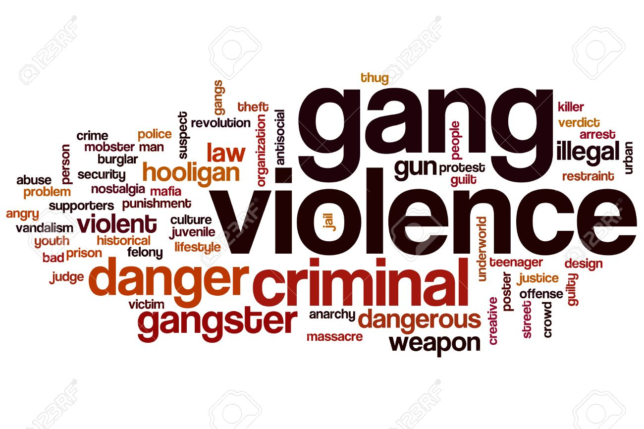
Here is a word cloud of gang violence. Image source
Imagine hearing gunshots not blocks away your own home. For some people this is an everyday occurrence. Gangs are organized social groups who commit crimes. Some gangs partake in violence to receive social status, partake in theft, vandalism, murder, etc… to receive respect from their gang members that they probably haven’t received or earned in their own lives. Gangs are very passionate about respect, so passionate that they will do anything to protect their own members or their turf, this is where the violence part comes in. Out of passion, gangs inflict violence on each other to maintain respect. Not only is this problematic because of the deaths it is causing in gangs, but it is also harming innocent people who might just be pedestrians or bystanders. This issue is growing, because now it is affecting whole neighborhoods and branding them as “bad” or dangerous neighborhoods. This leaves a bad reputation on the neighborhood, the people who live in the neighborhood, and the entire city.

This is a photo of the streets of Kensington. Image source
I live in Kensington, gang violence is a huge problem there. I have a personal connection to gang violence because it could affect the way I live or harm me. Not only me but my friends, family, and neighbors could all suffer from gang violence. I don’t want to see my neighborhood have a bad reputation or be dangerous. My neighborhood isn’t the only neighborhood with this problem. People need to be informed if they want to be safe or to have a positive effect on their neighborhood. Making a change to make your neighborhood a safer place is not hard. You can make a change in a big way or small way. It is important to have safe living conditions for our generation growing up and the next generation to come.

Poster against gang violence. Image source
Gang violence is something that has a long history. Sadly there is a lot of facts to back it up. A statement from USLegal says that “Gang violence means criminal and non political acts of violence committed by a group of people who regularly engage in criminal activity against innocent people.” This source is a negative towards gangs but it can still be true. This means that gangs can and do that stuff. That it why it is important to be aware and be safe. Another statement from NCBI says “During childhood and adolescence, the formation of groups or gangs is a normal part of the growing process. Playmates, school friends, Boy and Girl Scout troops are each examples of the natural inclination to form group attachments that provide a stable social outlet.” this source is important because it is explaining how gangs start and what to look out for. It is important to be educated in subjects like gang violence which are very dangerous and can affect your safety and security.
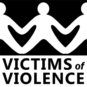
Poster for victims who suffered violence. Image source
Through extensive research about gang violence, I have concluded that gang violence is not just a two-sided topic. Gang violence is something that has been completely stereotyped, but stereotypes are stereotypes for a reason. I do not understand the pride that gangs need to maintain. I question the reliability of the opinions of those who are not victims of gang violence or gang members. Going forward in research I hope to find a simple way to improve this solution.
Wildlife Preservation
In Africa, African Wild Dogs used to range to 500,000 in 39 countries. But now because of issues like roadkill and destroying habitats, there are only thought to be about 6,600 left. Seeing that big of a change in the world is quite upsetting, especially when there are tons of other endangered animals out there. Just from seeing those few sentences I can tell that there are some people who would already like to read more into this topic and how much of an impact this has in the world.
Personally I feel connected to this topic because I love animals. I know it seems like such a basic thing to say but it’s really is true. I haven’t had any real pets besides from a turtle if that counts but if or whenever I see a pet in public I take any chance I can to pet them and be all over them. I think this topic on endangered animals and protecting their habitats is something others should know because besides from them being needed for loving and caring for, but as a source of inspiration. From what I heard from The Wildlife Conservation, protecting animals and their habitats lets us protect the planet as a whole. There are so many things that we can still learn about them. Plus, they haven't done anything to us, there just species living on the Earth same as us. So there's no reason to hurt the space they live in in any way, shape, or form.
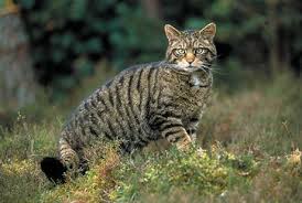
Now, for those wondering what some of the issues going around are, there's a lot. But I picked out some of the worst ones I saw. Starting with small wild cats very little is known about them but that's what makes it much of a problem. Of all the unique different types of animals out there if you can’t say much for just a simple cat then there's the problem right there. But from what was gathered these small cats are being threatened by loss of habitats, killing, and conflicts with humans, livestock and domestic animals. They can be found in parts of South America, Asia, and Europe.

Moving onto another animal that is in need of help is the Ethiopian Wolf. These wolves are one of the rarest and most endangered canid in the world so that on it’s own speaks for itself. But ironically another thing that stops the wolves from thriving is the growth of the human population. With more and more humans in the Ethiopian highlands it forces the wolves out only into domestic dogs that carry diseases. As a result of these diseases three out of four of the wolves die. Now with only 500 left to remain in the wilds of Ethiopian people want to do anything they can to find a place for these animals and to get them treated for their diseases.
In conclusion I think that people should take the time to look around and start seeing issues in life that they should be more aware of. From all the research I was able to do I feel like it has really changed my view on how animals have to struggle to survive. If there was anything I could do in order to help out in any way I would do it. I think I would start with donating money to the Wildlife Conservation Network just to any animal I can. As I dig more into this matter I don’t really know what I hope to find but whatever I do find I'll be sure to have all the info down.