The Road Hunt//Rivera, Rogers, Wentzell
The Road Hunt
The Rules of The Road:
Players:
Man, boy, army, cannibals
Order of the game:
Identity:
Everyone is given an identity card. You can’t share it with anyone else and nobody else knows who anyone else is.
Significance:
In The Road, nobody has a true identity. It’s dangerous to tell anyone who you are, your name, or anything personal. It’s every man for himself.
Beginning:
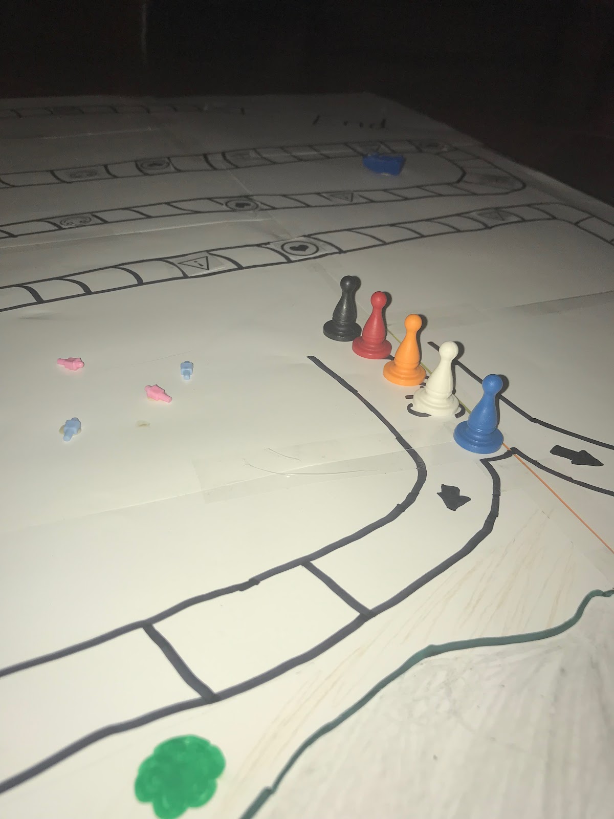
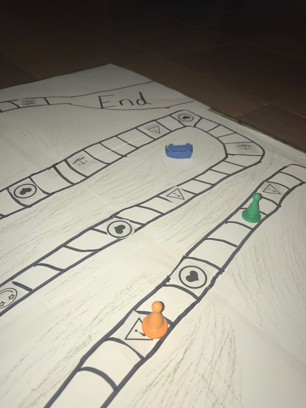
After everyone is given an identity card, they are sent on a journey throughout the school. There will be more around the school are note cards with different things written on them.
Each player starts with 90 years of life. At the end of every challenge the players’ years of life are deducted and calculated. The the top 50 percentile players (with the most life remaining) will move onto the next challenge. If a player loses all of their life, they are removed from the game.
Challenges:
Apple Picking Challenge
Race
Obstacle Course
The player with the most years on their life at the end of all of the challenges is the winner.
Character Special Abilities:
The Man:
If gets attacked by another player, or gets the trick human card, the one who is the man gets to use their gun one time to either fend off the trick card or kill the other player.
Cannibal:
If you are a Cannibal from the beginning of the game, you get to attempt to form an alliance with someone, and if your life is threatened at some point during the game, you get to make a Moral Decision; Will you kill your partner to survive? Will you lead them on and gain their trust, but eat them at the end of the game to better your chances of winning?
Army:
You are part of the army in this world. If you happen to make an alliance with a Cannibal without knowing, and they attempt to kill you at some point in the game, you can counter and decide to kill them instead.
Justifications:
The courses are specifically designed to make players lose just enough lives for each round to continue as planned. The most average players will lose naturally without being weeded out by the mechanic of the top 50% of players moving onto the next round. This is to ensure that players must actually be good at the game and not rely on just being better than everyone else. In The Road, survival of an individual is just as important as strength over others. Characters in The Road must not only face other characters, but also face the wrath of nature.
The point of the food hunt game is to demonstrate how hard it is for the man and the boy in The Road to find food that wasn’t human. There are less real food cards than there are human food cards which also represents how much harder it was for the man and the boy to live without them. Human food cards don’t give you more life than regular food cards but when you’re starving and the point of the game is to survive, you’ll take what you can get. The purpose of having two types of human cards is to reenact the risk the man and the boy take every time they come face to face with another human. They never know if they’re good guys or bad guys. There were a number of times where they took risks, Ely is only one example.
In the book the man has a disadvantage since he has to take care of the boy. All the food he gets he has to share with the boy, all the supplies have to be split for two people. In the piggy-back race it is purposefully easier to win for those who are on their own. It makes it harder for those who have been forced to make an alliance with someone because they have to piggy-back race down the track. Not only is this inconvenient all around, but it forces you to quickly problem solve and it can potentially slow you down. This is true for the man and the boy because the man would be much more efficient and faster by himself but with a child to take care of, it makes the whole journey harder, especially when they’re trying to run quickly. This also represents how hard it can be to lug a cart around the woods in the mud and dirt.