Ever wonder why people are considered unequal or some are classified into a system where people are at the top and some who are lowly regarded are at the bottom? Why is power derived from sources, then used against people? Ethnic Inequality is the answer. I am interested in this topic because Ethnic Inequality is a major issue and always was in today’s society and is a major flaw in history. I am also interested in this because Racial Discrimination is like dust, it's everywhere and it's difficult to get rid of. The only way we can somehow stultify it is to work together to help loosen that mentality everybody has on Discrimination. No one wants to be a victim of racism, but it can happen to anyone. Racial discrimination can be so painful that it can leave a scar and anger that traumatizes the victim.
How can we fight this social issue of racial discrimination in our society? We can stop racial discrimination by fighting for their rights and standing up for those people who were victimized because we care for them and our future generations along with making a change.
The people today can make a great impact on how to end this. Furthermore, we can start by educating the people and children in our home and in school. If we express our thoughts to those who are learning, that this is not an acceptable trait, it can make a big difference. We need to teach this to narrow-minded people who believe that their race is better than others and to appreciate not discriminate. Too much discrimination exists in this world, and it seems like it only gets worse by the second.
While researching I learned that ethnicity is clearly distinguished from race due to countries like North America, Africans, People across the border, or any descendant of the Latino culture. From this link, I learned that housing, employment, and health has been one of the main reasons why racial and ethnic inequalities have continued. “Families of color were, in effect, excluded from receiving these mortgages. While white families took advantage of them and prospered, other families were left behind and are still trying to catch up.” This line right here from the link below shows that ethnic and racial inequality is real. It’s not really about what you are going to get out of it, but what you’ll learn and how you can better that issue so there won’t be any problems in that community or society. http://www.futurity.org/racial-ethnic-inequalities-united-states-1467732-2/
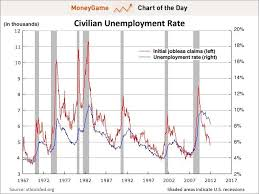
Did you know that less than half of black families (41 percent) and Hispanic families (45 percent) live in owner-occupied housing, whereas white families are 71 percent? This is economic discrimination. Economic Discrimination is discrimination based on economic factors. My question is how can people speak so poorly about people of “Low status” when the reason why they are classified in that position or order is that of Racial Discrimination? That’s like making an assumption about a person's personality, and automatically ranking them as this type of person without knowing who they are.
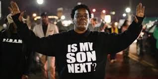
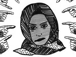
This topic matters to me because there are probably others who have stories and may not want to speak out on this issue, so therefore I’m here to address this, and also I’m passionate about this because I want to bring it to people’s attention what’s going on. I noticed that Ethnic Inequality and Racial Discrimination are sometimes swept away because of other issues that are constantly on the news. Discrimination is like a noose, preventing people from making smart decisions. It restricts people from making their own personal choices. Nooses are occasionally unfairly put around innocent men's' lives for their death, controlling those people and their future.
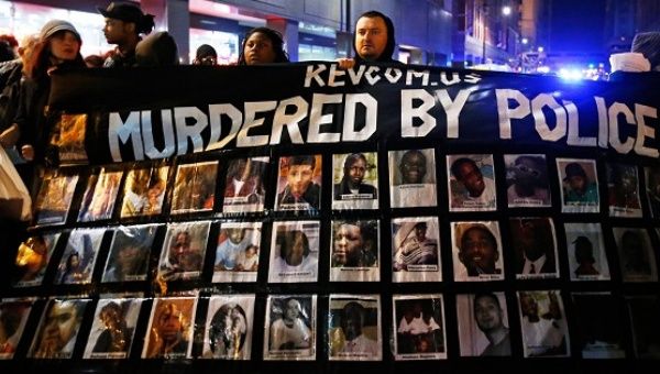
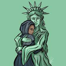
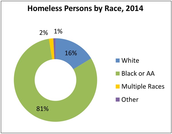
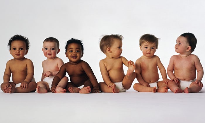
This issue is important because our nation is moving toward two societies, one black, one white separate and unequal.” The commission blamed white racism for the riots and urged the government to provide jobs and housing for African Americans and to take steps to end racial segregation. More than four decades later, racial inequality in the United States continues to exist and in many ways has worsened. Despite major advances by African Americans, Latinos, and other people of color during the past few decades, they continue to lag behind non-Hispanic whites in education, income, health, and other social indicators. Biological race is impossible because there is no genetic or DNA make-up difference from one race to another. Racial inequality is a very big issue that the world is dealing with, especially the United States. People tend to discriminate because of the way someone looks or where they are from. These could be an example prejudice which is the act of prejudging a person because of their appearance, thoughts and/or ideas. Also stereotyping, discrimination, and racism goes hand in hand with a lot of things.
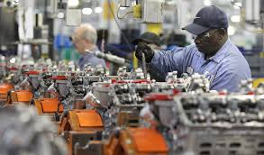
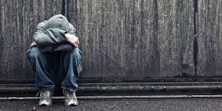
It’s sad how we look to policy and law enforcement for situations like these to be “solved” when we can’t even do it ourselves. Perhaps talking to people who care about this topic would be a good idea, and make things easier. The policy really won’t make things easier, instead, it will just make people more paranoid, and more stigma will happen. Because of low health care and employment, something like “lower class” exists. I think this exists because they are not just more likely to be born into families with less wealth, education, and income, but they are also more likely to live in poor neighborhoods where high-quality schools are more difficult to find, crime is high, and other high and safe things are unavailable.
How can we fight this social issue of racial discrimination in our society? We can stop racial discrimination by fighting for their rights and standing up for those people who were victimized because we care for them and our future generations along with making a change.
The people today can make a great impact on how to end this. Furthermore, we can start by educating the people and children in our home and in school. If we express our thoughts to those who are learning, that this is not an acceptable trait, it can make a big difference. We need to teach this to narrow-minded people who believe that there race is better than others and to appreciate not discriminate. Too much discrimination exists in this world, and it seems like it only gets worst by the second. Racial and Ethnic Inequality along with Discrimination is real, It’s not just happening here, it's happening in other countries and places too. Racial slurs, discrimination, racial classification is terrible. Stop classifying people by their skin, and accept them for who they are.


