Blog Feed
The Walk That Made The Change
Hey it’s Kai Payton again. In my previous two post I introduced my You & The World Project. For my topic of the project I chose to focus on premature births. In my first blog post I gave basic information on premature births. I also discussed some of the more serious topics of premature births. In my second blog post I discussed stories of other families that had premature births. I also included the major parts of the interview that I had with my aunt where she talked about how she got through the experience.
In this blog I’m going to be talking about the Agent of Change portion of the project. The Agent of Change portion of the project is where you go out and do something to make a change to your topic. So since my topic is premature births I did the March for Babies walk. The walk was on April 30th and it was ran by the March of Dimes Foundation. For the walk there are teams that raise money for the foundation to help with premature births. My aunt’s team raised a little over a thousand dollars to go to the foundation. I love doing these walks every year because it’s a good way to see family but because it’s for a good cause.
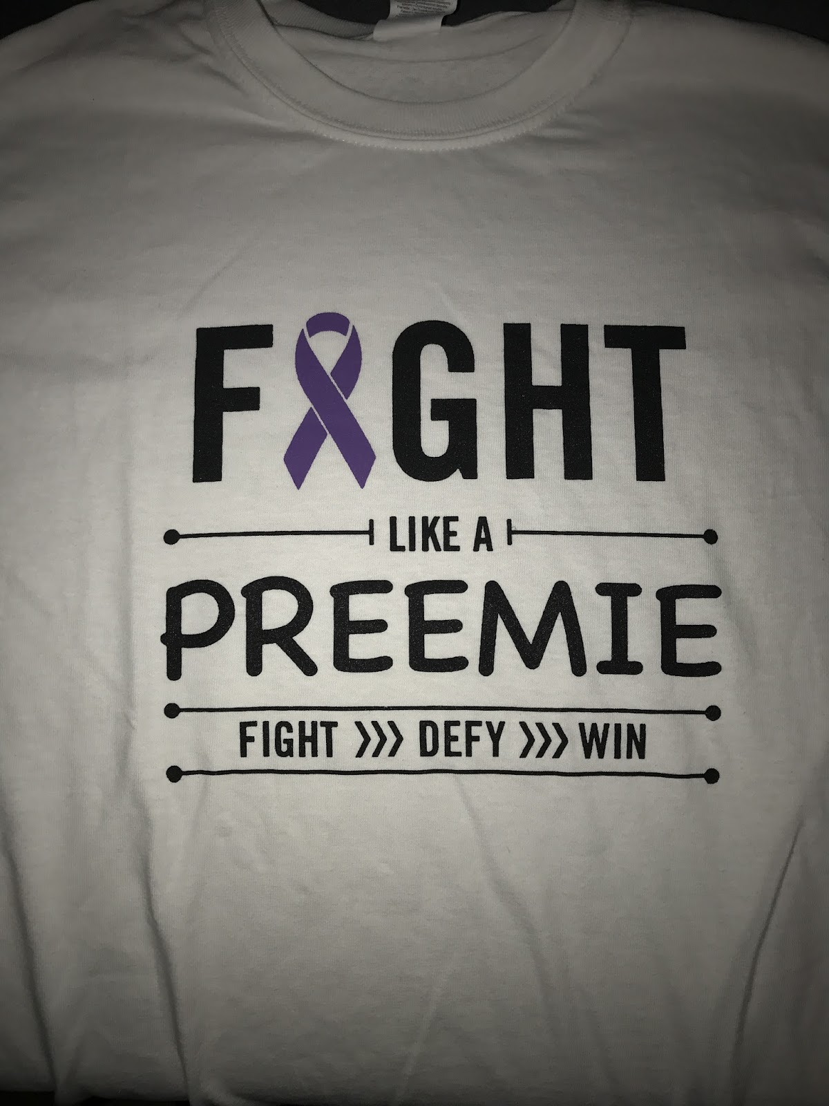
At the walk there was so many people from different walk teams and I thought it was so cool that so many people support premature births. Each team gets a custom shirt to represent their team. This year my team's shirt said “Fight Like a Preemie.” In my opinion that’s another reason to go to the walks every year because every always has cool different shirts. My team is called “Chasing Jase,” and it’s made up of family and friends basically whoever comes out to support Jase. From this walk it got family members to come together to support Jase. During the walk they gave Jase a purple cape and it was really funny to see him run around in it.
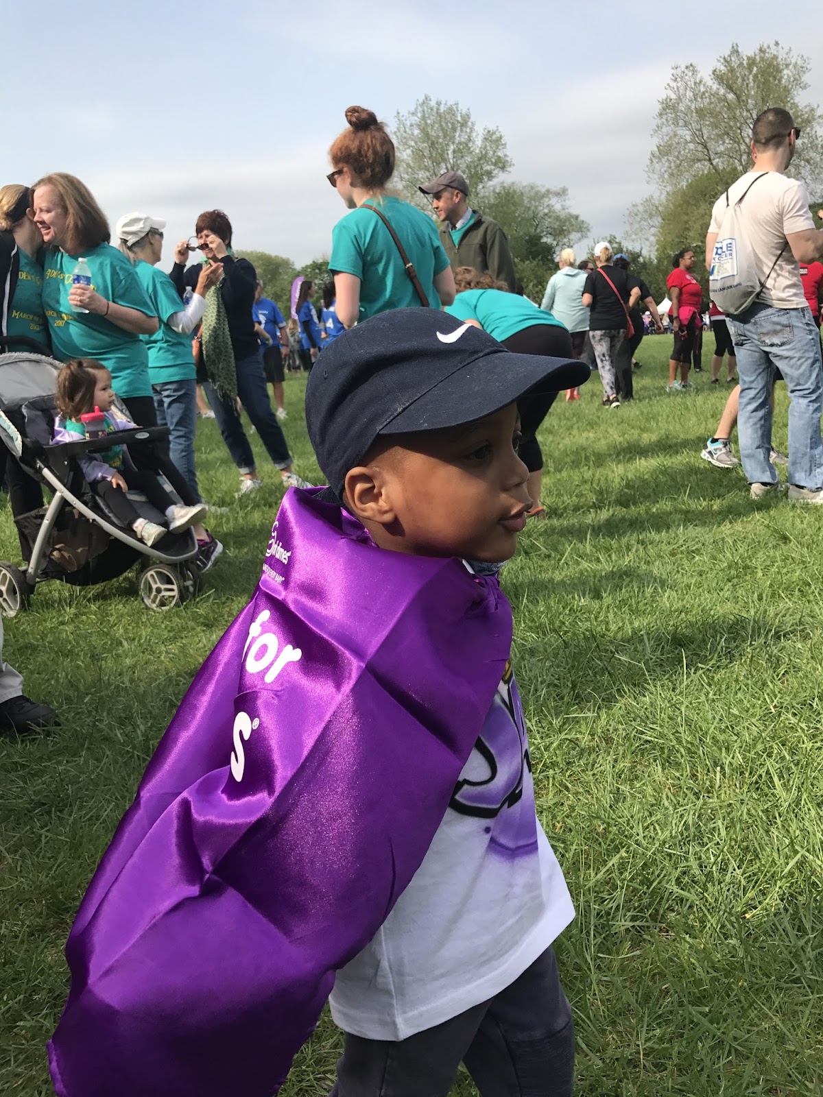
- Picture of Jase with his cape
-Picture of the shirt
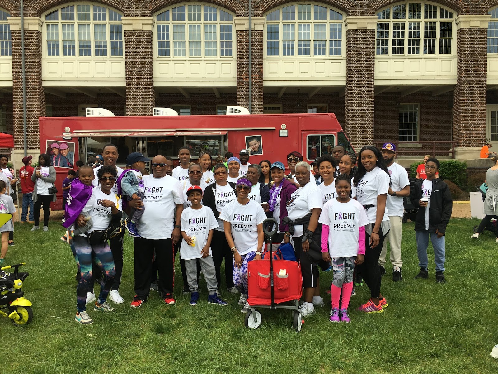
- A picture of the walking team
While doing the walk you meet a lot of other families that share a similar story to yours. The experience creates a way to be active and meet new people who all support each other. There was a lady we met and she had a daughter that was the same weight as Jase when she was born (1 pound 11 ounces). My aunt and her had a heart to heart in a way because their children were in the hospital for about the same amount of time. I wish I had a way to thank the March of Dimes Foundation personally because the walk is always a great experience when we do it.
Before we started this project I didn’t know what direction I wanted to go with it. In the beginning I was thinking about choosing littering as my topic. Then as time went on I realized that I could choose premature births a topic that people know about but don’t know the major facts or how they can help change it and I had a better connection with it. This project helped me gain a new understanding of premature births because before I did this I didn’t know too much myself.
So in conclusion, I want to thank Ms. Giknis for allowing us to do this cool project. It helped us go out in the world and make a change big or little to a problem we connected with. It helped us learn more about each other and connect with our classmates on a deeper level.
You can check out my Annotated Bibliography here
Element Project
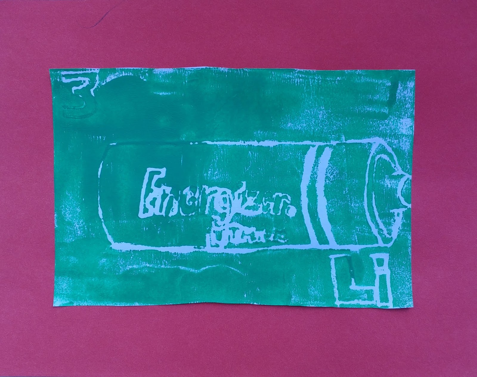
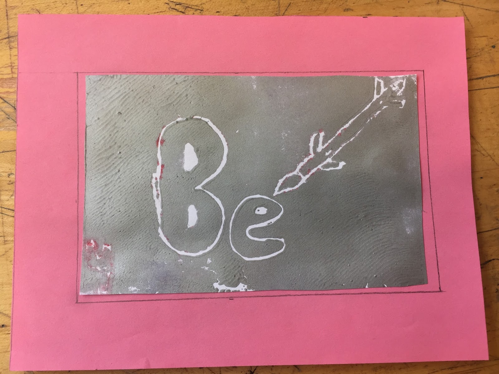
Lithium is my Element and it’s atomic number is 3.
Lithium is used in batteries and fireworks.
I searched for things that had Lithium in it.
It took a while to sketch it and carve it into a print.
In the second print. I used less paint.
I loved rubbing the paint on the stamp because it felt satisfied.
Printing Matt // Zinc
My element is Zinc. The name is taken from the German, ‘zinc’ which may in turn be taken from the Persian word ‘sing’ meaning stone. The atomic number is 30, and so is the protons and electrons. The atomic mass is 65.38. And the number of neutrons is 35. Zinc is a transition metal. German chemist Andreas Marggraf figured out how to isolate zinc by heating carbon and calamine. Zinc is actually useful for the human health. It can be seen in pills that help reduce pain and it can seen in cream that can help reduce rashes and skin irritations. Zinc is used throughout the world largely to protect steel against rust. For my art, I drew a recycling symbol with steel designs on it because according to studies zinc is always recyclable, and it protects steel from rusting. In the beginning, I had to sketch it on paper then traced it on thin paper. After that, I traced it on foam board, and I made sure to deepen the parts that I didn’t want the ink to touch. Lastly, I used the paint roller to roll the ink over the foam board, then I placed the foam board on paper and made sure it’s the opposite side so it will print the correct side on paper. If I were to do this differently, I will make sure to deepen the parts that should be without ink on the foam board better. I enjoyed the sketching the idea part, because I managed to express my creative ideas and it was fun.
Argon 18th- Ben Rivera Final Print

My Element is Argon the 18th element in the periodic table
My element is a noble gas and it makes us 1% of the air. To make this print was a process; first I got the image I wanted to print. Next I got tracing paper and traced my image backwards. After I got a Styrofoam slide and put the tracing paper over and traced the backwards image onto the Styrofoam. Finally I got ink and a roller and I rolled ink onto the Styrofoam. I stamped the inked Styrofoam onto the paper and got my stamp.
If I could do this project again I would make a completely different print image and make sure my Styrofoam doesn't get damaged. The part of the project I enjoyed the most was the ink stamping because it was easy and fun to do. All we had to do was pick your favorite color out of the four given roll the ink onto the Styrofoam and stamp onto your paper.
W9 D1&2 - Print/Matt
My element is Technetium (Tc), its atomic number is 43. My element is man-made by two scientists, one of them was a photographer. It is also radioactive and a small amount is found in stars. I chose my imagery by thinking it was radioactive, i figured if i was radioactive, then i could have the numbers and symbol surrounding the radioactive symbol. I went through this process with difficulty. I had many ideas surrounded by the radioactive symbol, however this was the most interesting one. Then i put the picture on a wax paper then put it on a foam board and indented everything that i wanted to be white. After that i rolled ink on it and put 6 copies on pieces of paper. I then let them dry and picked 3 of the best ones, cut them down and cut out 2 pieces on construction paper for the background of 2 of them. I then put the construction paper as the background of two of them and left one of them with no background. I glued on the backgrounds and i was done. I i did this differently, i would’ve done the prints better on the white paper because they can out weird. I liked the printing the best because it was really fun to roll the paint onto the foam board then rub the wooden spoon on the back of it for all of the paint to get onto the white paper. I just really like painting.
Final Art Print: Manganese
My element is manganese. Its atomic number is 25 and its symbol is Mn. Manganese was discovered in Magnesia, Greece. It is mainly used in steel production. Manganese is mixed with iron to produce corrosion-resistant steel.
The image I created is a replica of the island Magnesia. Written in the corner is the word "manganese" in Greek. I decided that this design was simple and straightforward. When I was making the print I took many steps. I began by brainstorming several design ideas. Once I chose my final design, I redrew it, traced it, transferred it, and finally carved it into my plate. After this, I rolled paint over the plate using a brayer, and then I layed it on my paper.
If I were to do this project again, I would spend more time gathering information about my element so that I could produce a more creative design. Despite this, I did enjoy this project. I especially liked the actual printing because I got to see my sketches become real prints.
Why I Left Home -A Tale of a Mother and Daughter
Nitrogen - Sam
What is your element? Name and atomic number
Nitrogen, 7
Tell the reader about your element, history, function/use and so on.
In 1772, Daniel Rutherford sucked out the Oxygen and Co2 out of the air and examined what was left. It can be used in dyes, fertilizers, and as an explosive. Found in Ammonia, Cyanide, and Phosphazene.
How did you get the idea for the imagery you chose?
It’s most commonly a gas, so I drew a gas floating into the air in the shape of the atomic symbol and number. My favorite print was a little under-inked. I liked it because it looked more airy, and the blotches of ink only add to the effect.
What process did you go through to make this print?
I drew the design, traced it on to paper, etched the design into foam, rolled ink onto the foam and pressed that onto paper.
What would you do differently if you did this print a second time?
I accidentally etched the design forewards instead of backwards the first time and I had to re do it. I would make sure to do it right the first time if I did again.
What part of the project did you enjoy the most? Describe the step and what you liked so much about it.
Drawing the design. It was the most creative part, thus the most fun.
Week 9 - Day 1 & 2 print/matt
My element is beryllium and the atomic number four. My element was discovered in 1798 by Nicolas Louis Vauquelin. Its uses include the make of computer parts, missiles, and aircrafts. I chose to draw a missile because I thought since beryllium is a key use to make a missile, I would draw one heading into beryllium. The process I went through was researching how to draw a missile, then I did a few test runs and sketches before making it look really good. If I did this project again, I would want to add more to my print, but more detailed and details. The most enjoyable part of the project would have had to be seeing the finished product.
Printmaking: Nirogen
My element is nitrogen and its atomic number is 7. Nitrogen is found in vast majority the atmosphere but in liquid form can basically instantly freeze things. Nitrogen is colorless and odorless and is sold for 4 cents per 100 grams. When I went about making my design I looked at uses for nitrogen and I kept coming up with people using liquid Nitrogen to make ice cream so that inspire my print. I would probably add a little more to my design to make the print more interesting. Maybe adding a cool background or incorporating the atomic number into the design more. For this project I really enjoyed the printing because I could peel away the stamp and have a beautiful image.
Addiction: What is there to be done?
Has anybody ever realized that everyone has problems? That every single person on this earth is going through some tough situation. It may not be so bad, but to the person it is. Sometimes a person just needs someone to just be there for them. For my fourth quarter English benchmark we had to choose an important topic and make a change. I chose Addiction. I realized not many people talk about it or really see it as the problem it really is. To make that change I first started with a lot of research on addiction and how a person becomes addicted and how it affects others. Then I did a survey to see how common addiction was. After getting those results I wanted to make sure the people who were affected by addiction knew that they weren’t alone.
At first, I wasn’t really sure on how I can make the change that I wanted to make. I wanted people to understand why addicts are addicts, and why it wasn’t their or the addict's fault. Knowing that there’s nobody to blame can save a lot less trouble, and can send some help to the situation. I didn’t want people to feel this stress from what I chose to do that would cause them to realize “Oh that’s me I don’t care.” I mainly didn’t want to say my opinion or phrases like “It will get better”. I wanted people to know the facts, so I took all of my research from my first and second blog post (including my survey) and made it into a brochure.
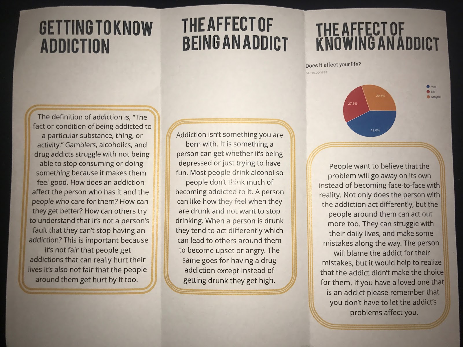
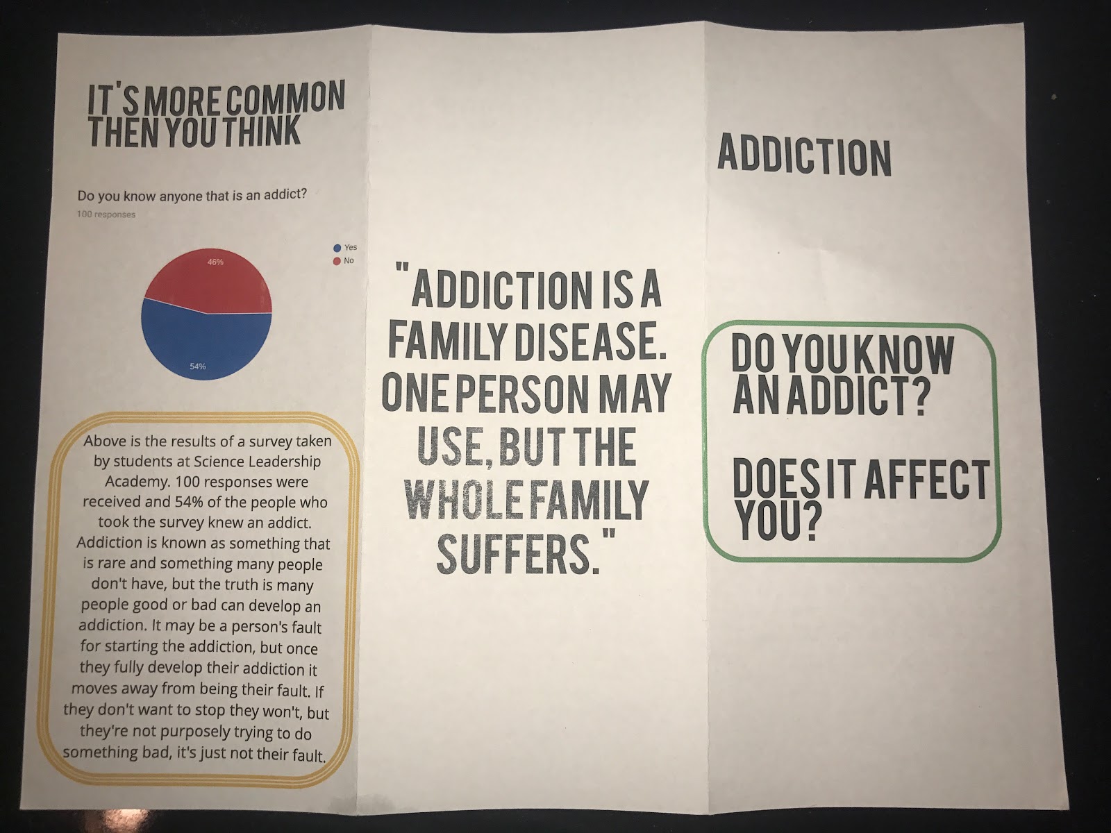
Pictures of Brochure
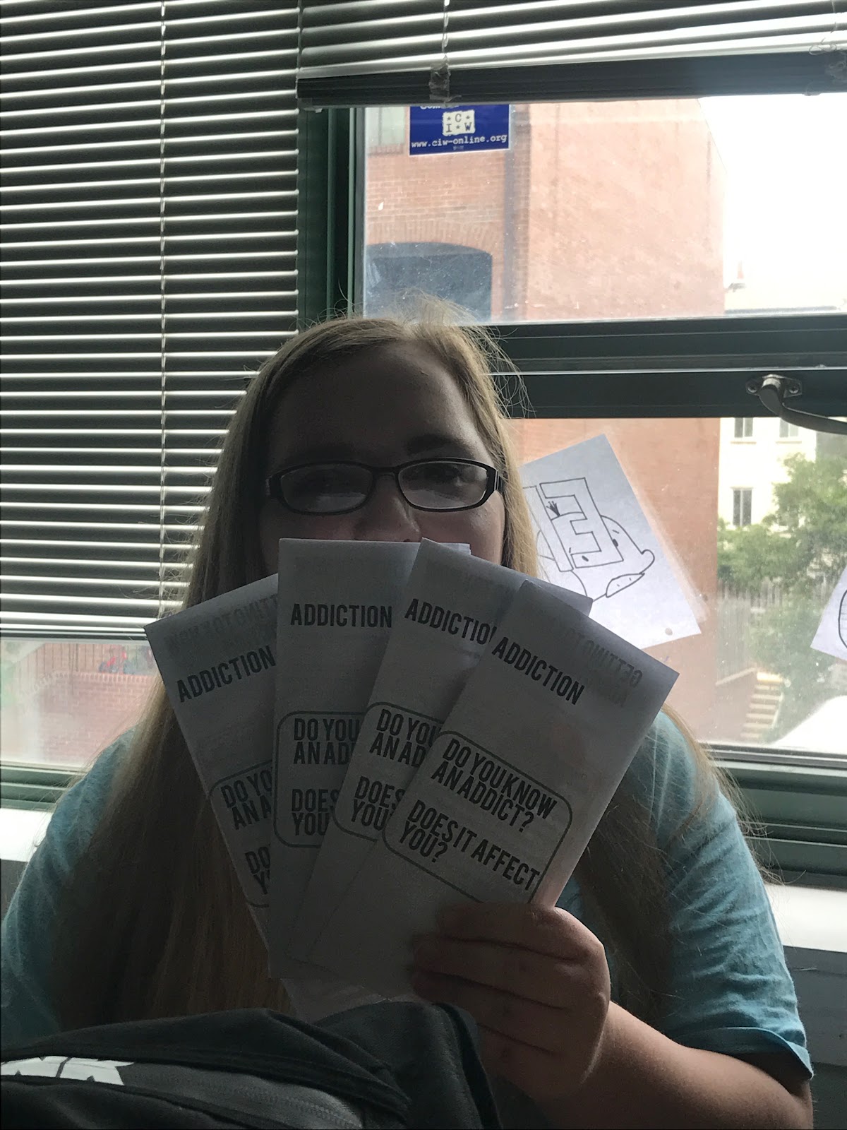
My brochure took a bit of time to put together, but it turned out great! I was targeting the audience that knew an addict and was affected by it, and the addicts themself. I made over 70 copies and handed them out to the students who go to Science Leadership Academy. One thing I was worried about was putting people under pressure. I was worried handing out a brochure to one specific person would make them think I was implying something. When I handed these out I made sure to go to groups of people and say, “Hey guys. do you want a brochure?” That left a lot of mystery on what it was, and if somebody really wanted to read they didn’t have to do it then and was able to save it for later. My brochure turned out to be a really good idea thankfully! I had a few students come up to me and say, “Thank you for making this. I struggle with this problem and I love what you wrote about.” That made me feel really good and helped me realized how truly important addiction is.

Picture of me handing out Brochures
I was really curious how much awareness is being raised for addiction so I decided to do some research. I ended up finding a website that gives you the 9 best charities for addiction. I personally think these charities are a great way to help with people who have an addiction. The main things these charities donate to is research on addiction, rehabs, and scientific methods to help cure addiction. Rehabs try to help people stay sober, but it is known that if you only go one time it is likely not to work compared to going 2-3 times that really helps a person to realize that it’s time to end the situation they are in. It is really great that there are charities out there to help, so donate now to help.
Overall, this has been a great experience, and I am really happy that I did it. I myself know some addicts and one has actually recently relapsed. With my new gathered information on addiction I was really able to help the person. One thing the person said was, “It was really easy to talk to you about this, and I’m really happy you understand.” Something I could have done better was my annotated bibliography because I fell a little behind on it. There is still a lot to be done on addiction. Hopefully there will be more people to help addicts, and some thing to help cure it. I have this feeling of success when I think about this project and hope all my readers enjoy reading and learning about everything I discovered. I also hope it has made an impact on everyone as much as it has on me.
Picture of me with Brochures
If you want to know more please read my Annotated Bibliography.
Q4 Artist Statement
This quarter, I learned a variety of skills that I added to my inventory of tools. A lot of the tools were specifically for drawing, which was great for me because that is the medium of art I prefer. We did so much in this quarter, I feel like I did the most this quarter.
The first project, we did edited photos that we took. We used different methods such as coloring, cutting, and for the final method I used I put two pictures on top of each other. This, I learned about the basics of photo-editing that will be incredibly useful in the future if I have jobs related to media work.
The second project, we did work relating to form. This was useful because I learned a lot about how to proportion my drawings of full-bodied people correctly. This is incredibly useful considering I tend to draw a lot of comic book-style art.
The third project, we did line work. We had to practice a variety of exercises that strengthened the way I drew lines. For example, I had to do one line drawings meaning I had to complete a drawing of an object without taking a break and it had to be one continuous line. This was difficult considering it was uncomfortable. This lesson added on to my armory of tools relating to drawing.
The fourth project, we had to do a digital drawing. This was one of the easier projects because I already had experience in digital drawings from doing them in the past. It was fun to do again because it brought back a lot of memories.
The fifth project, we had to do drawings that utilized space. This helped a lot with my skill on perspective because space has a lot to do with perspective, so I sharpened my skills on 3D like drawings. This was a lot of fun to draw too because Muhammad Ali is one of my inspirations.
The sixth drawing was the most challenging for me. We had to practice drawing textures and we learned different methods for drawing different kinds of textures. While this was the most challenging, I also learned a lot from this one. I got better at drawing things more life-like. I was mainly used to drawing just plain line drawings, but this project helped create variety in my lines.
Then, for the final project, I just utilized everything I learned and put it all into one project. This project helped me learn how to utilize my drawing arsenal and put it all into one big final project. It also helped me sharpen each of the skills that I used in making this drawing. This quarter was the most productive for me because it focused mainly on a medium of art that I was familiar with and that I plan on pursuing.
The Spirt Of The Atmosphere
I had literally had so many plans for my agent of change in the begging of my process in my previous blog post I really liked to talk about helping others understand what it’s like to help your friend or child/teenager to a complicated situation in their lives as struggling inside of theirselves, fighting against themselves and have a conscience that will either trick or yell to them for help even most people who don’t know how to scream for help when they feeling like they are lost. https://www.helpguide.org/articles/depression/helping-someone-with-depression.htm
Being there to listen to a fellow a friend about their story and how they expressed their emotions, listening and being loyal is a big part if they push you away from you because really they care deep down when you actually are still there when say it does not mean that they meant it at all. Resentally I did a article on depression and a fundraise for notebooks at my chruch to help out for those that suffer from depression and that really help this me and the other I’ve helped this week.
One of my interviews and the second one is Autumn Harvey. She said she has shown lots of improvemnet with expressing her feelings like dancing and songs drawing or even writing, either I has change for not just me but for others people who actually really try their best to get better and work for it is a bigg thing for most and to see that results of that change is very heart warming.
My experience with this project and this opportunity to have it with these two most bright young women who have had it hard and actually looked up to people and others in the eye and lie but had the courage to tell the ones they trusted to be the ones to listen in great moments in their life to be happy with all dure with respect it was the most amazing experience in my life to have be apart of both of their stories (reader) of the memoir.
Autumn and Sara were amazing to intervirew, being apart of their voice and all I’ve done was made their voice a little louder for those listen. To Autumn I gave her a care package I’m plnnin gon giving Sara one, but Autumn really apreciated the gift and I hope that I’ve made a change in others live to be apart of a greater cause inside o the world and being apart of the change that is being chang everyday as a person part of the world. Thank everypone who had helped out and thanks for being apart of this change and thank everyone for being apart of my YOU& THE WORLD Project. What I could done better would be to have a better budget to share more of the things not just with 2 people and make it much better. http://www.valleymorningstar.com/sie/fresh_ink/article_4ff50d2e-3123-11e3-a200-001a4bcf6878.html
Time for Society to Look Up
Hello everyone! My name is Mayah Gold and I am a freshman at Science Leadership Academy. This blog post is about my Agent of Change for my You and The World project. In my first blog post I talked about what rape culture is, and in my second blog post I talked about the research findings that were shown in my own SLA community. Based on my research, my change that I am making is putting posters around the school to inform people about what rape culture is, and what it looks like.
Even though this is the final blog post I will be writing, there is some more information that I have come to gather. In this further research, I have come to learn are ways that men and women can combat rape culture, ways that they can speak up and stop someone when they see them perpetuating this behavior. Furthermore, some of those examples include being respectful of someone's space even in a casual setting, thinking intensely about the media's portrayal of men and women and the stereotypes that are set up for us.
Moving on, for my agent of change I decided to build off of the open survey research and information I had gathered. I had seen examples of rape culture and victim blaming throughout my own community. The community that I was supposed to feel safe in. And seeing some of my results not only shocked me, but made me sad for my community. So as a result of those findings, I wanted to send messages around the school informing people exactly what rape culture is and how they might be enforcing it. So I made four posters with pictures of sexual assault victims quoting their attackers. None of these people I knew personally, but I had read their stories, and my heart ached for them. I wanted more people to realize what exactly rape culture is. I printed out the pictures, put two images on one poster, and wrote a little message under each other.

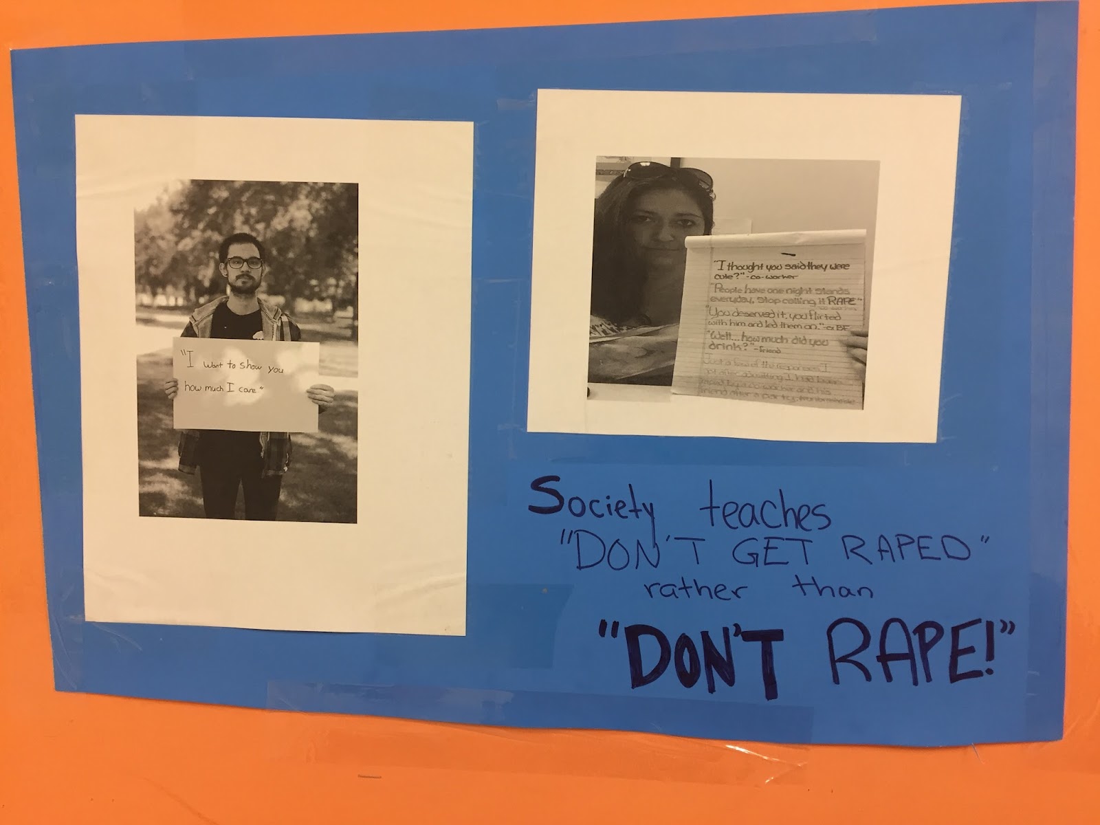
These are just two of the four posters that I hung around the SLA school building. I feel that by putting these up, I can make people see what other people have gone through. What sexual assault and rape culture they have experienced, and how these ideas can lead to a bigger problem.
Reflecting on the overall project, I would say this would have had to be my favorite project of any subject of my freshman year. I was given the opportunity to choose a topic that I am passionate on, and inform people about it, and then make a change. Another point was I loved going on a rant when people disagreed with me. I learned that others don’t have the same string opinions as me, which could be challenging at times to deal with. But within myself, I learned that I have a really strong voice about myself. And I want to share it. I feel like I could have done some more outside organization research with more powerful people. In conclusion, I would love to do this project all over again, just for thr fun of it!
For more information, check out my annotated bibliography!
Teen Depression Part 2
Leading back into my previous blog post about the depressing adventure of interest of learning about depression. Everyday in world people become insignificant of themselves, how exactly do you think the people who are suffering from this problem feel?, What would you do from this to not keep happening? And How can you change this problem in the world and in you life?

This problem that occurs in our world is really important to me. I wish that someone had written something like this for me or at least ask me these specific question about” how I felt”. As a child I was always taught to be myself, when I felt like things were’nt going well I was feeling unsure of what to do with myself and I did’nt know how to express my feelings yet. What I did was hold them in (my thoughts my feelings and my anger) and try not be visible. There are many ways for you and someone to connect with the another who is going through it by asking questions, what is going with them, how are doing things at home, what are things that would want to express to you or anyone else, sometimes it is great to talk; but it is always great to listen too. The best thing you can do when you are trying to comfort your friend or anyone sentimental to you, you can pretend to become a professional with them. Having people around you is hard for people to understand what exactly someone like you is going through, because many others don’t understand you and you are who you are, try your best to be handle what you can handle.
My interview with Autumn Harvey, was a good experience to listen to what she had to say what she wanted to say about how, what. And where she was during her time depressed, I asked her this question specifically about what would you have done if you did’nt have anyone to confess yourself to?
“She said that being in a her state of mind with guilt and having to being upset and not wanted to be doing anything with anyone or even talking but I finally had a bright chance of being able to tell my(bestfriend/sister) that how I felt and what I wanted to do to myself”. She felt hand on her shoulder seeming like she was not by herself, what informed me with an understanding to her issue and how she got through being so strong inside and outside deep down. Things that I have may have done more research about advice to talk to someone who is struggling with emotional concern through out their daily lives.
Things that I’ve learned in my previous and present research with “How to deal with and except it”, “Express it in a more positive way every step of the way”. Speaking of my interview with (Sara Frunzi) she told me that she did’nt exactly remember when she was first diagnosed with depression and being a child she was always to herslef and she did’nt trust people and was bullied for the way she was and looked and she struggled with that, being able to talk about today with so kind of confidence and wanting to share her story with others about what she went through and being so strong till this day and going through that suffering and “Not feeling like no one cared or hated her for a reason but she had depression and having anxiety with it made it harder” today she will always look back on today and think to her past about her life as if it was something she takes with her everyday to school to try and be herself and do her best everyday while it’s still going good for knowo on the right path. I felt touched by this specific line when she said “I don’t remember when I was diagnosed?” because that was the same thing I siad when I lashed out and broke at thing ; a sad feeling of isolating youself and how it would go on you worst days even through you already knew they were gonna be bad. Having that feeling of undesire of dealing with like and “It’s’ difficult problems that are ike banana peels every step of the way in our lives.
My Efforts To Help The Homeless
Recently, In my first blog post about homelessness, I’ve talked about what it was based on the research that I’ve done, (all links are in my annotated bibliography at the bottom of this post and my past two posts about homelessness). In my second blog post, I interviewed both my parents about their experiences with being homeless themselves. In this blog post, I want to talk about what I did to bring a bit of awareness to this issue and what I did to help a few people affected by the issue.
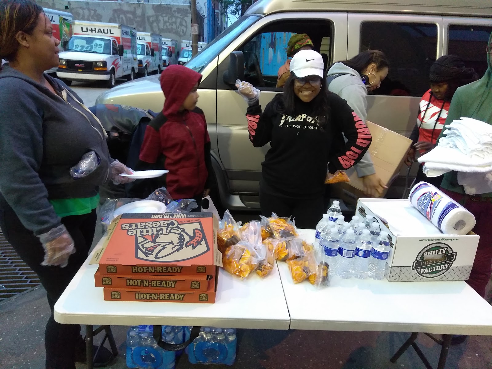
This past Tuesday June 6th, 2017, i set out with my mother, older brother, and younger brother along with a few of my mother’s friends, to feed a few of the less fortunate. We bought apples, bananas, pizza, philly pretzels, chips, cookies and waters to give out. We also had rags, towels, and large water bottles for them too. We ended up giving away ALL of the food we bought, and it honestly felt good knowing I was able to provide for men, women, and children whether they needed it at the moment or not. Many of them were very grateful. Many were humble and didn’t want to take.they kept their pride and made sure to stay cleaned up, so it didn’t seem like they needed anything. Only a few of them didn’t have those good traits, but not all of the homeless are bad people.
In the process of all of this I met this man. Lets call him “Leo” to protect his identity, plus he looked like a Leo. We asked him what the reason was for him to end up without a home. He said that he got laid off his job and his girlfriend ended up going to jail. He couldn’t get a new job in time to pay the rest of his bills and he lost his home. So he had to resort to living on the streets. I’m sure he’s going to try and find another job, but it can be hard. Just like my dad said in blog post two, people in businesses judge you and are less likely to hire you, after knowing you’ve been homeless. Leo also said that after his girlfriend gets out of jail that they are going to try again to get jobs. Im praying for him. \
I chose to feed the homeless as my agent of change because I’ve done it before and it means a lot to me to help these people. You learn a lot from this. Especially because both my parents had experienced this. You learn to appreciate what you have. I want to give. Even if and when I have nothing, i still want to be able to give and help out people who have less.
To be honest, i really loved doing this project. I loved how I got to actually talk about something very important that people don’t always talk about. Whenever people think “homeless” they think “they did drugs” or “they didn’t go to school” and that is because our parents fill our minds with “you will end up homeless on the streets if you fail school, or do drugs” and that’s really not the case. Yes I know that there are still many people who are homeless because of those things, but there are many other reasons why. I saw homeless children that day. Not because they did drugs or dropped out, but because they had no family to go to. Many children run away from home, not always because they don’t listen. Sometimes children have a very rough homelife. There are many many different reasons people go homeless, so you should have an open mind about it. Be willing to hear them out and know their story. Help them and give to them, but don’t ever give them money, because you don’t know what they might buy with it.
Mild Cognitive Impairment: The Final Steps to Making a Change
Hello again, my name is Louisa Strohm and this is the last blog of three about my personal experience with Mild Cognitive Impairment. If you would like to read my first and second posts, you can find them linked here. For a short summary I have discussed my personal experience with MCI and shared my story about taking care of my grandmother. Throughout the entire project I have expressed my deep passion in putting more information for at home care of those with MCI or Dementia.
I had a lot of time to think about what I wanted to do for my agent of change. I went through a lot of ideas but finally decided to go with making a website, so people can access my personal story and tips for living with and caring with those with MCI and Dementia. I made this website because in my personal opinion there is a huge lack of information on how to care for these people at home. This lack of information is leading to people checking their loved ones into nursing homes and assisted care facilities. Although it may seem like the best option, for some people who only have mild Dementia or MCI, it may be better to keep them at home where they feel most comfortable.
Getting back onto the topic of my website, the sites name is Caring for Cuzzies. You can find the link to website here I chose this name because Cuzzie is my grandmother’s nickname and I want people to be able to know how to care for all of the Cuzzies out there. When you visit my site you will find three tabs. The home tab, where you can find five tips for caring for those with MCI or Dementia. The next tab is the ‘My Story’ tab and here I shared my story and personal experience with my grandmother’s disease. The last tab is the Contact tab where I put my email.
The process of creating the website was pretty fun. I learned a lot of new things about how websites work and how to make them. I enjoyed writing the tips and I really hope that it helps someone who’s lost in the sea of information about MCI and Dementia. Sharing my story out there was really scary at first, but once I started writing, and realized how passionate I am about this topic, it doesn’t even phase me.
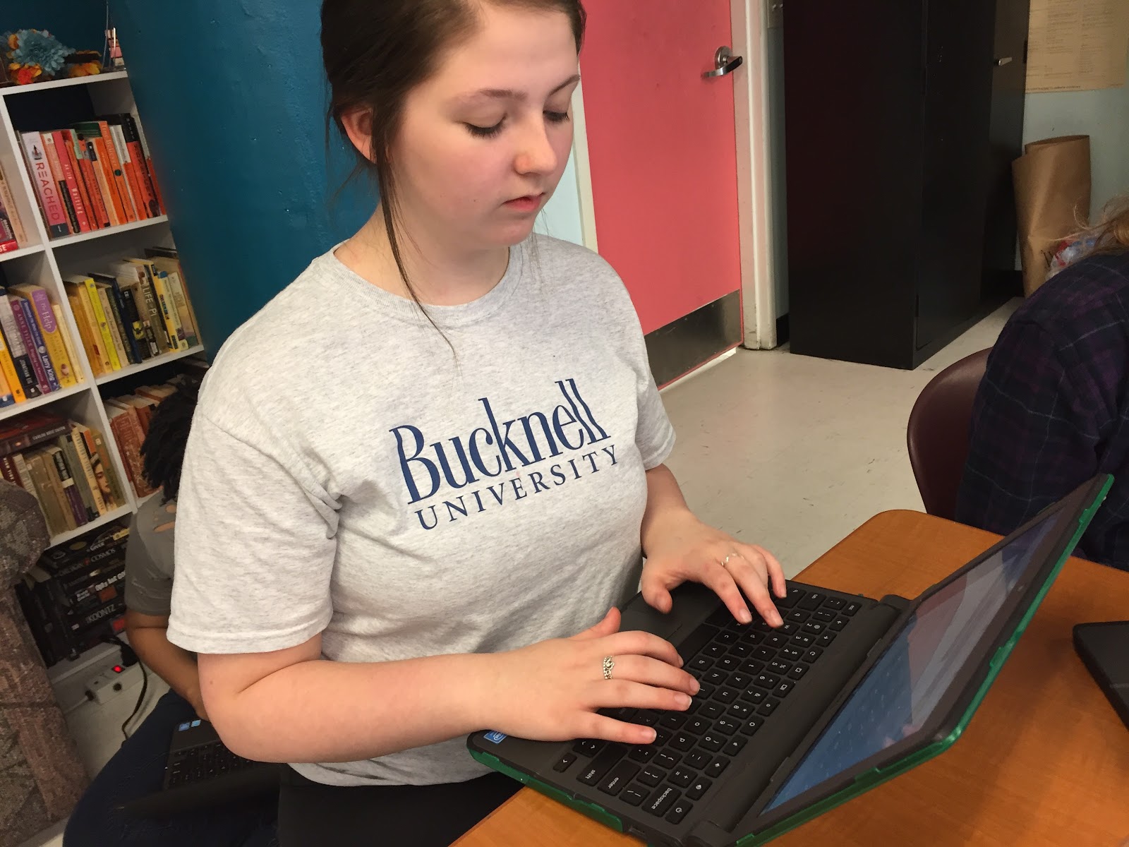
Picture of me creating the website
Doing the You & The World Project at first was very intimidating. I found that as I worked more and more, did extensive amounts of research, and put my heart into my topic, I really could make a change. Having my family, friends, and peers support pushed me to make this difference and want to help people. I think this project has made me a better person. Learning my grandmother’s full story, and help other people going through the same thing my family did, I think will make an impact on the rest of my life. This project will stay with me for the rest of my life and I think I will always remember my time at SLA through this.
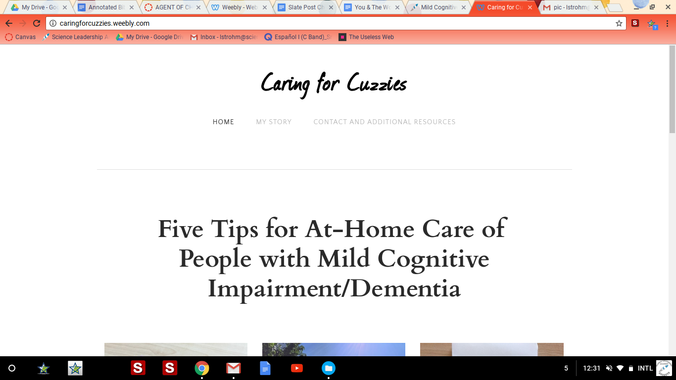
Screenshot of the website's front page.
Domestic Violence
In my first blog post I talked about domestic violence and my personal experience with it. I talked about my mother and father's relationship and how to my mom everything seemed normal. My second blog post was about an interview I did with my mother. She experienced domestic violence in her home while she was younger and again when she was adult.
This blog post is about my agent of change. For my agent of change I had the kids at my moms school take a pledge against domestic violence. A girl at my mom’s school who is only 15 years old had to have a restraining order against her boyfriend because he got drunk and punched her in the face.
I had the kids at my mom’s school take this pledge because they need to be aware of domestic violence. I know some of them have seen it firsthand with their parents but I thought that raising awareness would be something good for them. The pledge basically asks that you pledge to never raise a hand to your partner or abuse them in any way whatsoever.

This is a girl in one of my mom’s classes who signed the pledge
30 kids and 15 adults took the pledge against domestic abuse. I found this on the Women Against Abuse website. Women Against Abuse is an organization that helps anyone who needs help after getting out of a domestic violence situation or help getting back on their feet after getting out.
Many women and men experience things such as financial abuse from their partner. Financial abuse is a method abusers use in order to control their partner. It limits the victim's access to their own money. They can gradually take more and more control of their partner's money leaving the victim helpless in the relationship.
Most of the time when people speak about domestic violence you hear about men hitting their wives or you don't really hear about it at all.
I would like to complete my you and the world project by saying that domestic violence is overlooked a lot of the time. Both men and women suffer from domestic partner abuse. There is not only abuse physically but mentally as well, in some situations abuse can be one partner having all the control in a relationship. Domestic abuse is never the victim's fault but in some relationships there are signs that it is an abusive relationship. Signs include your partner being extremely jealous of your other relationships. Making you feel bad about having friends or controlling where you go and who with.
A really big sign of an abusive relationship is when all the blame for everything is assigned to one partner. Blame for anything that goes wrong should not all be assigned to one partner. Being constantly blamed for having feelings is another method of mental abuse. Abuse comes in many different ways and need to be recognized. Mostly physical abuse is what people see but, different forms of verbal and mental abuser can also be damaging.
Day 1 & 1 print/matt
My element's name is Aluminum. It's atomic number is 13. My element wasn't even discovered until 1825. It was found and harnessed pretty easily because it was 8% of the worlds crust. It's used for industrial uses and thing like foil. It was also used in World War 2's battle elements. I got the idea of the image because I looked up the abundance of the element and found out it was thirst most abundant so I thought of the olympics. The process I went through was that I came up with 3 different ideas and found one. If I could print a sign I would try to make the olympic picture more realistic. I enjoyed the creativity I was able to express.
Silicon Art
My element is Silicon and the atomic number is 14. Silicon was discovered by a Swedish chemist in 1824, Jons Jacob Berzelius. It is created by the heating chips of potassium in a silica container. Then it is washes away the residual by products. It is the seventh most abundant element in the world. The first thing I thought about when I first heard the word Silicon was breasts implants. First I did the research and thought of a drawing. Then I drew it on the wax paper and then redrew it onto the plastic plate. I made sure that the print is really deep so there is negative and positive space. Finally I put the paint onto the plate and pasted it onto the paper three times. I would just make sure that I did things nice and neat and also I would just make sure that I followed the steps correctly, but I did. I liked putting the print and paint and then pasting it onto the paper. I liked pulling the paper out of the plate and seeing the final picture.
Jaws film noir
The reasoning behind my storyboard was due to me recreating a scene from Jaws into a film noir setting with a film noir tone and take of the movie. In this particular scene of Jaws, I had the main character, Roy Scheider, converted from a cop to a detective. Through this, I then reworked more of the story by saying that Roy was called on a case to investigate the attack on the beach to see if the beach should be shut down for safety reasons as the city wants the beach to remain open.
The common tropes of a film noir usually involve a grayscale setting with a rainy or damp atmosphere. There is usually shady people throughout the story and information gathering by the protagonist engages in multiple questionings, along with twists in the story that the viewer may not see coming since the story may seem straightforward. The detective usually comes to a conclusion at the end which usually is very understandable but no one would think twice that it was the correct conclusion beforehand.
In my storyboard, Roy starts gathering information by investigating the raft washed up on the beach. Roy then decides to ask some locals until he stumbles upon the guy who lost his dog to the shark. The two engage in a conversation but the man is unwilling to talk until Roy asks if his dog was missing. The information Roy receives from the man then eventually leads him to the woman who lost her son to the shark. After asking her, she tells Roy, causing a flashback to occur. She tells that on the foggy day at the beach, when Alex went into the water with the other kids, things seemed alright until she noticed the commotion picking up. Everyone ran to the edge of the water and the kids all ran back to the shore. All except for Alex who never returned.
My motivation behind making Jaws a film noir is due to the incident of the shark attacks and the conflict between Roy and the city wanting to keep the beach open. I thought that in a setting like this, Jaws would be a very interesting movie to see if it was less about hunting the shark and working against closing a beach that was a danger to public safety that the city wants to remain open. If it was not just a scene and it was the whole film, Jaws would probably be able to fill in the role of film noir if directed like one. It would engage in tension between the city and a Roy where people would be unwilling to help or provide little information and the city also making an attempt to stop Roy from completing the case. I guarantee that a film like this would be an interesting take on an old time classic and I would recommend that if a remake would be in production that it could put this new style in it to make it stand out from the original.
It's Time For A Change
It’s Time For A Change
My name is Kyla Gladney-Enos and in the previous blog, I talked about an interview I conducted about deep poverty. In this blog, I’ll be talking about how I’m going to make a change for my interviewee. This is the last main section of the You & The World project. I’m really excited to talk about what I’m going to make for the women I interviewed. I’m going to talk about my change and why I picked this change, but before I do that, I’m going to summarize the last two blog posts.
In Blog post #1, I talked about what deep poverty is. Deep poverty is when someone is living under the income of $6,000. For new viewers, you might be wondering what’s the difference between deep poverty and poverty. The difference between the two is that you would have to be making under $20,000 a year to be considered living in poverty, whereas to be considered living in deep poverty, you’d have to be making under $6,000 a year. Something I said in the last blog post that surprised me was that even though Philadelphia has the highest number of people who are living in deep poverty within the Nation’s most 10 populous cities, it has a low range of homeless people living on the streets. About half the people living in poverty are living in deep poverty.
In Blog Post #2, I talked about what I did for my original research plan. I interviewed a 26 year old African American woman. The conversation in the interview talked about her personal experiences and how she felt about things. I started off the interview by saying my name and what the interview was about; Kyla Gladney-Enos and deep poverty. I then told the time and the date; 7:19 PM on May 5, 2017. I asked her simple questions like, “How long have you lived in deep poverty and what was your experience like?” The lady answered since she was 16. Her original words were, “Umm, I’ve been living in deep poverty since I was about 16. It’s kind of hard, but if you know how to make it work, then it’s not as hard as you think it is.” I asked her another question like, “Did you ever experience hunger? If so, how did you manage paying your bills and feeding yourself? If not, what did you do to help yourself not be hungry?” She basically said she has experienced hunger, but she knows how to manage her bills.

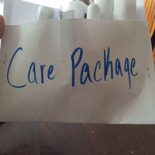
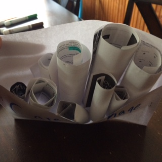
For this blog post, I’m going to be talking about the change I made for the lady I interviewed. For my Agent of Change I made a care package for the lady I interviewed. In the care package I included things I think will help her. I included a lot of museum admission information in the care package because if she shows her access card, she’ll get to pay $2.00 to get in. Plus, she has little kids. When I was a kid, I remember going to a lot of cool museums that educated me on little things. I decided to do this because I felt like it would be more effective for me to give someone in need a care package than to give a presentation to my classmates. I also put a map of free clinics in Philadelphia because after the interview, she told me a story about one of her family members, so I thought this would help. When I decided that a care package would be my agent of change, I felt like it wasn’t that hard of a task, but when I was completing it, it was mildly difficult to find museums for children in Philadelphia that allows people pay with their access card. I was effective in making this care package because I was creative and thoughtful when finding information. My creativity really came in hand when I was making the pouch to put the information in.
I felt really calm while completing this project. I wasn’t really stressed when it came close to the checkpoints because there was so much time to do each one. Usually with a benchmark, the deadlines are so close together that it gets so stressful, but with this project, there was a lot of time to complete checkpoints without feeling that stressed out. I learned that I didn’t know a lot about poverty. Like, I knew what it was and what it looked like, but I didn’t know the facts. I think I could have found more sources about poverty, because the more I know about something, the more I can understand it. For my project, there isn’t anything else to do. Some things people have done to raise awareness is asking their local community to give up one thing they enjoy (make-up, phones, food) on a particular day. Others have petitioned for a poverty reduction. I honestly think signing petitions and protesting is a good idea because when we fight for what’s right, it brings attention to the issue. Everyone will know about what’s going on if we protested about poverty. Thanks for tuning in, see you later!
(P. S. Check out my annotated bibliography for more information!)
Week 9 - Day 1 & 2 print/matt
Clari Herrera
June 9, 2017
Green
Matted
1.
2.

Unmatted
1.

My Experience
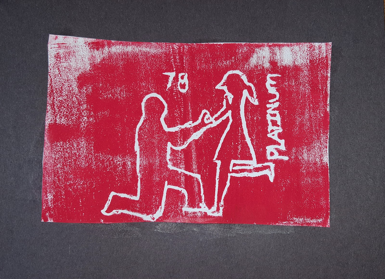
My element is platinum. My atomic number is 78. Platinum was first discovered in South America. The first written account of him was Julius C Scaliger in 1557. The origin of its name is “platina” which means little silver. Platinum is used for jewelry, catalytic converters, and dental work. I am making a print design to represent platinum. I thought of this idea because platinum is used in jewelry. Many people use platinum to represent their commitment with a ring. This print had the best image in my mind. First, I did research and I found many different uses for it. I found out that people use it in jewelry. I thought that the most perfect idea would be to represent commitment. I came up with many different designs to represent platinum. I finally came up with the perfect one. I had traced my idea onto the tracing paper. Once I was finished, I flipped the printing paper backwards and retraced over it with the foam board. I then got the foam board and rolled paint onto it. I pasted them down onto a blank sheet of paper. I selected the best three, matted two of them and unmatted another one. If I were able to redo this assignment, I would come up with a more precise design. I could use more details within the design of the dress and make it very detailed. I would trace my lines more accurately.
Printmaking was quite exciting! The best part had to be the ending. When I used the roll to paint and pasted it down onto the paper, I was anticipating how well my prints would turn out. I would slowly lift the paper peeling it hearing the paint and the paper sticking. The end results were so fascinating. The negative and positive space were so contrasting. Printing down my own designs was really fun. It was a great new experience! I can't wait to design more creative prints on my own.
The Final Stretch
Well here we are. We have reached the end of my project which means this is my last post. It was a crazy ride. This project took a lot, I learned that you should keep up with your deadlines for assignments because once it’s late it gets added to the 15 million other things you have to do and it becomes more difficult to find time to complete it. Well that’s enough reflection, now let’s talk my progress since my last post and my agent of change.
First lets look at past posts. For you faithful viewers you should remember my first blog post where I introduce my project and it’s purpose and importance. That post had the most information about my issue. If you are new or just want reread that post please click here . After that post I then posted a second post called Exercising The Public. In that post I showed you my results from survey and talked a little bit about obesity and who it affects.
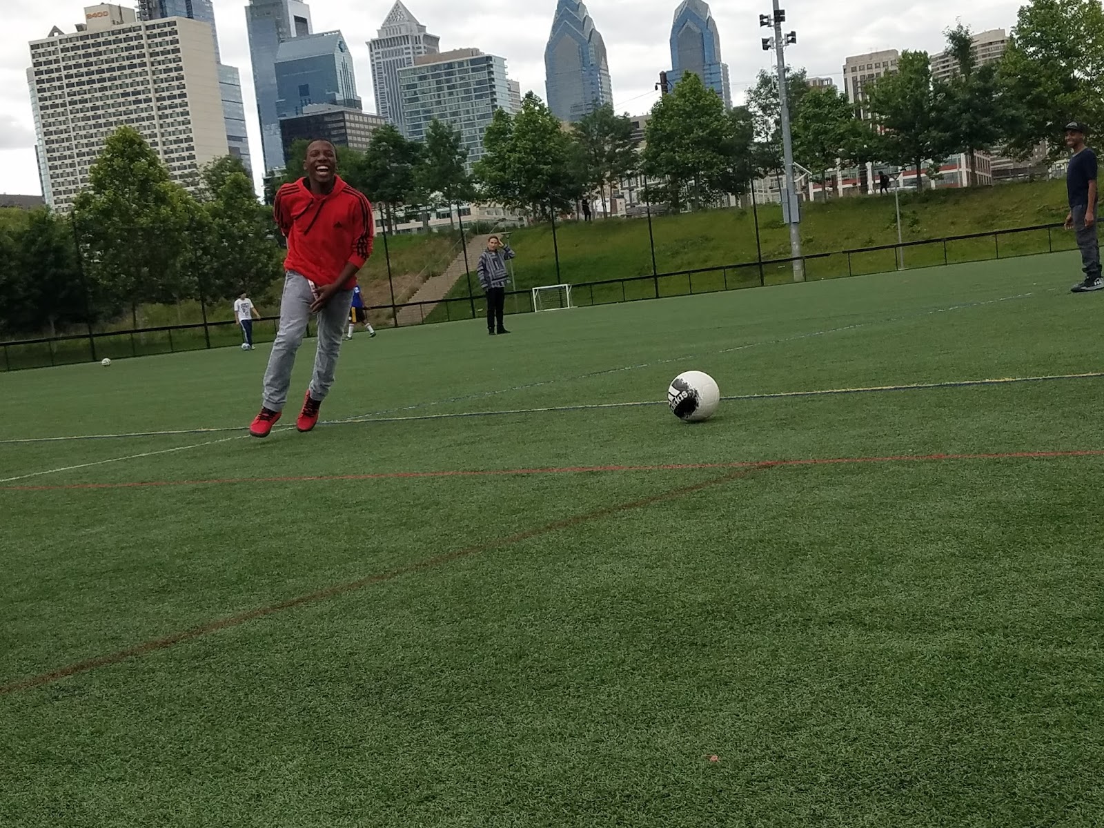
This is post 3 where I tell you about my agent of change. For my agent of change I partnered up with my good friend Elijah Afrifa. For his You and The World project he wanted to promote parks so that they can build more in the communities that need them. For more info on his project click here. Together me and Elijah invited some kids from Science Leadership Academy to join us for a day at the park.
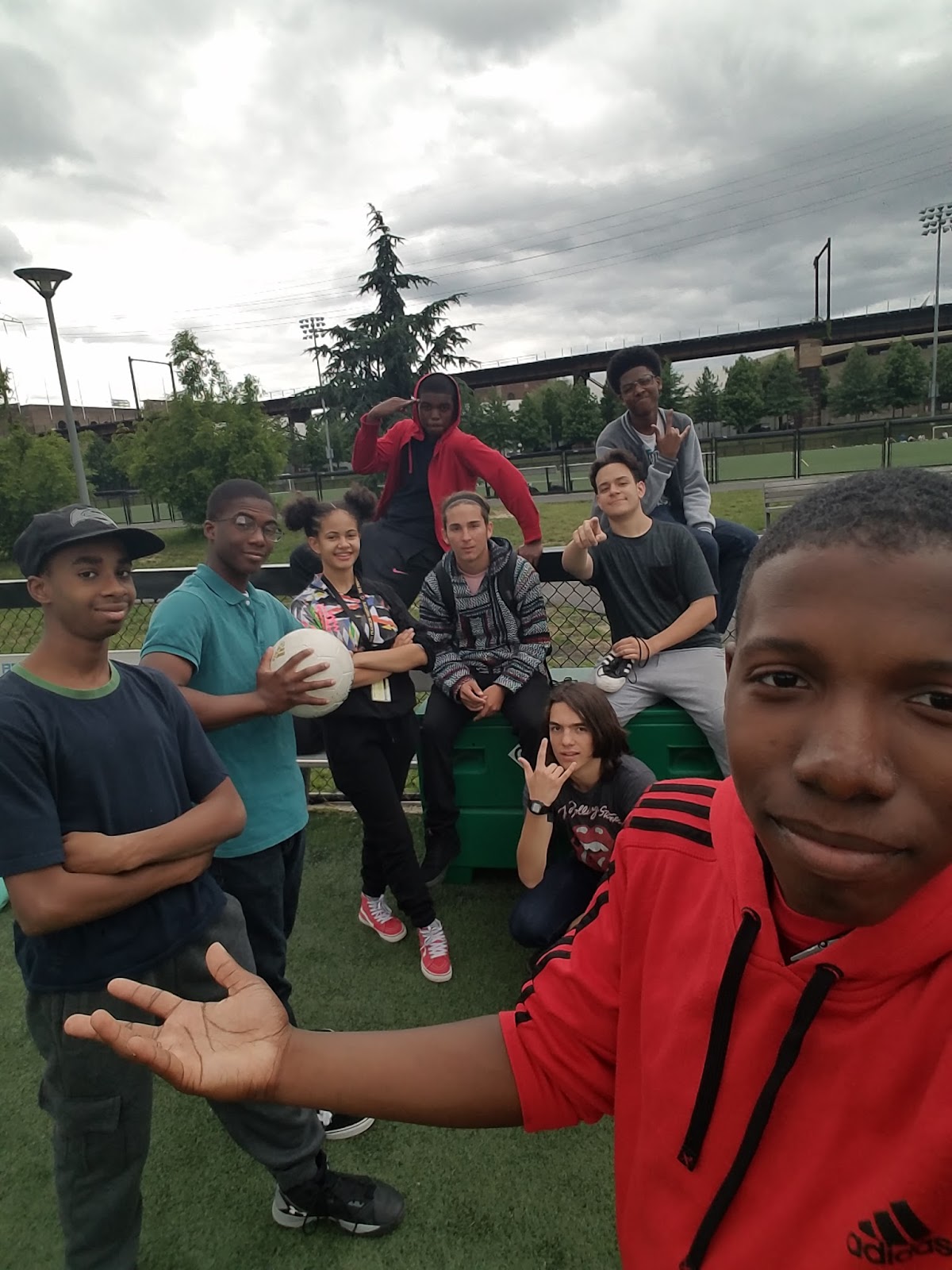
We went to Penn Park and played sports and other games that involved physical exercise. The activities included: Soccer, a Relay race, Skateboarding, and a game of tag. This was to show that exercise could be fun and going to parks can be fun too.

From the reviews I got from the participants they said they enjoyed themselves and would like to do this again. Honestly if I were to do this again I would change the park because we had to share it it with others who were there doing their own thing. I would aslo plan it better because it was kinda last minute and not a lot of people could come.
This shows that it’s not hard to get out there and exercise, you just need to find the time to do it. If you are still stuck on where to start with exercising look at this site. It has a ton of information and it gives workout routines to help you plan out workouts. If you choose to do any these plans you should do them consistently. I think I have another website like that one that also gives out ways to workout in my Annotated Bibliography.
Thank you for your faithful reading. I hope you took this to heart and decided to get you health and body on the right track if it wasn’t already. Till next time stay healthy.