Net Neutrality
Why is net neutrality important for teens to know about?
Net neutrality is important for teens to know because teens like freedom. Net neutrality is the freedom of internet use that is in the edge of getting taken away. Teens should learn more net neutrality because they spend most of their time using internet for everything. I think that if teens don t know about net neutrality they would get mad if their ISP made the "fast lanes" to slow down some of the sites they use.
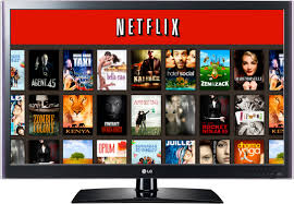
Its important for teens to know net neutrality because if their freedom of internet get taken away, they could get mad and doesn't realize what was happening. If we don't have net neutrality we wouldn't have equal internet access from our ISPs. If we don't have it, some of the sites that we use will be slower than the other sites, such as Netflix. Teens now are on Netflix to watch lots of movies and if the ISP makes the use of Netflix slower, it would be a big problem.
If the ISPs get to make their fast lanes and net neutrality is taken away, we might have to pay more for the internet we use daily. Teens should know about the rights that they have online. The next generation of kids won't know what its like to have networking rights. I hope that teens will understand how important it is for them to know about net neutrality.
https://www.eff.org/issues/net-neutrality
https://medium.com/@jamesdean_49818/teens-and-net-neutrality-696d6b23cbd5
http://www.washingtonpost.com/blogs/post-tech/post/the-circuit-fcc-plan-for-affordable-broadband-mean-teens-online-net-neutrality-heats-up-again/2011/11/08/gIQA5iB74M_blog.html