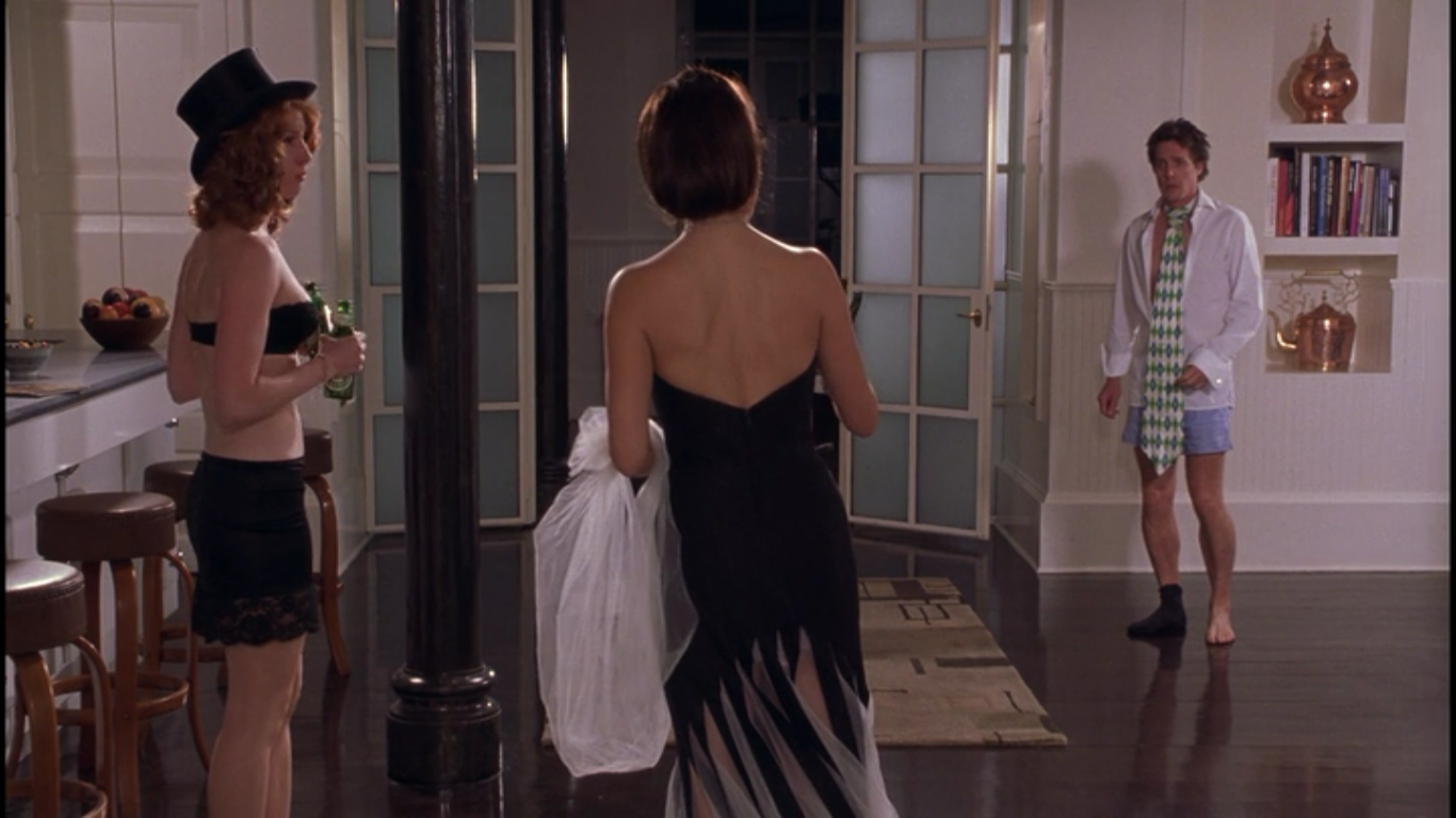
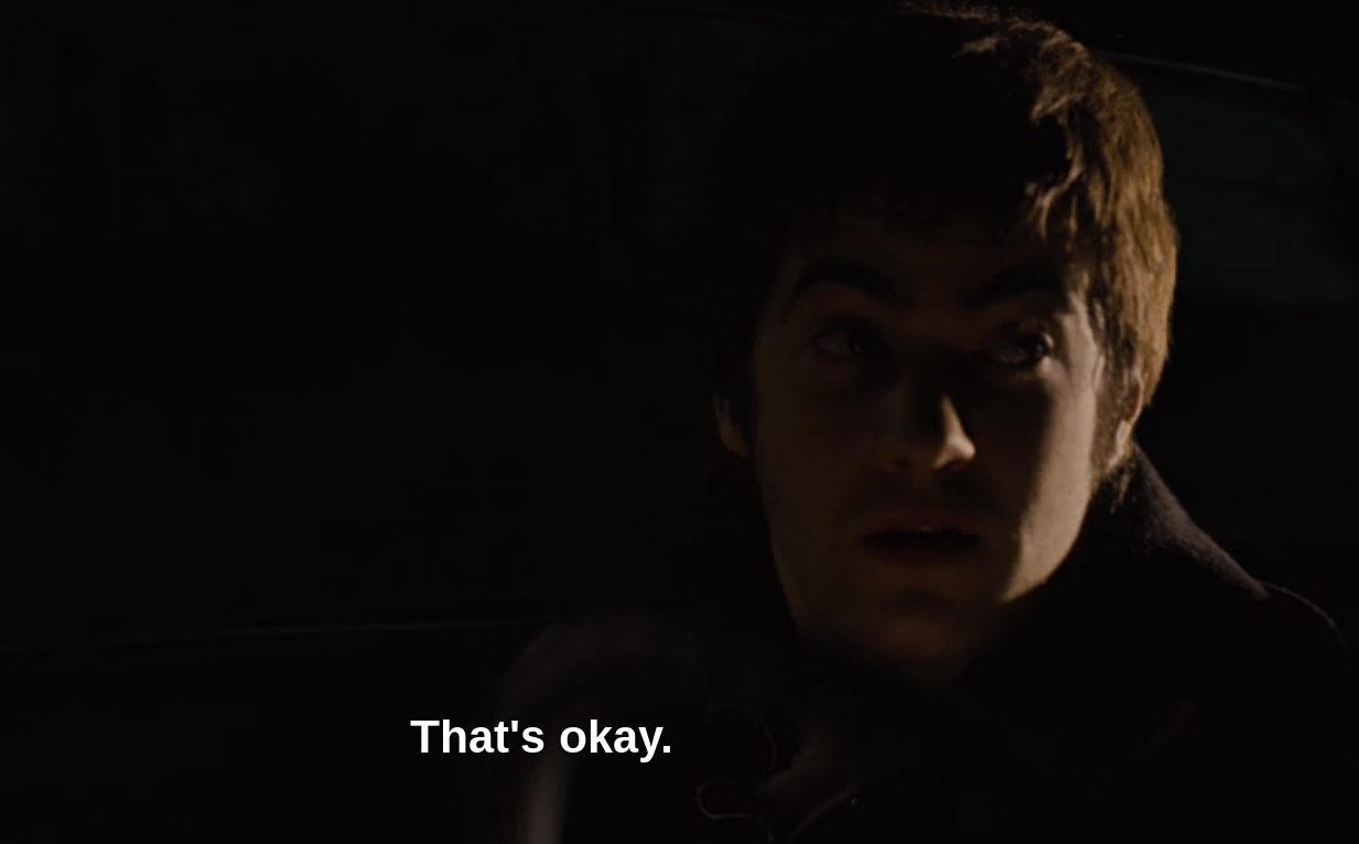
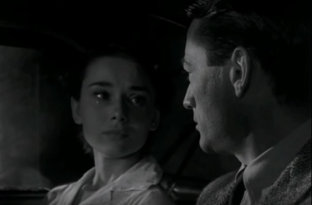
Boys and Girls Ultimate: State Championships
Teams must qualify.
d. Specifically comment on the 10 tips for effective infographics -
Be Concise: Used as little text as possible.
Be Visual: We used object and events to compare the coal slurry spill to what we could relate to.
Be Smarter: Used colors and size to highlight difference between events.
Be Transparent:Be Different: Used photoshop to create our own infographic.
Be Accurate: Used a variety of sources to verify the information.
Be Attractive: Infographic was colorful.
Be Varied: Used not only normal shapes but other methods to display information.
Be Gracious:
Be Creative: Used various fonts and methods to visualise the information.
Which of these areas did you excel in? Which were not so well represented? Why do you think some elements of design were easier or harder to include in the end product?
I thinkBe Concise - We didn't use too many words, but relied on using pictures and graphs to relay the information.
Be Visual - Similarly, the majority of the info-graphic is comprised mainly if pictures, graphs, and keys to demonstrate the facts and information gathered.
Be Smarter - I'm not necessarily sure how "smarter" we could have made it, but as far as information is concerned I suppose we did a "smart" job.
Be Transparent - Similar to being concise, it's just specific data without too many words that shows the information we've gathered.
Be Accurate - The information
What went well?
We found information on our topic very easily. It was easy for us to research what we wanted and our brainstorming and collaboration went very well.
What did not?
We had a lot of ideas for how we wanted our info-graphic to be displayed but they required more photoshop skills than what we were capable of.
c. What would you do differently next time?
Next time, we would use paper and pencil so that we could specifically plan out the way we wanted our info-graphic to look. I would also use the spare time we had to look up more information about the company. Also, next time it would be better to use a site where everyone could edit the page, the work basically had to be put on one person.
d. Specifically comment on the 10 tips for effective infographics -
Be Concise- remain specific to one topic. Although our topic had many elements
Be Visual- to use visual elements and a lot less words.
Be Smarter- think about our topic thoroughly and use whatever elements we think will work best.
Be Transparent- to make it obvious.
Be Different- to be creative.
Be Accurate- make sure we do research on our topic.
Be Attractive- make sure it looks nice and is aesthetically appealing.
Be Varied- have a variety of images
Be Gracious- fair.
Be Creative- use the left side of our brains.
Which of these areas did you excel in? Which were not so well represented? Why do you think some elements of design were easier or harder to include in the end product?
I think we worked very well with being attractive, concise and different. We weren't very varied because our info-graphic had a set theme. I think being gracious and being different was harder because within the time frame we had we focused on getting it done.b. What did not?
Because of the topic we had, we had an extremely hard time trying to find graphics to use. We then got distracted by trying to find graphics and stopped paying attention to the time we had, which caused us to have to drop finding graphics, and just make a creative post with the information we had.
c. What would you do differently next time?
I would ask for help so that the process of finding graphics would come more smoothly and spend less time on finding information and more time on creating a better info graphic
d. Specifically comment on the 10 tips for effective infographics -
Be Concise
Be Visual
It is very important that you make the information appealing to the eye. A boring text heavy poster, isn't exactly the way to go.
Be Smarter
Be Transparent
Don't make things hard to understand. People should be able to get the general gist just by your info graphic alone.
Be Different
Stand out from things that people may have seen before. If it's something that's repetitive then others may not be intrigued to look.
Be Accurate
Make sure the information are facts. Do not lie to innocent people.
Be Attractive
Make the info graphic appealing to the eye.
Be Varied
Add variety to your info graphic. In other words, don't just stick with one concept!
Be Gracious
Be Creative
I think what when well was the fact that there wasn't much argument about the design of it. We didn't have underminding ideas and we worked together to make it look very neat and creative. We tried to keep the information concise and to the point and i think we did that well.
Nothing really went wrong or bad. We got a little of task at times but we got out project done with all (iThink) of the required components. If we were to do this project again, the only thing I'd probably change would be the colors because I'm really picky about that.
The ten tips that we got were very helpful to our presentation and we really tried to use them. The main ones we focused on were using contrasting and popping colors, and keeping the text easy to understand and read.
Below are a list of things we believe we excelled in when making this project:
Being Concise
Being Visual
Being Accurate
Being Attractive
Being Varied
Being Creative

What would you do differently next time?
Primary researches involving our topic and maybe even a scale to keep our progress on point. I even think we needed an extended amount of time because design wise our graphic could have been improved.
Which of these areas did you excel in? Which were not so well represented? Why do you think some elements of design were easier or harder to include in the end product?
The message topic for our project seemed to be very brought out into recognition which included our detailed and labeled pictures. It was difficult to add a portion of information that sets in a visual way with detailed explanations presented.
Be Visual
Be Smarter
Be Transparent
Be Different
Be Accurate
Be Attractive
Be Varied
Be Gracious
Be Creative
Which of these areas did you excel in? Which were not so well represented? Why do you think some elements of design were easier or harder to include in the end product?
I feel as though we excelled in the creative part. We were able to use things that people can relate to to show our findings. If we had ut simply numbers it might not have been so mind boggling, however, visually seeing the number, truly brings out what is out there. We were Different in that we used different ideas to represent our data.a. I believe the overall research went well. We found a lot of statistics and different things that we could potentially use for the info graphic, so there was a lot of freedom when deciding what to put and what to not put.
b. I believe when it came to putting the right information into the graphic we fell short. We have things that resulted in the oil spill, but not so much how it was caused or what happened afterward. I believe we needed to include more of this in the info graphic.
c. I think I would include more information about the before and after, we included a lot about what happened because of the spill, but not so much how they cleaned it up, how long it took and how much oil is still there (according to some of our sources there is still some oil remaining in the area).
d. I think we excelled in "be visual" and "be transparent." I think the "be varied" and "be smarter" elements were not as well represented. I think the "be varied" and "be smarter" elements were not as well represented because when it comes to variation, if there is too much variation things can look sloppy and they will not be consistent. So when it came to variation, it was hard to add as much due to the fear of looking sloppy or the info graphic being hard to understand. I think when it came to "be smarter" we didn't want to add too much information because it would have been overpowering and maybe even cluttered. If there was too much information, it may have been harder to understand and read.
Something that went well with this project is that we were able to break things up evenly and assist one another here and there. We each became experts with a certain time frame of the accident and were able to summarize each part to the whole group.
The only flaw in our project was that it was hard to incorporate everything into a visually appealing project. We only displayed the event and what was harmed/killed, but we didn't get to incorporate how it happened or how it was improved because it was just due to lack of preparation for disasters.
Something to consider for next time is adding more information or show symbols for things on how it happened or what was going on.
The areas we excelled in as a group were graciousnss, visual appeal, transparency, accuracy, creativity, it was different, it was concise, and it was varied but not repetitive. The areas we didn't represent so much were the knowledge we learned wasn't portrayed in the infographic as much as it should have been because it was hard to incorporate it into the project in an appealing manner.
a. What went well? Some of the things that went well were coming with the idea and making it to be creative yet clear. Also we worked together as a group and spilt up the work to get it done quicker and we also helped each other understanding their part of the project.
b. What did not? Some of the things that did not go well were, getting out pictures to be large on the slides and when we upload it. Also to connect the creativities with our ideas we had in mind and that our a audiences would be able to see the message clear.
c. What would you do differently next time? Some of the things we would like to do differently next time are, instead of using what we used to show our numbers on the mountain we could of more pictures and instead of the using the mountain, would could of used something different like hills etc.
d. Specifically comment on the 10 tips for effective infographics –our project wasn’t that creative to have all the 10 tips, however the mining people on the mountain is the notifies the creative’s that is in it because it stand for in OCK the area were very tight and many people had to make their way up by fighting and because of the oil spill it was hard. Our elements of designer were hard because of the image we had in our head kind of turned out the way we wanted it but still not exact, our pictures isn’t large enough and the 10 tips wasn’t in it as much.
b. What did not?
Finding a way we were going to portray the information was the difficult part.Be Concise- To be brief but not give little information.
Be Visual- To not include too much writing but images.
Be Smarter- Must be helpful, informative, and entertaining.
Be Transparent- To make our focus point obvious.
Be Different- Be unique/creative. You don't always have to go by someone else's idea.
Be Accurate- The research cannot be false.
Be Attractive- The info graphic must be eye-catching, not boring.
Be Varied- To keep the variation to a minimum. If it were to be too varied, the info graphic would look messy (The main idea wouldn't be there anymore).
Be Gracious- To not have too many things going on all at once. For example "this means this, and this means this, and this means this."Be Creative- This is similar to being different. Being simple can be bad sometimes, therefore being creative can take the boringness of a project away!
Which of these areas did you excel in? Which were not so well represented? Why do you think some elements of design were easier or harder to include in the end product?Be Concise
We tried not to use a lot of words. We wanted to use more pictures to describe what was happening. We hoped that people would understand it with a quick glance.Be Visual
We had a lot of pictures that told their own story. We do have some sentences, but we just tried to use phrases. We picked a theme and colors, that we tried to keep consistant through out the graphic.Be Smarter
I thought that our graphic was clever and well represented. I don't think it is perfect, but it is good.Be Transparent
Our graphic was a little not clear at times and if i didn't make it, I might not understand what was going on.Be Different
Our graphic has a different theme than others. We used used blue throughout. We tried to have the least amount of words and others had a lot.Be Accurate
We did tons of research and tried not to use any sources that looked unreliable.Be Attractive
I feel that it is well organized and the color makes it appealing to the eyes. It might be a bit crowded, but I think it looks fine.Be Varied
We used a variation of ways to display the data, like we tried to tell a story with the fish and showing a scale with the randrops.Be Creative
We used tons of pictures and used different ways to display the data. I thought that we were creative with the way we approached the assignment.2.
a. What went well?
I feel that we did a good job collecting different sources about our topic. We also did well communicating how to display this on our visual.
b. What did not?
A few times, there were a few communication disputes, but they were quickly resolved. Other than that, I feel that we were pretty successful.
c. What would you do differently next time?
For me, I feel that if we did the infographic on a site that all of us could edit on, everyone would be able to take part in actually working on the visual, instead of having it on one computer, and having one person actually put it together.
d. Specifically comment on the 10 tips for effective infographics -
Be Concise : We provided different information, and it was brief.
Be Visual: We did well using different graphics to display information we learned.
Be Smarter : The design of the visual is clever, and smart.
Be Transparent : It's clear to interpret the idea, and topic of the visual, without much background information given. It gets straight to the point about the issue.
Be Different : I think it is different, because we included different colors, and objects to portray the issue that we researched.
Be Accurate : All of the information that is given, was fully researched, so nothing is false.
Be Attractive : Our visual is quite attractive.
Be Varied : We included different elements, and numbers used in the visual.
Be Gracious
Be Creative : The visual is creative with how we display the information, and how the visual is organized.
Which of these areas did you excel in? Which were not so well represented? Why do you think some elements of design were easier or harder to include in the end product?
I think we excelled in "Be Creative", "Be Visual", and "Be Accurate".
a. What went well?
What I think went well was the amount of teamwork, and cooperation that we had. I think that as a group, we meshed our ideas together, and divided the work well and evenly.
b. What did not? Actually not too much didn't go well. But I guess the only thing was our file gave us a bit of problems, but we solved that.
c. What would you do differently next time? Next time, I would definitely change my timeline, and try to have less text on it. Perhaps changing structure of it.
d. Specifically comment on the 10 tips for effective infographics -
Be Concise- Make sure that fonts and colors remain the same, or complimenting through out.
Be Visual- Pictures and visuals are vital for showing information. Make sure that the main portrayal of information is from images rather than text.
Be Smarter- Divide work to save time. Make sure the theme of your info graph fits your topic well.
Be Transparent- Don't beat around the bush and provide irrelevant information. Make sure that the point and information of you info-graph is clear.
Be Different- Be original! Be creative and make your info-graph stand out.
Be Accurate- Try to be precise with your dates provided. Have good and valid sources for your information.
Be Attractive- Be tasteful with the amount of words, or the colors.
Be Varied- Have different kinds of sources for you information! Provide images and statistics and anything that can easily transmit information.
Be Gracious- Be neat and tidy. Try not to have information just scattered about, and lacking structure. Structure is key.
Be Creative- Have fun! Make your info graph something totally original and more importantly cool looking. Find cool and appealing ways to represent different types of information.
Which of these areas did you excel in? Which were not so well represented? Why do you think some elements of design were easier or harder to include in the end product?
I think we excelled when it came to being smarter, transparent, varied, and attractive. I believe we excelled in there areas because our work was divided evenly, and we each shared an equal role in the design. I think we were very transparent will the point of the info graph, as well as having a nice supply statistics and images to further the understanding of the text. I think that it is attractive because of our colors that we chose, and how they relate to the drilling that happened in the town- hence, all of the brown. I don't think that being concise and visual was represented as well because not all of our fonts are exactly the same, and we had a lot of text. I think that we could have organized the text differently, and that would change the visual effect on the reader. I do think that it was harder/ easier to represent some of the elements of design because it vary depending on the type of topic that you have. I believe that visuals are used in specifics ways, and some ways may not be as universal as others. For us, I think that it was harder being completely visually creative.
I think the final product turned out well. Dan and I worked together well out of and in class. We worked pretty hard, and I think it paid off in the end. One thing that wasn't so great was teamwork throughout the group, we had 1 member who didn't really contribute to the product. Some of the class time wasn't used wisely when there were distractions, but it was mostly used well. Next time I would choose a different way of portraying this information, maybe using pie charts or other methods. I would also make sure to use all of the class time effectively.
I think that we were good at being creative, because we showed parts of the accident that other people might not have thought about. I think that the project was concise, not using very many words, and having a lot of images. I think that it was somewhat attractive, because our images are interesting, and cool to look at. Our project could be more transparent, because it's not that easy to tell who, what, when or where. Also there is only 1 government reaction on the info graphic. It was harder to make the who, what, when, where, how, and why because it would take away from the info graphic if it was obvious, and the info graphic wouldn't make sense if they weren't included. It was hard to think of a unique design, but once it was thought of and planned it wasn't that hard to make
.

a. What went well?
- We all worked together and we communicated well. Even when we were stressed with other class' benchmark projects, we still managed to do our own part of the work done.
b. What did not?
- I don't think there were anything that didn't work well. But I guess we had difficult trying to post the actual work on the thinglink because the file was too big. However, we sorted out and we got our product!
c. What would you do differently next time?
- I can actually say that I wouldn't do anything different than what we have now because I'm very proud of our final product. It's very professional and creative (in my opinion).
d. Specifically comment on the 10 tips for effective infographics -
Be Concise - I hate to admit but we have a lot of word on our final infographic but the main things are the ones that are in bigger fonts so, it kind of makes up for it.
Be Visual- Ours is very visual and on point. The colorings are meant to show that way. We have rocks to represent lead etc.
Be Smarter- Before this mini-project, I was completely oblivious to the fact that such an event occurred. I learned a lot of things.
Be Transparent- The infographic talks about the event and its effects on people. It doesn't go in depth with every single details but it shows the important ones in a bigger font.
Be Different
Be Accurate
Be Attractive
Be Varied
Be Gracious
Be Creative
Which of these areas did you excel in? Which were not so well represented? Why do you think some elements of design were easier or harder to include in the end product?

b. What did not?
-Figuring out which data to use and what was important was difficult as well as sourcing it. We found the population one day and then couldn't find an accurate source the next.
c. What would you do differently next time?
-I would use some more data to paint the picture of what happened. I mean the numbers are there but not enough to evoke an appropriate emotion.
d. Specifically comment on the 10 tips for effective infographics -
Be Concise- it is concise with very few words
Be Visual- the whole thing is visual using picture to show numbers
Be Smarter- not sure about it this one
Be Transparent- the data is there and easy to understand
Be Different- we used the ical calendar as a clever way to show about W.R. Grace cleaning up
Be Accurate- the data is mostly from the EPA
Be Attractive- it's colorful
Be Varied- we sort of vary, using pictograms and a pie chart
Be Gracious- not sure about this one, I guess we didn't do it?
Be Creative- we utilized different methods using the pictograms
Why do you think some elements of design were easier or harder to include in the end product?