Lithium
What is your element? Name and atomic number
My element is Lithium and the atomic number is three.
Tell the reader about your element, history, function/use and so on.
Lithium’s weight is the lightest solid element and the lightest metal. It conducts electricity functions and heat very well. Johann August Arfvedson is the founder of the element Lithium and found it in 1817.
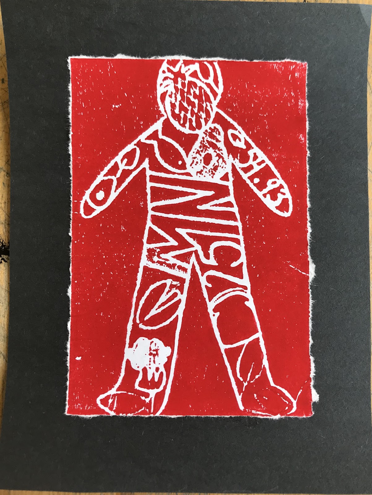
How did you get the idea for the imagery you chose?
I got the idea from its conduction of electricity so my print was a battery.
What process did you go through to make this print?
I brainstormed of an idea, drew it, traced on paper which got put on a styrofoam paper. Then I put paint on the styrofoam and then pushed into it on a paper which created a print.
What would you do differently if you did this print a second time?
Nothing, I felt I did pretty good with everything.
What part of the project did you enjoy the most? Describe the step and what you liked so much about it.
I like brainstorming because it allowed me to express my creativity.