Blog Feed
Mi video: Advisory
Business Unit Project
- I chose this type of presentation because it looks the most attractive and meaningful, given the concepts utilized. It seems that when data is expressed to an audience, the fewer the amount of words used, the better. Thus, a single slide was ideal.
- Individual change is when you set your mind to something. Systemic change is when a group of people set their minds to a universal idea.
- What is "business" like in other countries?
Rugeiatu
I chose to do is as a collage because I thought it would have been a better way for me to send the message or the idea I was trying to send.
My project(collage) answers the questions of how individuals causes the system in changing of each individuals.
My project(collage) answers the questions of how individuals causes the system in changing of each individuals.
STOP Child Labour!!!
Imani's human trafficking project
Child Labor
Alex, Kim, and Kam Project
¡¡La Fantastico Escheula!!
1. La SLA es muy loco y interesante. We have many clubs including math, poetry, engineering, etc. We have sports, a school store, and also literature & math club for extra help. The school has about 500 students and 25 teachers. It's located at... I think SLA is a very independent and open school that gets work done in a fun way while teaching both the teachers and students.
La chico y chica y mi at la Franklin Institute.
Es mi at escheula en historia on Halloween.
La chica Kennedy y mi en Bio chemica.
Clase: English
Profesor/a: Srta. Dunn
Actividades en la clase: Yo escribe poemos y books y stories y essays.
Responsibilidades:
Materiales: La computadora, los plumas, las hojas de papel
Opinion: Es muy te gusta. Por qué sí. Es my muy muy importante y favorita.
Profesor/a: Srta. Dunn
Actividades en la clase: Yo escribe poemos y books y stories y essays.
Responsibilidades:
Materiales: La computadora, los plumas, las hojas de papel
Opinion: Es muy te gusta. Por qué sí. Es my muy muy importante y favorita.
Clase: Arté
Profesor/a: Srta. Hull
Actividades en la clase: Yo escribe pictures.
Responsibilidades:
Materiales: La carpeta, las hojas de papel
Opinion: Es bastante te gusta. Por qué sí. Es muy diversión.
Profesor/a: Srta. Hull
Actividades en la clase: Yo escribe pictures.
Responsibilidades:
Materiales: La carpeta, las hojas de papel
Opinion: Es bastante te gusta. Por qué sí. Es muy diversión.
Human Trafficking
PSA
PUBLIC SERVICE ANNOUNCEMENT !!
Sweatshop
Human Trafficking
Human trafficking
Mi video: English
Alyssa: Child Abuse
Human Trafficking.....
Human Trafficking
Puppy Mills
Micah Getz's PSA
World of 100 Ali Ahmed
Ali Ahmed
Poverty of 100
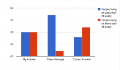
The graph above is a representation of my guess, m classes average guess and the actual answer of how many people live in poverty (less than 2usd/day). I held a much more realistic view than the res of my class in the statistic. I know that the unfortunate are a dominant amount of people but I know that our world has moved in the direction where labor in general is needed more and more and even if they are not getting paid much, 2 dollars isn't much at all. The statistic is still staggering. 48% of people in poverty is still a horrible statistic and is suprising for our day in age.
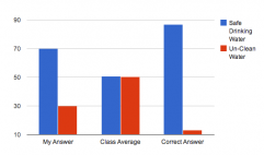
One statistic that I felt really confident about was drinking water. I know that there have been huge leaps in cheap humanitarian alternatives to drinking water. What I did not expect was the huge leaps in such advancements. To achieve such a record is amazing, The class were pessimist with these statistics I guess I expect more of the world community.
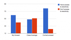
As with the water statistic this one suprised me similiarly. I knew electricty has become much more accesible but advances have become surprising, and as with the water statistic the class was full of pessimists. We are getting to a point where things we take for granted are being taken for granted elsewhere and this creates an illusion that we live the same. Just because you have electricity doesn't means it's on 24 hours a day nor do you have the supplies to actually use it. These statistics are skewed as are all stats but I like that these stats can even be justified. This wasn't possible ten years ago. Maybe in ten years there stats will be real.
Poverty of 100
The graph above is a representation of my guess, m classes average guess and the actual answer of how many people live in poverty (less than 2usd/day). I held a much more realistic view than the res of my class in the statistic. I know that the unfortunate are a dominant amount of people but I know that our world has moved in the direction where labor in general is needed more and more and even if they are not getting paid much, 2 dollars isn't much at all. The statistic is still staggering. 48% of people in poverty is still a horrible statistic and is suprising for our day in age.
One statistic that I felt really confident about was drinking water. I know that there have been huge leaps in cheap humanitarian alternatives to drinking water. What I did not expect was the huge leaps in such advancements. To achieve such a record is amazing, The class were pessimist with these statistics I guess I expect more of the world community.
As with the water statistic this one suprised me similiarly. I knew electricty has become much more accesible but advances have become surprising, and as with the water statistic the class was full of pessimists. We are getting to a point where things we take for granted are being taken for granted elsewhere and this creates an illusion that we live the same. Just because you have electricity doesn't means it's on 24 hours a day nor do you have the supplies to actually use it. These statistics are skewed as are all stats but I like that these stats can even be justified. This wasn't possible ten years ago. Maybe in ten years there stats will be real.
World of 100 Analysis
<script type="text/javascript" src="//ajax.googleapis.com/ajax/static/modules/gviz/1.0/chart.js">
{"dataSourceUrl":"//docs.google.com/a/scienceleadership.org/spreadsheet/tq?key=0Ampys0iavQBCdGl2Z3JWcDRGNmxmT2FxSzNmTXFwOUE&transpose=0&headers=0&range=A2%3AB3&gid=0&pub=1","options":{"vAxes":[{"title":null,"minValue":null,"viewWindowMode":"pretty","viewWindow":{"min":null,"max":null},"maxValue":null},{"viewWindowMode":"pretty","viewWindow":{}}],"booleanRole":"certainty","animation":{"duration":500},"vAxis":{"format":""},"useFirstColumnAsDomain":true,"hAxis":{"maxAlternations":1,"format":""},"isStacked":false,"width":243,"height":371},"state":{},"view":["{\"columns\":[0,1]}","{\"columns\":[0,1]}","{\"columns\":[0,1]}"],"chartType":"ColumnChart","chartName":"Chart 1"}
</script>
<script type="text/javascript" src="//ajax.googleapis.com/ajax/static/modules/gviz/1.0/chart.js">
{"dataSourceUrl":"//docs.google.com/a/scienceleadership.org/spreadsheet/tq?key=0Ampys0iavQBCdGl2Z3JWcDRGNmxmT2FxSzNmTXFwOUE&transpose=0&headers=0&range=A5%3AB7&gid=0&pub=1","options":{"vAxes":[{"title":null,"minValue":null,"viewWindowMode":"pretty","viewWindow":{"min":null,"max":null},"maxValue":null},{"viewWindowMode":"pretty","viewWindow":{}}],"booleanRole":"certainty","animation":{"duration":500},"vAxis":{"format":""},"useFirstColumnAsDomain":true,"hAxis":{"maxAlternations":1,"format":""},"isStacked":false,"width":248,"height":371},"state":{},"view":["{\"columns\":[0,1]}","{\"columns\":[0,1]}","{\"columns\":[0,1]}"],"chartType":"ColumnChart","chartName":"Chart 2"}
</script>
World of 100
The sections I was most accurate in were the “owning vs. not owning
a computer” and age categories. For the age I think I was accurate because the
age division seems to be the same almost anywhere you look. In every
statistical set of data you’ll find that the age separations are pretty
consistent. Because of this, I recognized seeing the numbers fairly often and
used memory to take my guess. For the technology section, I simply assumed/knew
most people in the world didn’t have access to a computer like we do at SLA. I
picked the simplest ratio (90 to 10) and that was close enough to the real
answer (88 to 12).
I didn’t get much right but I think the incorrect guess that was
most surprising was the gender and drinking water categories. Usually when I
look at schools, there's more girls than boys in a class. That has been mostly
true for me since first grade. Seeing that we’re actually split right down the
middle shocked me because I had never seen that ratio before. The drinking
water was a shock because in lower school we did an assignment and found that
only about 3% of the water in the world was drinkable. Because I this I assumed
that there would be more people without water than with it and not the other
way around.
My predictions weren’t split evenly but there was enough in the
right category (in my opinion). I think this is because the city of
Philadelphia doesn’t give me an accurate outlook on the world. Philadelphia and
SLA project statistics and ratios that are much different from the actual world.
If someone only saw one type of people wherever they went they would think the
entire world was filled with those types of people, that's what SLA and
Philadelphia have done to me. In some aspects they're an accurate portrayal of
the word but in most aspects they're not.
World of 100
For one of the graphs, I chose to do the one with the technology. For the world of 100, when it came to pick how many people would have cell phones and how many wouldn't, I went off from the current time right now. Now days 9 out of 10 people has a cell phone so therefore I chose that 70% would have cell phones and 30% wouldn't.
For the male literacy, I wanted to chose something that's different from this world. For instance it is common for someone to say that men are lazy or illiterate. That's why I chose more men that could read and write then men that couldn't. I chose that because if there was a world with more men not knowing how to read and write then that world would be at risk because it would have a lot of illiterate people.
For the poverty part I chose that more people would live on than 2 dollar a day then people that would live on less than 2 dollar a day. I hate seeing people who struggles everyday just to get what they want that's why I chose more people would live on more than 2 dollar a day because they would have jobs and it would be easier for them to buy their personal needs. Also there would be some poor people but more rich people then poor so the rich people can help the poor ones and that will increase the love they would have for each other.